The ability to visualize data analytics has never been more important than it is now, at a time when the amount of data being generated on a global scale continues to grow exponentially. Without a way to visualize the ever-growing amount of inert data being amassed by companies across all industries, they stand to miss out on the business insights and opportunities that analytics can provide.
From identifying trends and fluctuations, to visualizing funnels and comparisons over time, to summarizing subjective performance and proportional totals – there are many ways developers can visualize companies' analytics data to transform it into more useful information. The question is how best to do it.
For web developers who build apps and websites that include analytics components, the challenge of visualizing data to maximize its informative power is still uncharted territory in many ways. From a multitude of device compatibility and scaling concerns, to a variety of integration considerations, there's a lot of thought that has to go into the way developers choose to integrate digital charts into their projects.
Fortunately, the ZingChart JavaScript library addresses most if not all of those concerns and considerations because it's a mobile-friendly, self-contained, dependency-free library that’s compatible with all major browsers. Check out ZingChart's page on browser compatibility for a more in-depth look into its compatibility details.
Whether your development project requires charts with shared chart interactions, animations, real-time feeds, mobile responsiveness, a powerful JavaScript API, or other types of interactivity, ZingChart's built-in features are robust enough that they can most likely accommodate your needs. Beyond its feature set, ZingChart can visualize datasets of all sizes using more than 35 different chart types with various chart-specific capabilities and customizations.
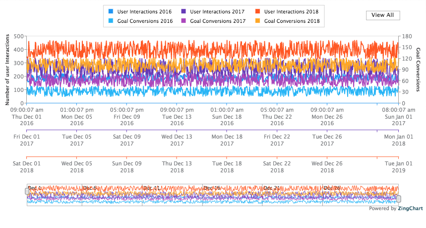
So what are some practical use case cases for analytics charts? Website analytics dashboard components are an obvious example, as exemplified by this ring chart with a center label and this line chart with crosshairs. Marketing analytics dashboard components are another example, as illustrated by this mixed line and bar chart and this line chart with multiple scales.
Here's a more extensive list of ZingChart demos that accommodate different analytics use cases across a variety of industries, including the ones mentioned above:
- Ring Chart with Center Label demo
- Colorful Pie Chart demo
- Drilldown Bar Chart demo
- Line Chart with Crosshair Tooltips demo
- Size Aspect Heatmap demo
- Mixed Line Column Shapes demo
- Spline Dynamic Labels demo
- Gecko Style Widgets demo
- Area Date Formatting demo
- India Map demo
- Response Dashboard Media Queries demo
- Stacked Bar Hooked Labels demo
- Multiple Time Series Scales demo
- Gauge with Center Label demo
- Live Sparkline Chart demo
If you're interested in finding out more about what it would look like to integrate ZingChart in your next analytics-related web development project, visit the ZingChart website to chat with us, or look into other ways to contact the ZingSoft team. We've been trusted with advanced data visualization solutions for organizations of all sizes worldwide since 2008.
Please make sure to also check out ZingChart's sister product, ZingGrid, to learn how to easily build CRUD-ready data grids and data tables with only a few lines of code. Together, ZingGrid and ZingChart form a powerful suite of data visualization products that are meant to make it easier than ever to transform your analytics data into analytics information.
A pioneer in the world of data visualization, ZingChart is a powerful Javascript library built with big data in mind. With over 35 chart types and easy integration with your development stack, ZingChart allows you to create interactive and responsive charts with ease.