![]()
Social media has become a focal point for marketers online, and many organizations, big and small, are spoken about by endless amounts of users.
Understanding the depth, sentiment, and demographics of users speaking about your organization is incredibly difficult to track. Conversations occur on different social networks and looking at each message individually does little to help understand the mass of data.
Enter: Nuvi to visualize all this data.
Nuvi is a real-time social media analytics tool born out of the need to track conversations online in a more visual way. This unique system listens on various social networks (Twitter, LinkedIn, and Delicious to name a few) for the keywords or usernames you’re interested in.
Each time the keyword or username is mentioned in a conversation, Nuvi will plot the data on an interactive bubble chart that updates in realtime.
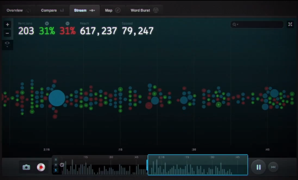
The bubble chart provides additional useful information, which serve as examples of sound data visualization. Bubble color changes depending on sentiment - red for negative, green for positive.
This allows social media managers and marketers to quickly identify trends in the conversation, whether they are skewing positive or negative. Bubble size changes depending on user influence.
If Jane Doe were to mention your organization or a keyword you’re interested in, she would appear as a very small bubble. However, if Oprah were to mention your organization, then the bubble would be enormous.
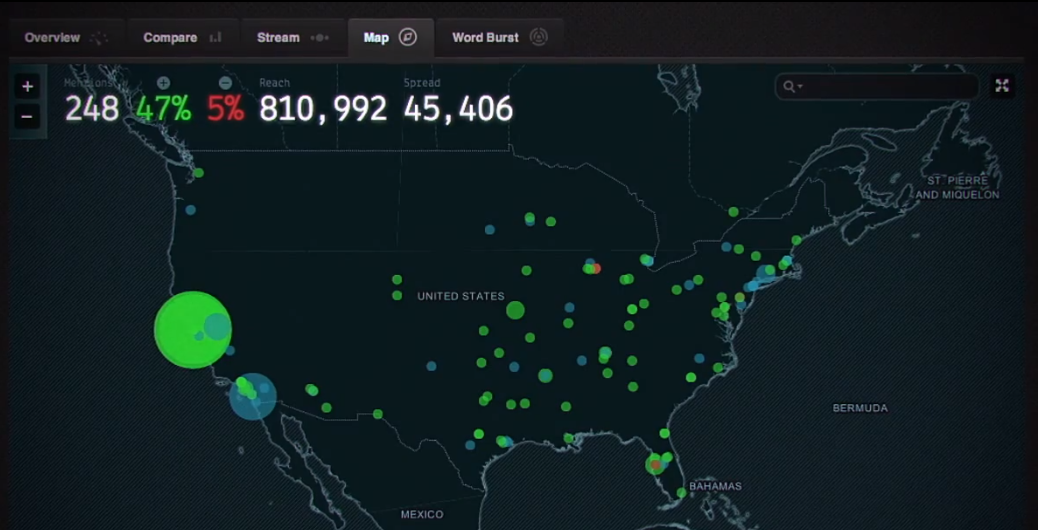
Another useful visualization feature Nuvi offers is an interactive map that can be drilled down into. This tool plots the location a keyword or username was mentioned from.
This helps to identify where pockets of conversation occur in real time and displays geographical segments of your audience.
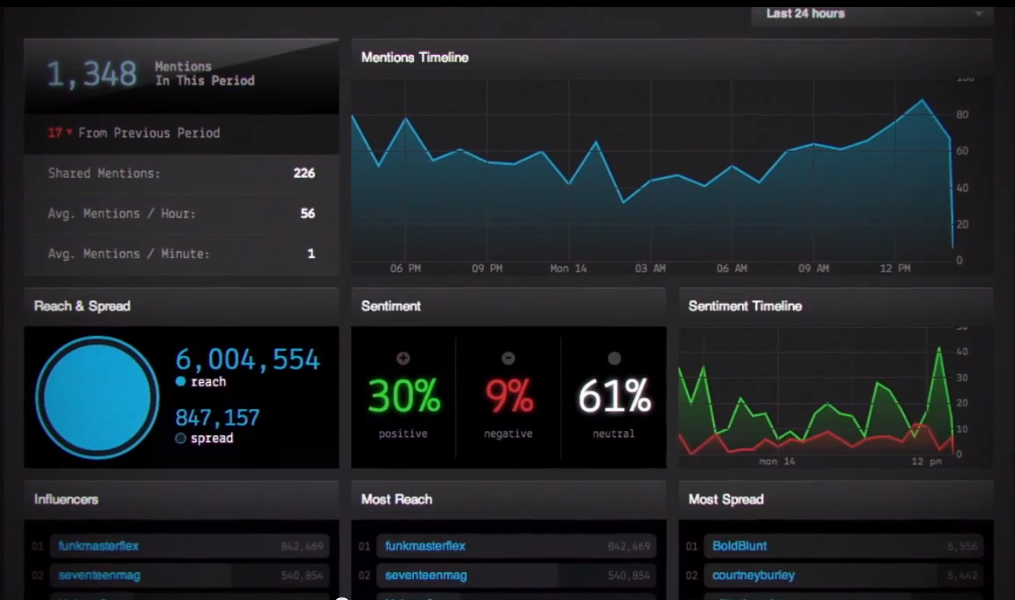
The main dashboard for Nuvi has real-time line charts that offer insight into sentiment and mentions from the networks on which users are talking about you. We enjoyed the black background and color scheme.
In fact, all of the Nuvi charts included some good examples of user experience in chart design, including zooming, tooltips, markers, and real-time data.
At ZingChart, we love taking on fun little challenges, so you can look forward to a future post where we replicate the Nuvi dashboard using ZingChart.
We were lucky to receive a demo of this tool, and found the data visualization features very inspiring. We were also impressed by the visual design of the charts and dashboard.
This is something we pay a lot of attention to at ZingChart, with all of our design customization options. Are you feeling inspired too? Download ZingChart to try your hand at designing your own awesome charts and dashboards.