Positioning was the weakest part of my CSS game...until Flexbox gained wider browser support. Life after Flexbox has been more intuitive for me.
I've recently been doing some personal testing of Flexbox, which has prompted two questions. How heavily can I rely on Flexbox for modern layouts? How can Flexbox simplify my stylesheets?
While building out my latest demo for this tutorial, I've come to the conclusion that both full layouts & simple style sheets are very possible with Flexbox.
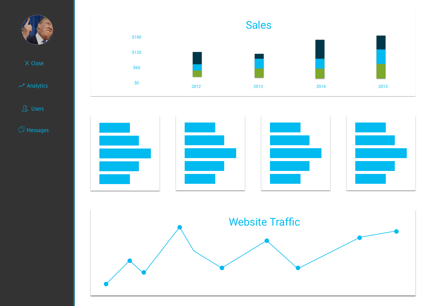
Before we get too deep into this discussion, here is the Sketch Mockup of what we are going to build:
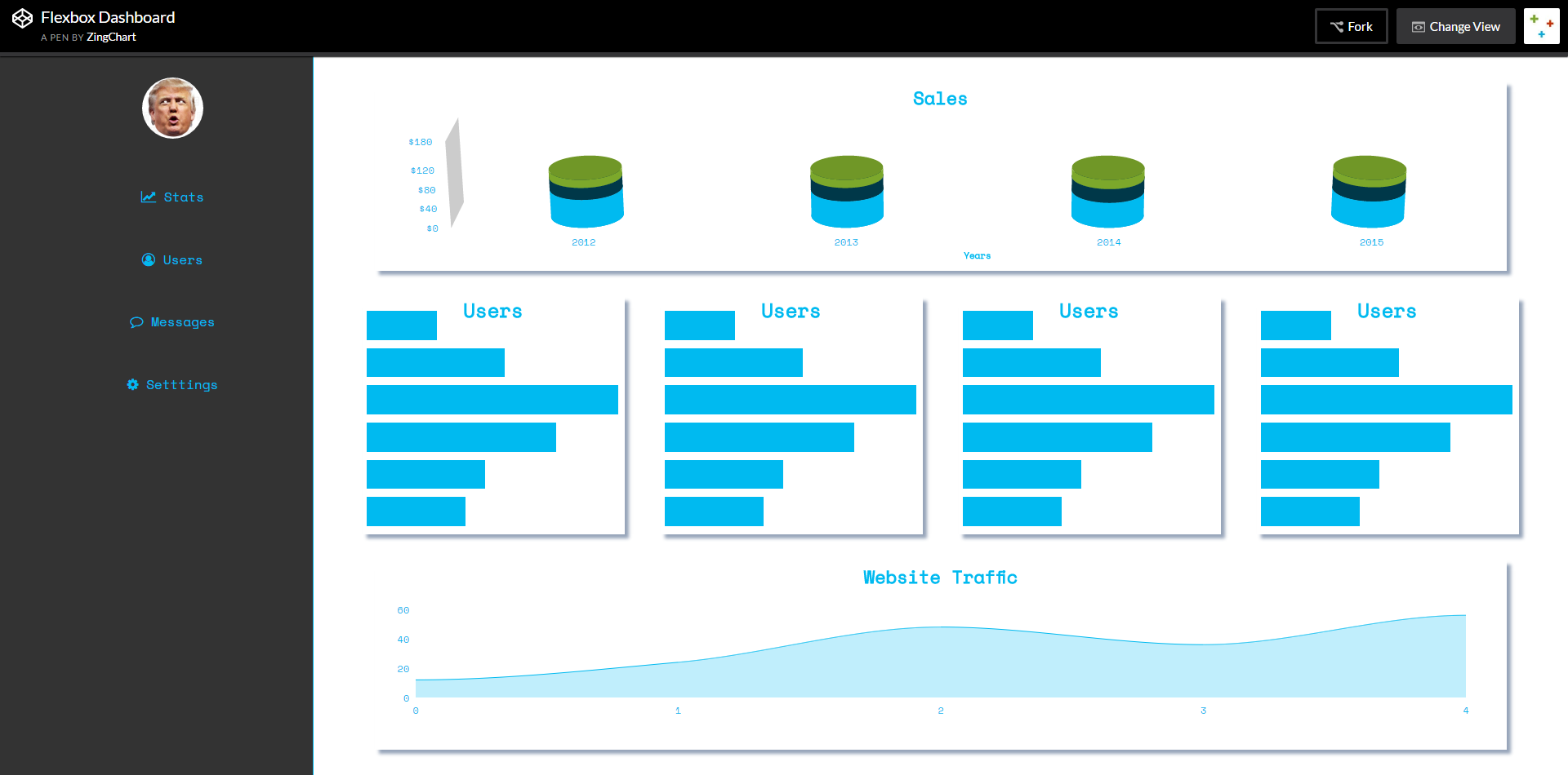
And here is the final coded result using ZingChart:
Let me know which you think is better in the comments :)
Our dashboard tutorial can be broken into three parts: HTML layout, CSS styling, & media rules (which are just an extension of CSS styling). They all build on one another.
I wanted to keep this project clean & simple. I tried to avoid margins, padding, & non-Flexbox positioning in the entire project to see just how far Flexbox could go.
HTML
I designed this dashboard in Sketch. This made it really easy to visually see what kind of HTML tags I wanted to use before any coding was done. There were three clear tags I saw in the mockup.
1. <nav>
The dashboard has a big navigation on the left side of the page. Naturally, <nav> is the appropriate tag.
2. <main>
<main> was used for the main content of a page. I also used this in place of a container div for this page. I'm not sure if this is correct, but I find this is pretty efficient & intuitive.
3. <section>
I asked myself which tag I should use to each chart section...but it seems I answered my own question. The <section> tag is used to house our charts.
Using semantic tags & naming conventions allow code to be easily deciphered. I created this project with semantic function in mind. It should be easy for you to understand & interpret.
CSS & Flexbox
Flexbox allowed for the simplicity of this design. Flexbox was applied to this dashboard exactly four times. Three of these sections had the same exact values applied.
I will walk you through every instance. I will also walk you through the main Flexbox attributes & values we use below:
-
display: Giving an object a display of flex allows you to use Flexbox attributes on its direct children.
-
flex-direction: This defines the layout of the aforementioned flex children. If specified as row, the layout will move across the x-axis (horizontal). If specified as column, the layout will move along the y-axis (stacked). *Note: flex-direction defaults to row if not specified.
-
justify-content: This flex property is used to align items. justify-content will align items across the main axis specified in flex-direction.
-
align-items: Also used to align items. It will align items across the secondary axis specified by the flex-direction.
justify-content can take the following values: center, flex-end, flex-start, space-around, space-evenly, & space-between.
align-items can take the following values: stretch, baseline, center, flex-end, flex-start.
*Note: I excluded colors & other items that weren't really necessary in the code examples below. Reference the demo at the bottom of the page. The full code will be exhibited there.
1. <body>
body {
  /*FLEX STUFF*/
  display: flex;
}
The skeleton of this page is comprised of two main parts. The left side <nav> & the right <main> content. To achieve this layout, the <body> needs to be given a display of flex.
This automatically applies a flex-direction of row to the two direct children of my body tag, which are conveniently the <nav> & <main> tags.
2. <ul>
nav ul {
  /*FLEX STUFF*/
  display: flex;
  flex-direction: column;
  justify-content: space-around;
  align-items: center;
}
Our navigation <ul> is given a display value of flex. <li> tags are direct children of the <ul> tag, which means they can be aligned with Flexbox. I wanted the list items stacked on top of each other so I used "column" as the flex-direction value.
justify-content is commonly used to center single items. However, if there are a few items to align, space-around can be used. This distributes items equally across the height (if flex-direction is column) or width (if flex-direction is row) of its parent.
3. <main>
main {
  /*FLEX STUFF*/
  display: flex;
  flex-direction: column;
  justify-content: space-around;
  align-items: center;
}
The children of the <main> content are all of the <section> items in our HTML. These will hold all of the charts in our dashboard. We will be giving a flex-direction of column to stack our <section> items on top of each other. Our main axis will be the y-axis, as given by the column flex-direction.
4. <section>
main {
  height: 100vh;
  width: 80%;
  /*FLEX STUFF*/
  display: flex;
  flex-direction: column;
  justify-content: space-around;
  align-items: center;
}

section {
  height: 33%;
  width: 95%;
}
We used a combination of height, width, and the justify-content attribute of space-around to achieve a margin & card effect around every <section>. Quick, easy, & we don't have to perform calculations.
Just A Few Media Rules
Media rules are necessary in order to ensure our dashboard is responsive on smaller devices. I provided just one media rule break-point at 800 pixels to keep things simple. Each section below outlines our media rules changes.
1. <nav>
@media screen and (max-width: 800px) {
nav {
    display: none;
  }
}
At 800 pixels, our navigation style changes to free up space on smaller devices. Our original <nav> will be hidden in favor of a mobile style hamburger nav.
2. <div class="hamburger-nav">
@media screen and (max-width: 800px) {
.hamburger-nav {
    display: flex;
    align-self: flex-end;
    height: 50px;
    width: 50px;
    background: url(https://s3-us-west-2.amazonaws.com/s.cdpn.io/t-        503/Hamburger%204.png);
  }
}
Our .hamburger-nav was initially given a display of none in order to hide it from the page. However, we want this to show up on smaller screens. To achieve this we give our .hamburger-nav a display of flex in our media rules. The nav will now appear on screens smaller than 800px, as declared by our breakpoint.
Next, we declared a background, which is a png of a hamburger nav I created in Sketch.
Finally, we aligned our nav to the right side of our page using align-self: flex-end.
In this case, our hamburger nav does not have a declared flex-direction, thus defaulting to row (as we have previously discussed).
Align-self aligns items against the main axis. Since our flex-direction is row, flex-end aligns to the right side of our page (the end of our container).
3. <main>
@media screen and (max-width: 800px) {
 main {
    height: 2000px;
    width: 100%;
  }
}
Our original <main> content had a height of 100vh (viewport height). However, once we reach mobile, this layout is very hard to see.
A little adjustment of heights and widths achieves a more appropriate mobile layout. I chose 2000 pixels to ensure all of our content would be sized large enough to scroll through.
4. <section> Tags
@media screen and (max-width: 800px) {
section:first-of-type {
    height: 20%;
  }

  section:nth-of-type(2) {
    height: 50%;
    /*FLEX STUFF*/
    display: flex;
    flex-direction: column;
    justify-content: space-around;
    align-items: center;
  }

  .bar-chart-section div {
    height: 20%;
    width: 90%;
  }

  section:nth-of-type(3) {
    height: 20%;
  }
}
The height of the <main> changed to accommodate a phone screen. That means we need to amend each <section> to match.
We will be declaring flex-direction of the second <section> as column. Now these charts will be cascading in a column to match the layouts of the other <section> items.
We are also changing the second <section> to take up 50% of the <main> content because our series of four charts are now stacked via the new column flex-direction. Space-around just gives us some spacing between charts.
The other two <section> tags will be reduced in height because the middle <section> increased in height to stack the four bar charts.
Conclusion
Follow these steps and you should be good to go. Reference the example on CodePen to see the whole demo. Fork, edit, & share if you please.
Click here to see the full demo.
*Because of the page width constraints on this blog, I provided a link to the full CodePen demo.