
In the past decade, healthcare has been transformed considerably by scientific, technological, and legislative advances. These advances have increased the necessity to find better ways to organize, visualize, and present medical, health-related, and scientific data in a variety of contexts. Few teams know this better than the development teams responsible for building the systems and products that serve as the interfaces between entities at all levels of modern healthcare interactions.
As the healthcare industry becomes increasingly digitized and personalized, the type and quantity of data that needs to be organized and visualized has grown as well. Data visualizations like dashboards, reports, infographics, charts and diagrams have become vital for helping patients, health care providers, and intermediaries access and interpret data accurately and innovatively. This is where charting products like ZingChart can provide value to development teams facing data visualization challenges of any size.
ZingChart is a robust JavaScript data visualization library that makes it easy for developers to quickly create many different types of mobile-friendly, interactive charts and diagrams for their websites and applications. It’s suited for data sets of all sizes, including those with millions of data points or multiple scales or axes.
Beyond its scalability, ZingChart also comes with many interactive features that take only a few lines of code to activate. From real-time data, to animation, to zooming, to drill-down, and data export — ZingChart’s flexibility and versatility make it well-suited to meet the demands of a diverse set of web development projects within the healthcare space.
If you’d like to see a live example of a basic healthcare chart built using ZingChart, check out this list of ZingChart demos:
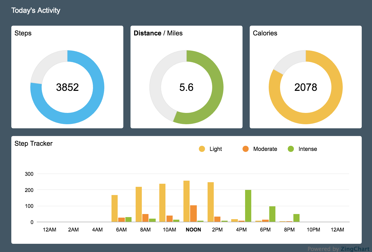
- Fitness Dashboard
- Dynamic Scatter Chart
- Bullet Chart with Draggable Nodes
- Dashboard with Null Graph Values
- Linked Stacked Bar Chart
- Dashboard with Grid & Shapes
- Scatter Plot Chart with Rules and Area Markers
- Radar Chart with Tokens & Tooltips
All live demos also include the code and data that was required to build them, so you can explore the exact syntax that was used to create each chart. I encourage you to play with these demos and make them your own by signing up for the ZingSoft Studio!
If you’d like to learn more about how ZingChart can help your development team’s data visualization workflow, check out our website, or contact us. We’re well-prepared to help you figure out custom solutions for your team’s healthcare use cases.
Lastly, I encourage you to check out the blog post I wrote about how our sister product, ZingGrid, can also help streamline your development team’s data visualization workflow for healthcare data. ZingGrid is a mobile-friendly, CRUD-ready JavaScript library for creating interactive data grids and data tables. Together, ZingGrid and ZingChart form a powerful suite of data visualization products that are sure to help take the headache out of visualizing healthcare data for your development team.
A pioneer in the world of data visualization, ZingChart is a powerful JavaScript library built with big data in mind. With over 35 chart types and easy integration with your development stack, ZingChart allows you to create interactive and responsive charts with ease.