Hey, what's up? This is part 3 of our charts in five minutes series. Let's make a line chart.
Line Chart Breakdown
We have a basic HTML template for all chart types included in our download package here.
HTML
The easiest way to get started is by referencing our CDN link. Place this in the head of your HTML Document. Next, create a <div> to hold your chart. Give it an ID we can reference later.
<!DOCTYPE html>
<html>
  <head>
  <script src= "https://cdn.zingchart.com/zingchart.min.js"></script>
  </head>
  <body>
    <div id="chart-div"></div>
  </body>
</html>
CSS
Give your chart <div> some height & width. Your chart will not render otherwise.
#chart-div {
  height: 350px;
  width: 600px;
}
JavaScript
Declare a variable to hold your chart data. The type attribute is used to declare your chart type. In this case, we will be using 'line'.
var chartData ={
  type: 'line', //'line3d' & 'vline' (vertical line) also available
};
Place your data into the series attribute. You can hard code into an array or refer from a database.
var chartData ={
type: 'line',
series: [
{
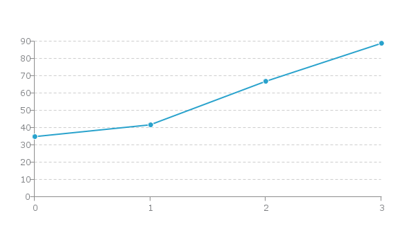
values: [35,42,67,89]
}
]
};
Finally, use the ZingChart render function to display the chart.
zingchart.render({
  id: 'chart-div',
  data: chartData
});
When you finish all of that, your document should look like this:
<!DOCTYPE html>
<html>
  <head>
    <script src= "https://cdn.zingchart.com/zingchart.min.js"></script>
    <style>
      #chart-div {
        height: 200px;
        width: 200px;
      }
    </style>
  </head>
  <body>
    <div id="chart-div"></div>
    <script>
      var chartData ={
        type: 'line',
        series: [
        {
          values: [35,42,67,89]
        }
        ]
        };
      zingchart.render({
        id: 'chart-div',
        data: chartData
      });
    </script>
  </body>
</html>
Line Chart Overview
-
Line charts show how quantitative values change over time
-
Y-axis will be your 'quantities' values
-
X-axis will be your 'time' values
Which Data Is Best Suited For line Charts
Single Series: A single array of consecutive numbers. This is the easiest way to use our line charts & it will output one line chart.
Multiple Series: You can have multiple arrays along with multiple values attributes in the series attribute. Each values attribute represents a new line.
Common Ways To Input Data Into Line Charts
Variables & Arrays
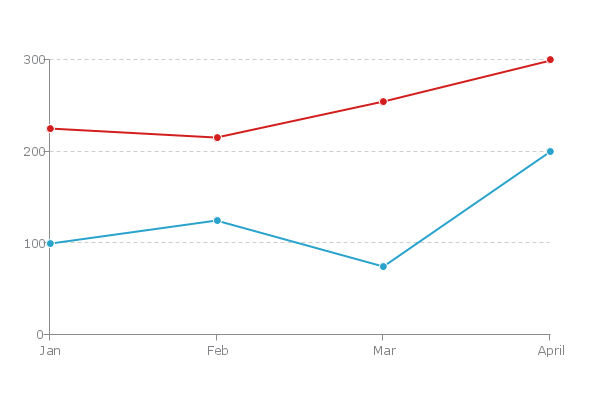
var adRevenue = [100, 125, 75, 200];
var organicRevenue = [225, 215, 255, 300];

var myConfig = {
  type: 'line',
  series: [
  {
    values: adRevenue
  },
  {
    values: organicRevenue
  }
  ]
};
This will be the output.

Variables & Array Of Arrays
var adRevenue = [['Jan', 100], ['Feb', 125], ['Mar', 75], ['Apr', 200]];
var organicRevenue = [['Jan', 225], ['Feb', 215], ['Mar', 255], ['Apr', 300]];

var myConfig = {
  type: 'line',
  series: [
  {
    values: adRevenue
  },
  {
    values: organicRevenue
  }
  ]
};
This will be your output:
How To Use Line Charts
- Comparing how quantitative values for different categories have changed over time.
- Start at a 0 baseline.
- Make sure your scales are correct (to scale haha).
- Use an interactive legend for multiple series. This way you can isolate certain pieces of data.
Most Relevant Interactive Features
-
Legend: Allows you to toggle through data. Very useful for comparisons.
-
Markers: Allows you highlight significant thresholds in data like sales goals.
-
Labels: Allows you to highlight significant points across data sets.