Hey, what's up? This is part 4 of our charts in five minutes series. Let's make a bubble chart.
Bubble Chart Breakdown
We have a basic HTML template for all of our charts included in our download package here.
HTML
The easiest way to get started is by referencing our CDN link. Place this in the head of your HTML Document. Next, create a <div> to hold your chart. Give it an ID we can reference later.
<!DOCTYPE html>
<html>
  <head>
  <script src= "https://cdn.zingchart.com/zingchart.min.js"></script>
  </head>
  <body>
    <div id="chart-div"></div>
  </body>
</html>
CSS
Give your chart <div> some height & width. Your chart will not render otherwise.
#chart-div {
  height: 300px;
  width: 600px;
}
JavaScript
Declare a variable to hold your chart data. The type attribute is used to declare your chart type. In this case, we will be using 'bubble'.
var chartData ={
  type: 'bubble', //or 'hbubble' for horizontal bubble
};
Place your data into the series attribute. You can hard code into an array or refer from a database.
var chartData ={
  type: 'bubble',
  series: [
  {
    values: [35, 42, 100] //[X-Axis, Y-Axis, Node-Size-Value]
  }
  ]
};
Finally, use the ZingChart render function to display the chart.
zingchart.render({
  id: 'chart-div',
  data: chartData
});
When you finish all of that, your document should look like this:
<!DOCTYPE html>
<html>
  <head>
    <script src= "https://cdn.zingchart.com/zingchart.min.js"></script>
    <style>
      #chart-div {
        height: 350px;
        width: 600px;
      }
    </style>
  </head>
  <body>
    <div id="chart-div"></div>
    <script>
      var chartData ={
        type: 'bubble',
        series: [
        {
          values: [35, 42, 100]
        }
        ]
        };
      zingchart.render({
        id: 'chart-div',
        data: chartData
      });
    </script>
  </body>
</html>
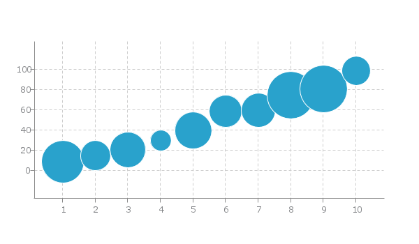
Bubble Chart Overview
-
Bubble charts are used to display the relationship between three quantities.
-
These three quantities are then measured to reference the relationship between them.
-
The size of bubbles is represented by the third quantitative value.
Which Data Is Best Suited For Bubble Charts
Single Series: Bubble charts are meant to compare three different dimensions to find correlations or relationships. Each piece of data should correspond to the appropriate data value (ScaleX, ScaleY, or Series Values).
Common Ways To Input Data Into Bubble Charts
Variables & Arrays Of Arrays
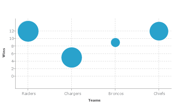
var nflTeams = [['Raiders', 12, 416], ['Chargers', 5, 410], ['Broncos', 9, 333], ['Chiefs', 12, 389]];


var my config = {
  type: 'bubble',
 	scaleX: {
 	  label: {
 	    text: 'Teams'
 	  }
 	},
 	scaleY: {
 	  label: {
 	    text: 'Wins'
 	  }
 	},
	series: [
		{
		  values: football
		}
	]
};
How To Use Bubble Charts
-
Use one color
-
Compare 3 values
-
Use gridlines
-
Make sure bubble sizes are being used to distinguish different quantities.
How Not To Use Bubble Charts
There are popular data visualization principles we can use to ensure you are using bar charts correctly. Here are a few:
-
Don't use irregular shapes or images for your bubbles. It will distort users comprehension of the data.
-
Make sure that all of your bubbles are visible by using opacity.
-
Make sure bubbles are scaled appropriately to exhibit differences in data.
-
Label axes & use tooltips.
Most Relevant Interactive Features
-
Tooltips: Tooltips are labels that appear when you hover over data points on your chart. These are best used on bubble chart to exhibit your third data parameter, as it is not represented by either axis.
-
Tokens: Tokens give you a way to exhibit important data from charts in tooltips and other text areas.
-
Legend: Used to toggle through data sets. Very useful for comparing data.