Hey, what's up? This is the first post in series of quick & easy charting tutorials with ZingChart. JavaScript charting libraries should provide speed & interactivity. I will be showing you how to achieve both in five minutes. Let's start by building a basic bar chart like the example below.
Bar Chart Breakdown
We have a basic HTML template for all of our charts included in our download package here.
HTML
The easiest way to get started is loading ZingChart from our CDN link. Place this in the head of your HTML Document.
Next, create a <div> to hold your chart. Give it an ID we can reference later.
<!DOCTYPE html>
<html>
  <head>
  <script src= "https://cdn.zingchart.com/zingchart.min.js"></script>
  </head>
  <body>
    <div id="chart-div"></div>
  </body>
</html>
CSS
Your chart <div> will need some height & width. Otherwise, it will not render.
#chart-div {
  height: 350px;
  width: 600px;
}
JavaScript
Declare a variable to hold your chart data. The type attribute is used to declare your chart type. In this case, we will be using 'bar'.
var chartData ={
  type: 'bar', //or 'hbar' for horizontal bar
};
Place your data into the series attribute. You can hard code data into an array or refer from a database.
var chartData ={
  type: 'bar',
  series: [
  {
    values: [35, 42, 67, 89]
  }
  ]
};
Finally, use the ZingChart render function to display the chart.
zingchart.render({
  id: 'chart-div',
  data: chartData
});
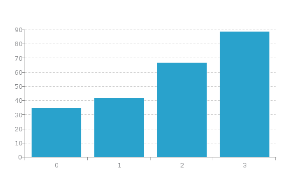
Your completed code should now look like this:
<!DOCTYPE html>
<html>
  <head>
    <script src= "https://cdn.zingchart.com/zingchart.min.js"></script>
    <style>
      #chart-div {
        height: 350px;
        width: 600px;
      }
    </style>
  </head>
  <body>
    <div id="chart-div"></div>
    <script>
      var chartData = {
        type: 'bar',
        series: [
        {
          values: [35, 42, 67, 89]
        }
        ]
        };
      zingchart.render({
        id: 'chart-div',
        data: chartData
      });
    </script>
  </body>
</html>
Bar Chart Overview
Cool, our bar chart is done. Let's move onto some very important chart information.
-
Bar charts are used to compare data. Think 'quantities' vs. 'references'.
-
The x-axis should be your 'references'
-
The y-axis should be your 'quantities'
Which Data Is Best Suited For Bar Charts
Single Series: A single array of consecutive numbers. This is the easiest way to use our bar charts & it will output bar charts of the same color.
Multiple Series: You can have multiple arrays along with multiple values attributes in the series attribute. Each values attribute represents a new bar.
Common Ways To Input Data Into Bar Charts
Variables & Arrays
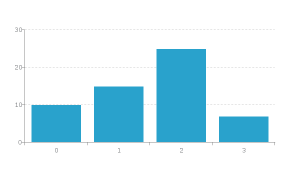
You can choose to store your data in a variable or place directly into your values attribute. I prefer a variable because it just keeps everything neat.
var data = [10, 15, 25, 7];

var my config = {
  type: 'bar',
  series: [
  {
    values: data
  }
  ]
};
Your result will look like this:
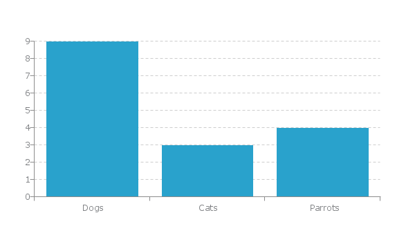
Variables & Arrays Of Arrays
The best option when working with a bar chart
var animals = [['Dogs', 9], ['Cats', 3], ['Parrots', 4]];

var my config = {
  type: 'bar',
  series: [
    {
      values: animals
    }
  ]
};
Your ouput should look like this:
Most Relevant Interactive Features
-
Legend: An easy way to toggle through data. Useful for isolating data sets.
-
Tooltips: Used to exhibit data upon hovering nodes.
-
Markers: Used to exhibit important data thresholds.
-
Labels: Used to exhibit important data points.
How To Use Bar Charts
- Comparing quantitative values of different categories.
- Properly label your axes. This makes it extremely easy to comprehend data.
- Always start your axes at zero.
How Not To Use Bar Charts
- Don't use 3D. It often times distorts bar sizes & the user's comprehension of data.