Hey, what's up? Let's talk design today. Specifically, Google's material design.
Material design has played an interesting role in the way the team here at ZingChart has been styling our gallery page charts (it's a work in progress).
Through trial and error, we have become very well versed about the style. So, today I am going to teach you the basics of this design style (with visual examples) and how to use it in your projects.
Material Design Basics
Material Design 101
Material Design relies on 3 basic principles (at least to my understanding). These are:
-
Objects: One object plays a central focus in material design followed by an accentuation of other objects. Separation of objects is important. Objects higher in the hierarchy will be given a box shadow effect to raise them from other objects both literally and metaphorically.
-
Color: Google's Color palette is used to signify importance and calls to action. Color makes a clear importance distinction between marquee elements and supplementary elements.
-
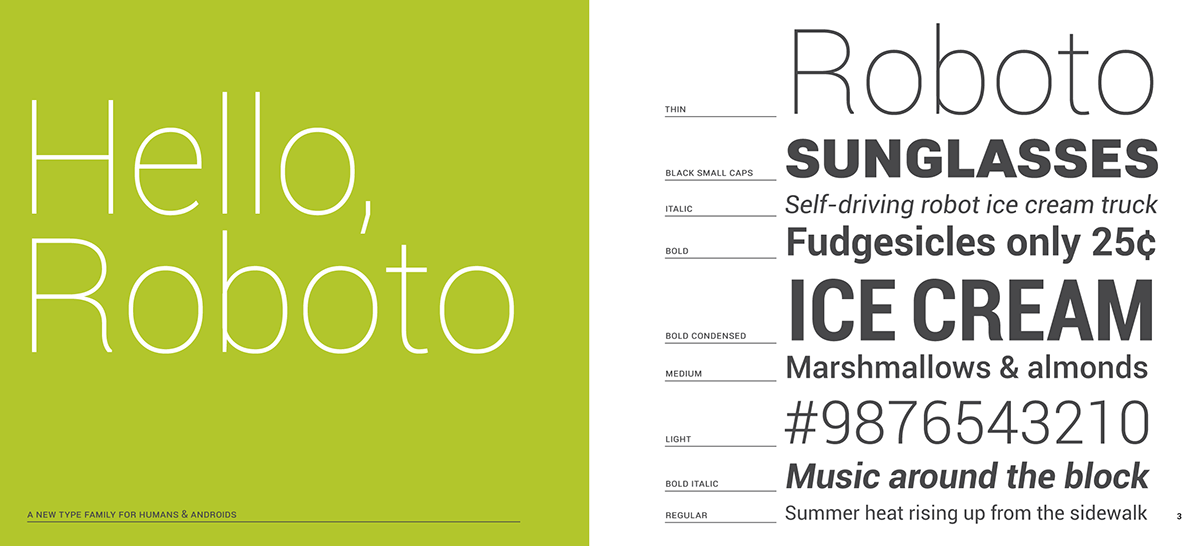
Language: The use of clear and concise language guides the user to make actions. Font choice (Roboto) accentuates the clear and concise aesthetic.
Material Design Do's & Don'ts
Do:
-
Keep it simple
-
Use white space
-
Be concise
Don't:
-
Use material design elements without knowing their purpose
-
Over-design
-
Forget about voice and language
Material Design Elements
Material
What
"Material" is the use of objects, hierarchy, and spacing just as you would see in the real world.
Why
Material design uses a real world type of spacing. Objects can't pass through each other and hold their own space in the design. This is done with spacing and shadows.
How
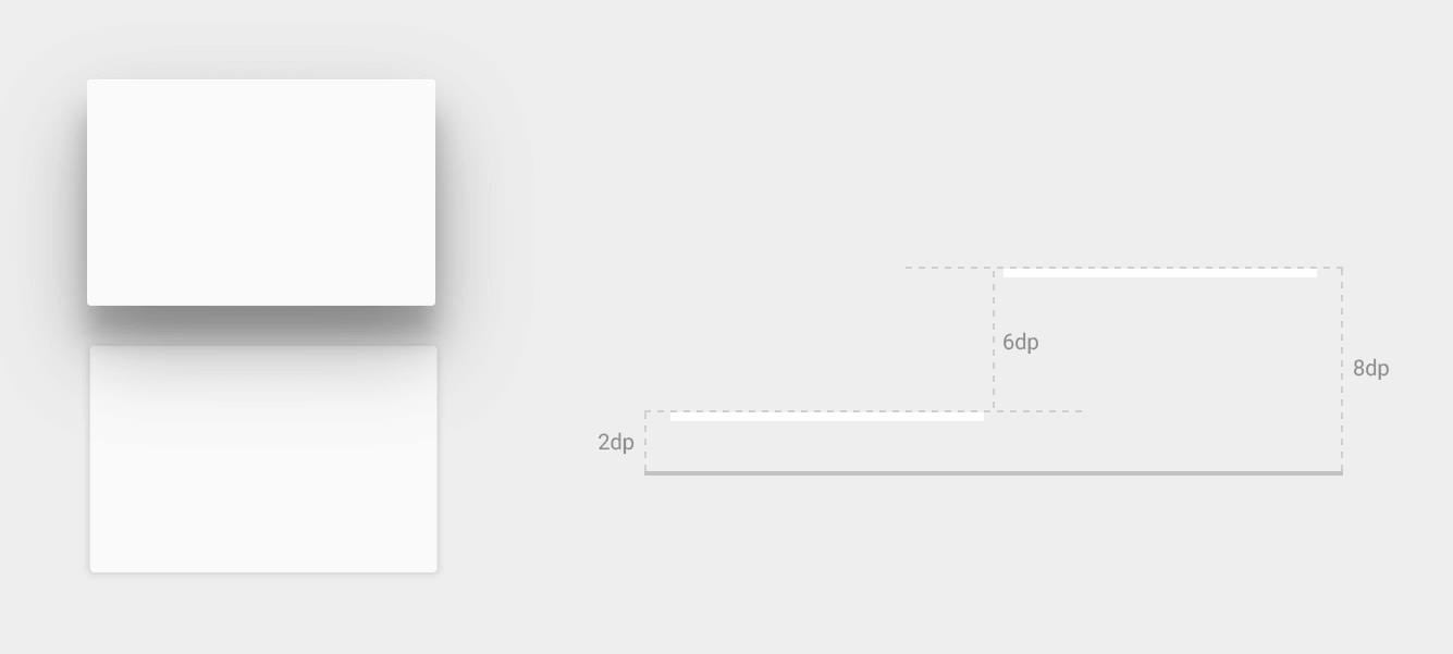
Box-Shadow. Important to note that this isn't just to style, box shadow is used to simulate the separation of elevations in objects. Objects cannot pass through each other.
This is a common mistake I used to make while using box-shadow, I would just use it on objects without considering the distance or space between objects.
Example
zKLxNE
(null)
Color
What
Color palette and scheme to highlight and accentuate.
Why
Color in material design is used to signify the importance order of elements, highlighting elements, and highlighting clear calls to action.
How
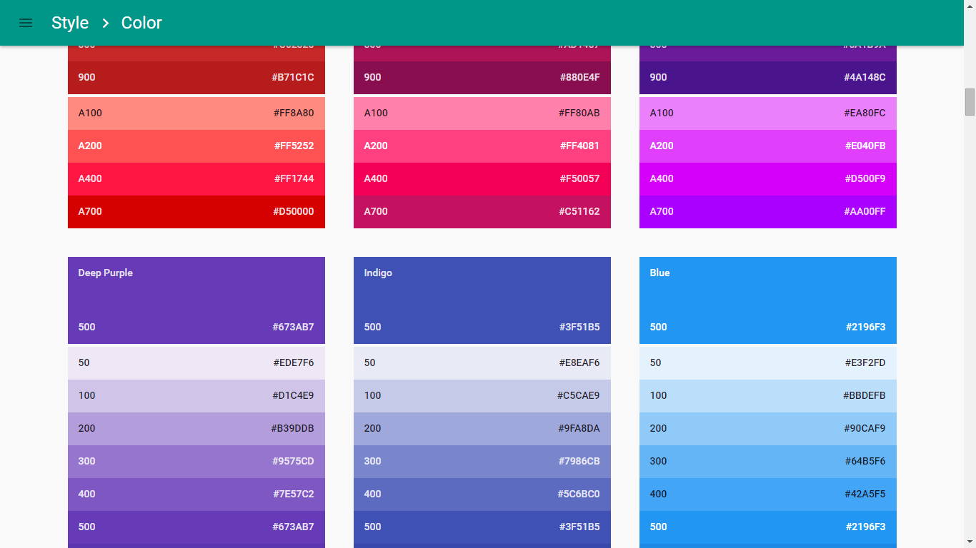
Google has a color palette scheme that highlights the style. Color contrasts are generally what is being done. A bold color is usually used to highlight an element.
Lighter and darker shades of the bold color are used as accents to frame the main content. Accents of a contrasting color are used to signify a call to action.
One of our software engineers made a really useful open source material design color picker called Materialette. It makes choosing material color schemes so much easier. Feel free to use that as a guide!
Example
Customer Survey Response Chart
(null)
Language
What
Material design uses language style and font to signify clear and concise messages.
Why
Language plays a role to guide the user into making decisions as guided by the designer. Material design seeks to make it almost second nature for a user to understand and follow directions. If used in cohesion with the other two elements, the user will easily navigate through your content.
How
Language caveats are the central focus. Keep directions clear and brief.
Example
Language
(null)
Both directions convey the same message. However, the left button would be preferred because it is much more efficient at conveying that message.
Final Product
I made a quick chart design putting these aspects together. Here is the result.
Real-Time Feed Material Design
(null)
Conclusion
Material design can be a very important tool in the way you guide users towards a purpose. These tips are just the beginning of what Google has outlined in terms of design. The main points I was trying to articulate in this article were:
-
Spacing: Use only the necessary elements, space to signify importance, and use real concepts of space.
-
Brevity: Keep your designs to the essentials, use clear and concise language, and use simple color patterns.
-
Cohesion: All of these features together make-up material design. Use each of these concepts to create a complete design idea.