Color in charts: used effectively, color can bring a chart to life. But without planning, color can create confusion within a data visualization. In your dataviz projects, you might be limited to a certain color palette due to branding guidelines.
However, dataviz experts have some recommendations on how to use color to ensure the usability of your charts and graphs.
Do color guidelines change when the chart becomes interactive? ZingChart has some tips for “palette-able interactions,” as well.
Data-Driven Color in Charts
There are three main ways to use color in charts:
-
Categorical or Qualitative
-
Sequential
-
Diverging
Qualitative Color Palettes
In a qualitative color palette, each color is used to identify a specific type of data. In these instances, you can use very different hues to distinguish between data types.


Here is a very simple illustration of qualitative or categorical color usage comparing revenue of lamp sales. Dribbble user Radium uses two colors to distinguish between lamp types and nowhere else. Floor lamps are blue. Desk lamps are purple. While Radium uses the two colors artistically, they understand the categorical application.
This is important to note, as dataviz expert Stephen Few points out. His stance is: when used properly, color should distinguish data more than it decorates the graph.
Sequential Color Palettes
In sequential color palettes, a single hue intensifies to represent fixed incremental changes.

Dona M. Wong describes saturation as “The intensity of a color. A color with higher saturation is more intense in the same hue.” And Stephen Few explains that each step in the sequence should have the same interval. (Read: No big jumps in saturation.)
In this example, Dribbble user Vladesign employs color scale graduation using soft, natural colors to display most information and bright and/or dark colors to highlight major improvements and milestones.
Vladesign also employs decreasing saturation. Immediately, the viewer perceives a difference between the saturated bars and has a baseline in the line chart when comparing yellow and red.
Diverging Color Palettes
Diverging color palettes feature two colors that grow in intensity, away from each other.

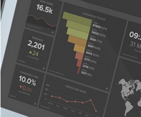
This graph only uses color when needed to communicate. Data objects should dominate our attention and not clutter the scene by whimsically accentuating numbers. Excessive UI elements can distract the user’s attention from the data.
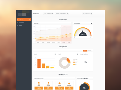
In this dashboard comp, Dribbble user Ben Garratt creates a good example of a diverging palette. The palette is muted so that it doesn’t overtake your attention from other important aspects of the dashboard.
The green bar puts an emphasis on what constitutes a successful benchmark, rather than just report measurements.
Diverging palettes are compelling not just because they are artistic. They also engage users because of the mathematics of perceptual uniformity. Want proof?
Kenneth Moreland takes us step by step from the following expression to explain the process of viewing scalar fields by coloring surfaces and volumes:
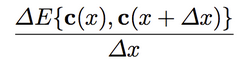
Delta E is the approximate perceived difference between two colors where ‘c’ is a color. Understanding color theory from a quantitative perspective will not only provide a robust intuition when selecting colors, it will also enable you to explain your UI aesthetics to your company’s engineers by giving them a deeper appreciation for the science behind your decision.
Color Palette tools for making charts
If you’re looking for a way to generate palettes within these categories, then here are some use cases:
-
Color Brewer - Generate and evaluate palette effectiveness
-
Color Gradient - Perfect for finding and estimating which saturation level to use
-
Adobe Kuler - Try out, create, and save various color schemes
Color for Interactive Charts
Interactive charts can pose some additional challenges when it comes to using color. Two of the most commonly used interactive features are hover effects and tooltips. And though there are many attributes you can apply to the tooltip object. Color is one of the subtlest yet effective ways to ensure usability.
Tooltips
The tooltip is a great way for users to interact with your chart and obtain more detailed information in an intuitive way. And being constrained by your company’s branding color palette doesn’t hold you back from standing out.
This is demonstrated under the Net Profit to Month portion of our chart. Here, a line is charted on top of vertical bars. There are only a few colors used:
-
Line: #96FEEF, moderate cyan
-
Node: #A5B6B1, greyish cyan
-
Bars: #6597A2, dark cyan
-
Tooltip: #54ced4, moderate cyan
Compact Tooltips
See how the tooltip is a more saturated cyan than the line ? This is is one small step you can take with any color to bring attention to the data without disrupting concentration on the task at hand.
It works especially well here because the tooltip was designed to be compact.
If you are building a ZingChart within a corporate setting, varying color saturation in such a small amount of screen real estate will highlight key points within your data.
"tooltip":{
	"background-color":"#54ced4",
	"font-color":"#454754",
	"border-radius":"6px",
	"shadow":false,
	"padding":"5px 10px"
},
Larger Tooltips
A stylistic choice you can make with tooltips that cover up the chart area is to make them appear semi-transparent. This is accomplished in ZingChart by adding the alpha attribute to the tooltip object.
"tooltip":{
	"alpha":0.75,
},
To see it in action, let’s try it out on the Sales by Employee graph.
A compact tooltip would be preferable for usability reasons, but when the annotation you are trying to make cannot fit into a small area, this is one way color can help enhance usability. Alpha ranges from 0 to 1. You will usually want to stay closer to 1.
Hover Effects
This is another really cool object and it looks outstanding on our chart because it zeros your attention in on a single bar to decrease all the other visual noise surrounding your signal.
What we have done here is just outlined our bar with the same color of our tool tip #2f6672. It makes interaction almost imperceptible which is what we want. Again, the data is what we are distinguishing.
"hover-state":{
	"visible":1,
	"border-width":"4px",
	"border-color":"#2f6672",
	"alpha":0.5
},
Coloring inside the lines is fun.
Selecting a palette can make or break your chart. Following a series of steps can ensure the colors in charts are contributing to overall usability, so here are some questions to ask yourself as you roll up your sleeves and get to work on a beautiful analysis:
-
Which palette type best fits your data’s dimensions?
-
Which colors will you use within the palette?
-
Can saturation be used without disrupting concentration?
-
Will alpha or transparency help show off chart elements?
The UI elements are easy to adjust with ZingChart’s CSS-like JSON styling syntax. Have you encountered any good or bad uses of color in charts online? Share your experiences with us in the comments section below.