UPDATE
Our team’s constant improvements and additions to ZingChart are great for users looking for the largest selection of features and options. But sometimes it means our “how-to” blog posts could use a little updating.
In order to make our older and highly viewed how-to posts more helpful, we are updating the Beginner’s Guide series. Updates include the most recent version of the syntax, which makes it even easier to use the cool styling capabilities of ZingChart. Follow the new tutorial series if you're interested in getting a substantial overview of using the ZingChart library.
Welcome Back ZingCharters!
At the end of our last tutorial, we briefly worked on using two colors to create gradients on the graph bars. You could certainly apply this same styling to the background of a chart, a title, a plot area, and more.
ZingChart is incredibly flexible, so you can use gradients wherever you need them. In this tutorial, we are going to work with using more than two colors. ZingChart allows you to create custom gradients, which is what we are going to do today.
Here is the chart we created after our last tutorial:
{
"type":"bar",
"background-color":"#ccc",
"title":{
    "text":"Chart Title",
    "background-color":"#555",
    "font-color":"#ccc"
},
"subtitle":{
    "text":"Our Subtitle",
    "font-color":"#000"
},
"legend":{
    "layout":"1x2",
    "x":"210px",
    "y":"365px",
    "border-width":0,
    "shadow":0,
    "alpha":0,
    "item":{
        "color":"#000"
    }
},
"scale-x":{
    "values":["Quarter 1","Quarter 2","Quarter 3","Quarter 4"],
    "line-color":"#555",
    "line-width":"4px",
    "item":{
        "color":"#000",
        "font-size":"12px"
    },
    "guide":{
        "visible":false
    },
    "tick":{
        "size":10,
        "line-width":3,
        "line-color":"#555",
        "placement":"outer"
    }
},
"scale-y":{
    "values":"0:75000000:10000000",
    "format":"$%v",
    "multiplier":true,
    "line-color":"#555",
    "line-width":"4px",
    "item":{
        "color":"#000"
    },
    "guide":{
        "line-color":"#555",
        "line-style":"dotted",
        "line-width":"2px"
    },
    "tick":{
        "size":10,
        "line-width":3,
        "line-color":"#555",
        "placement":"outer"
    },
    "item":{
        "padding":"5px",
        "color":"#000"
    }
},
"plotarea":{
    "background-color":"#fff"
},
"series":[
    {
        "values":[48000000,44000000,14000000,32000000],
        "text":"Products",
        "background-color-1":"#6135be",
        "background-color-2":"#8b73bd",
        "fill-angle":15
    },
    {
        "values":[22000000,36000000,15000000,37000000],
        "text":"Service",
        "background-color-1":"#8668e2",
        "background-color-2":"#bcafe3",
        "fill-angle":15
    }
]
}
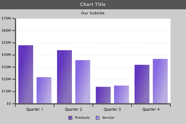
Series
Throughout this tutorial, you may notice that I've changed the data around. This is to make it easier to see the changes in color. However, I will change the data back to our original place once we are all finished.
In this first step, I am simply adding multiple colors to the background of the bars.
{
"type":"bar",
"background-color":"#ccc",
"title":{
    "text":"Chart Title",
    "background-color":"#555",
    "font-color":"#ccc"
},
"subtitle":{
    "text":"Our Subtitle",
    "font-color":"#000"
},
"legend":{
    "layout":"1x2",
    "x":"210px",
    "y":"365px",
    "border-width":0,
    "shadow":0,
    "alpha":0,
    "item":{
        "color":"#000"
    }
},
"scale-x":{
    "values":["Quarter 1","Quarter 2","Quarter 3","Quarter 4"],
    "line-color":"#555",
    "line-width":"4px",
    "item":{
        "color":"#000",
        "font-size":"12px"
    },
    "guide":{
        "visible":false
    },
    "tick":{
        "size":10,
        "line-width":3,
        "line-color":"#555",
        "placement":"outer"
    }
},
"scale-y":{
    "values":"0:75000000:10000000",
    "format":"$%v",
    "multiplier":true,
    "line-color":"#555",
    "line-width":"4px",
    "item":{
        "color":"#000"
    },
    "guide":{
        "line-color":"#555",
        "line-style":"dotted",
        "line-width":"2px"
    },
    "tick":{
        "size":10,
        "line-width":3,
        "line-color":"#555",
        "placement":"outer"
    },
    "item":{
        "padding":"5px",
        "color":"#000"
    }
},
"plotarea":{
    "background-color":"#fff"
},
"series":[
    {
        "values":[70000000,50000000,30000000,15000000],
        "text":"Products",
        "gradient-colors":"yellow orange red green blue purple",
        "gradient-stops":".1 .2 .4 .6 .7 .9"
    },
    {
        "values":[70000000,50000000,30000000,15000000],
        "text":"Service",
        "background-color-1":"#8668e2",
        "background-color-2":"#bcafe3",
        "fill-angle":15
    }
]
}

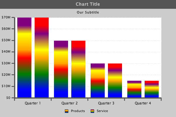
Gradient
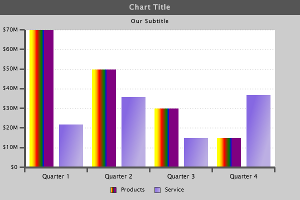
What we have done here is added the "gradient-colors":" " attribute and the "gradient-stops":" " attribute to the "series":[ ] values. The "gradient-colors":" " attribute will accept a string of colors. In this case, we simply used some primary colors in text form to make it easy to see the changes. You can use text colors, RGB, or hex codes in this string. The "gradient-stops":" " attribute is a set of steps to determine how much of any one color to use.
There are a few things to take into consideration with these attributes, which you will notice throughout this tutorial. There will be a certain amount of guess and check required to achieve a precise outcome.
{
        "values":[70000000,50000000,30000000,15000000],
        "text":"Products",
        "gradient-colors":"purple yellow orange red green blue",
        "gradient-stops":".1 .2 .4 .5 .7 .9"
    },
{
        "values":[70000000,50000000,30000000,15000000],
        "text":"Service",
        "gradient-colors":"red purple yellow orange green blue",
        "gradient-stops":".1 .2 .4 .5 .7 .9"
    }
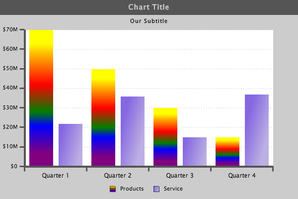
Gradient Stops
The order in which you list your colors in your string will affect the order in which the colors appear in your chart. You can see this in the example above.
However, you need to keep in mind that the "gradient-stops":" " can also have an affect on the order of your colors.
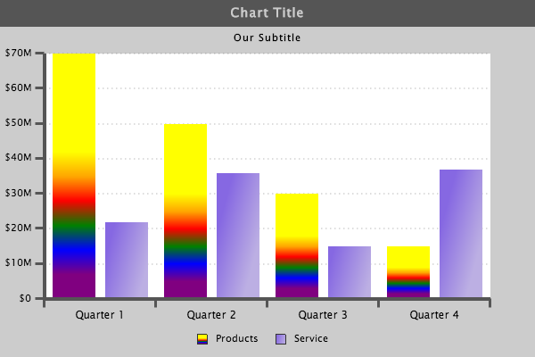
{
        "values":[70000000,50000000,30000000,15000000],
        "text":"Products",
        "gradient-colors":"yellow orange red green blue purple",
        "gradient-stops":".1 .2 .4 .6 .7 .9"
    }
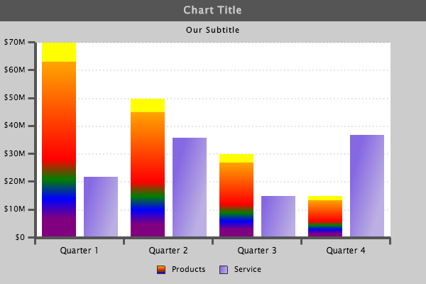
{
"values":[70000000,50000000,30000000,15000000],
"text":"Products",
"gradient-colors":"yellow orange red green blue purple",
"gradient-stops":".1 .4 .2 .6 .7 .9"
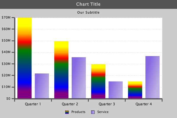
},

{
        "values":[70000000,50000000,30000000,15000000],
        "text":"Products",
        "gradient-colors":"yellow orange red green blue purple",
        "gradient-stops":".1 .2 .4 .9 .7 .6"
    },
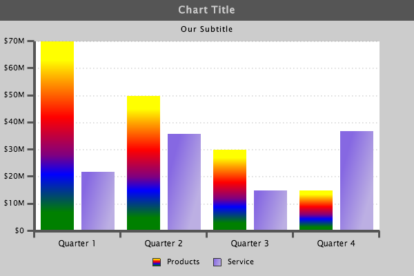
Gradient Stops
The "gradient-stops":" " will control the amount of each color, but the stops must be listed in ascending order to maintain the same color position as listed in the "gradient-colors":" " string.
As mentioned before, you can control how much of each color is used with the "gradient-stops":" "
Here is where we started:
{
        "values":[70000000,50000000,30000000,15000000],
        "text":"Products",
        "gradient-colors":"yellow orange red green blue purple",
        "gradient-stops":".1 .2 .4 .6 .7 .9"
    },

If we adjust the stops to increase the first colors-- while still keeping the colors in ascending order-- you will notice that more of the first colors are shown. Below there are a few examples of adjusting the stops.
{
        "values":[70000000,50000000,30000000,15000000],
        "text":"Products",
        "gradient-colors":"yellow orange red green blue purple",
        "gradient-stops":".4 .5 .6 .7 .8 .9"
    },
{
        "values":[70000000,50000000,30000000,15000000],
        "text":"Products",
        "gradient-colors":"yellow orange red green blue purple",
        "gradient-stops":".1 .1 .6 .7 .8 .9"
    },
{
        "values":[70000000,50000000,30000000,15000000],
        "text":"Products",
        "gradient-colors":"yellow orange red green blue purple",
        "gradient-stops":".1 .2 .3 .4 .8 .9"
    },
{
        "values":[70000000,50000000,30000000,15000000],
        "text":"Products",
        "gradient-colors":"yellow orange red green blue purple",
        "gradient-stops":".1 .2 .3 .5 .6 .6"
    },

Fill Angle
As you can see, there is a lot of possible customization with these attributes. You can also include the fill-angle as we did in our last tutorial.
{
        "values":[70000000,50000000,30000000,15000000],
        "text":"Products",
        "gradient-colors":"yellow orange red green blue purple",
        "gradient-stops":".1 .2 .3 .5 .6 .6",
        "fill-angle":15
    },

{
        "values":[70000000,50000000,30000000,15000000],
        "text":"Products",
        "gradient-colors":"yellow orange red green blue purple",
        "gradient-stops":".1 .2 .3 .5 .6 .6",
        "fill-angle":0
    },
Between adjusting the "gradient-colors":" " the "gradient-stops":" " and the "fill-angle": you have a limitless level of customization which can be achieved.
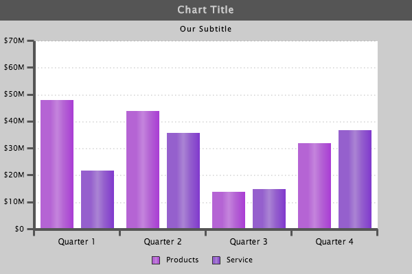
In reference to the chart we have been building, let's use some colors and stops that will match a little more closely with the look and feel of our chart.
{
"type":"bar",
"background-color":"#ccc",
"title":{
    "text":"Chart Title",
    "background-color":"#555",
    "font-color":"#ccc"
},
"subtitle":{
    "text":"Our Subtitle",
    "font-color":"#000"
},
"legend":{
    "layout":"1x2",
    "x":"210px",
    "y":"365px",
    "border-width":0,
    "shadow":0,
    "alpha":0,
    "item":{
        "color":"#000"
    }
},
"scale-x":{
    "values":["Quarter 1","Quarter 2","Quarter 3","Quarter 4"],
    "line-color":"#555",
    "line-width":"4px",
    "item":{
        "color":"#000",
        "font-size":"12px"
    },
    "guide":{
        "visible":false
    },
    "tick":{
        "size":10,
        "line-width":3,
        "line-color":"#555",
        "placement":"outer"
    }
},
"scale-y":{
    "values":"0:75000000:10000000",
    "format":"$%v",
    "multiplier":true,
    "line-color":"#555",
    "line-width":"4px",
    "item":{
        "color":"#000"
    },
    "guide":{
        "line-color":"#555",
        "line-style":"dotted",
        "line-width":"2px"
    },
    "tick":{
        "size":10,
        "line-width":3,
        "line-color":"#555",
        "placement":"outer"
    },
    "item":{
        "padding":"5px",
        "color":"#000"
    }
},
"plotarea":{
    "background-color":"#fff"
},
"series":[
    {
        "values":[48000000,44000000,14000000,32000000],
        "text":"Products",
        "gradient-colors":"#a93cd4 #b564d4 #c585dd #b564d4  #a93cd4",
        "gradient-stops":"0 .3 .5 .7 1",
        "fill-angle":0
    },
    {
        "values":[22000000,36000000,15000000,37000000],
        "text":"Service",
        "gradient-colors":"#8039cd #9560cd #ab85d4 #9560cd  #8039cd",
        "gradient-stops":"0 .3 .5 .7 1",
        "fill-angle":0
    }
]
}
3-D
As you can see, gradients provide a variety of styling options. Using multiple colors is particularly helpful when working with 3D charts.
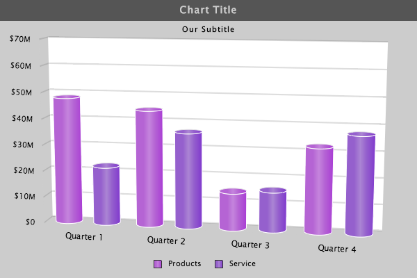
{
"type":"bar3d",
"3d-aspect":{
    "true3d":1,
    "x-angle":-10,
    "y-angle":-10,
    "depth":40
},
"background-color":"#ccc",
"title":{
    "text":"Chart Title",
    "background-color":"#555",
    "font-color":"#ccc"
},
"subtitle":{
    "text":"Our Subtitle",
    "font-color":"#000"
},
"legend":{
    "layout":"1x2",
    "x":"210px",
    "y":"365px",
    "border-width":0,
    "shadow":0,
    "alpha":0,
    "item":{
        "color":"#000"
    }
},
"scale-x":{
    "values":["Quarter 1","Quarter 2","Quarter 3","Quarter 4"],
    "line-color":"#555",
    "line-width":"4px",
    "item":{
        "color":"#000",
        "font-size":"12px"
    },
    "guide":{
        "visible":false
    },
    "tick":{
        "size":10,
        "line-width":3,
        "line-color":"#555",
        "placement":"outer"
    }
},
"scale-y":{
    "values":"0:75000000:10000000",
    "format":"$%v",
    "multiplier":true,
    "line-color":"#555",
    "line-width":"4px",
    "item":{
        "color":"#000"
    },
    "guide":{
        "line-color":"#555",
        "line-style":"dotted",
        "line-width":"2px"
    },
    "tick":{
        "size":10,
        "line-width":3,
        "line-color":"#555",
        "placement":"outer"
    },
    "item":{
        "padding":"5px",
        "color":"#000"
    }
},
"plotarea":{
    "background-color":"#fff"
},
"plot":{
    "aspect":"cylinder",

},
"series":[
    {
        "values":[48000000,44000000,14000000,32000000],
        "text":"Products",
        "gradient-colors":"#a93cd4 #b564d4 #c585dd #b564d4  #a93cd4",
        "gradient-stops":"0 .3 .5 .7 1",
        "fill-angle":0
    },
    {
        "values":[22000000,36000000,15000000,37000000],
        "text":"Service",
        "gradient-colors":"#8039cd #9560cd #ab85d4 #9560cd  #8039cd",
        "gradient-stops":"0 .3 .5 .7 1",
        "fill-angle":0
    }
]
}
Our goal for these basic styling tutorials is to show you how ZingChart allows you to customize every aspect of your charts.
Happy Charting,
ZingChart Team