UPDATE
Our team’s constant improvements and additions to ZingChart are great for users looking for the largest selection of features and options. But sometimes it means our “how-to” blog posts could use a little updating.
In order to make our older and highly viewed how-to posts more helpful, we are updating the Beginner’s Guide series. Updates include the most recent version of the syntax, which makes it even easier to use the cool styling capabilities of ZingChart.
Follow the new tutorial series if you're interested in getting a substantial overview of using the ZingChart library.
Welcome Back ZingCharters!
In this tutorial, we will work with the basics of styling fonts. We will also begin to discuss how to use layouts and positioning to move elements on the chart. Finally, we will show you how to start working with styling attributes such as gradients.
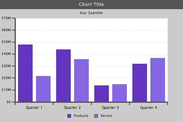
In our last tutorial, Chart Styling Basics 2, we left off with this chart:
{
"type":"bar",
"background-color":"#ccc",
"title":{
    "text":"Chart Title",
    "background-color":"#555",
    "font-color":"#ccc"
},
"subtitle":{
    "text":"Our Subtitle"
},
"legend":{
    "border-width":0,
    "shadow":0,
    "alpha":1,
    "item":{
        "color":"red"
    }
},
"scale-x":{
    "values":["Quarter 1","Quarter 2","Quarter 3","Quarter 4"],
    "line-color":"#555",
    "line-width":"4px",
    "item":{
        "color":"#fff"
    },
    "guide":{
        "visible":false
    },
    "tick":{
        "size":10,
        "line-width":3,
        "line-color":"#555",
        "placement":"outer"
    }
},
"scale-y":{
    "values":"0:75000000:10000000",
    "format":"$%v",
    "multiplier":true,
    "line-color":"#555",
    "line-width":"4px",
    "guide":{
        "line-color":"#555",
        "line-style":"dotted",
        "line-width":"2px"
    },
    "tick":{
        "size":10,
        "line-width":3,
        "line-color":"#555",
        "placement":"outer"
    },
    "item":{
        "padding":"5px"
    }
},
"plotarea":{
    "background-color":"#fff"
},
"series":[
    {
    "values":[48000000,44000000,14000000,32000000],
    "text":"Products",
    "background-color":"#6135be"
    },
    {
    "values":[22000000,36000000,15000000,37000000],
    "text":"Service",
    "background-color":"#8668e2"
    }
]
}
Font Size
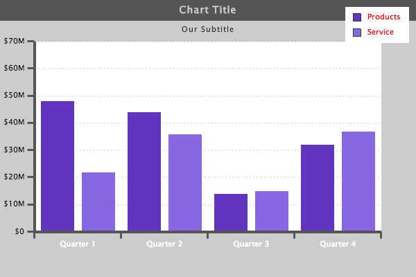
There are still a few things left to do on this chart to make it look really professional. First of all, we had changed the color of the "scale-x":{ } values in our first tutorial. But with the current look of the chart, the text would look better in a darker color. We can also make the "scale-x":{ } font larger, which will make it easier to read.
{
"type":"bar",
"background-color":"#ccc",
"title":{
    "text":"Chart Title",
    "background-color":"#555",
    "font-color":"#ccc"
},
"subtitle":{
    "text":"Our Subtitle"
},
"legend":{
    "border-width":0,
    "shadow":0,
    "alpha":1,
    "item":{
        "color":"red"
    }
},
"scale-x":{
    "values":["Quarter 1","Quarter 2","Quarter 3","Quarter 4"],
    "line-color":"#555",
    "line-width":"4px",
    "item":{
        "color":"#000",
        "font-size":"12px"
    },
    "guide":{
        "visible":false
    },
    "tick":{
        "size":10,
        "line-width":3,
        "line-color":"#555",
        "placement":"outer"
    }
},
"scale-y":{
    "values":"0:75000000:10000000",
    "format":"$%v",
    "multiplier":true,
    "line-color":"#555",
    "line-width":"4px",
    "guide":{
        "line-color":"#555",
        "line-style":"dotted",
        "line-width":"2px"
    },
    "tick":{
        "size":10,
        "line-width":3,
        "line-color":"#555",
        "placement":"outer"
    },
    "item":{
        "padding":"5px"

    }
},
"plotarea":{
    "background-color":"#fff"
},
"series":[
    {
    "values":[48000000,44000000,14000000,32000000],
    "text":"Products",
    "background-color":"#6135be"
    },
    {
    "values":[22000000,36000000,15000000,37000000],
    "text":"Service",
    "background-color":"#8668e2"
    }
]
}
Font Color
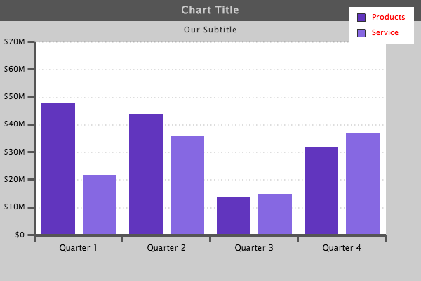
Now we can go through the chart and ensure the "font-color": matches throughout. We need to change the "legend":{ } "scale-y":{ } and "subtitle":{ }. We will leave the color of the title:{ } because of the dark background.
{
"type":"bar",
"background-color":"#ccc",
"title":{
    "text":"Chart Title",
    "background-color":"#555",
    "font-color":"#ccc"
},
"subtitle":{
    "text":"Our Subtitle",
    "color":"#000"
},
"legend":{
    "border-width":0,
    "shadow":0,
    "alpha":1,
    "item":{
        "color":"#000"
    }
},
"scale-x":{
    "values":["Quarter 1","Quarter 2","Quarter 3","Quarter 4"],
    "line-color":"#555",
    "line-width":"4px",
    "item":{
        "color":"#000",
        "font-size":"12px"
    },
    "guide":{
        "visible":false
    },
    "tick":{
        "size":10,
        "line-width":3,
        "line-color":"#555",
        "placement":"outer"
    }
},
"scale-y":{
    "values":"0:75000000:10000000",
    "format":"$%v",
    "multiplier":true,
    "line-color":"#555",
    "line-width":"4px",
    "guide":{
        "line-color":"#555",
        "line-style":"dotted",
        "line-width":"2px"
    },
    "tick":{
        "size":10,
        "line-width":3,
        "line-color":"#555",
        "placement":"outer"
    },
    "item":{
        "padding":"5px",
        "color":"#000"
    }
},
"plotarea":{
    "background-color":"#fff"
},
"series":[
    {
    "values":[48000000,44000000,14000000,32000000],
    "text":"Products",
    "background-color":"#6135be"
    },
    {
    "values":[22000000,36000000,15000000,37000000],
    "text":"Service",
    "background-color":"#8668e2"
    }
]
}
Legend
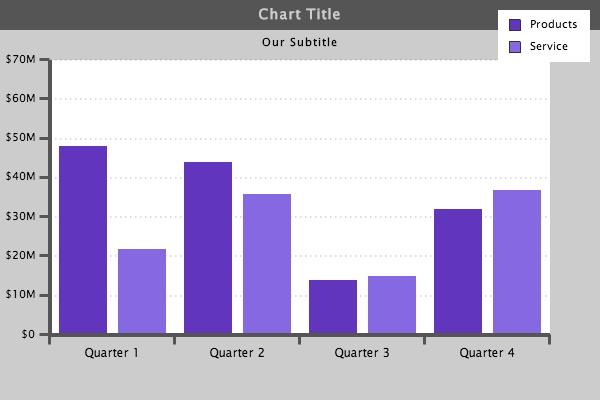
One element on the chart that still sticks out is the legend. It currently is just not in a place that fits very well. That makes this a good time to introduce you to the layout and position attributes. We will cover these attributes in more detail in upcoming tutorials.
To get started, we are going to change the layout of the legend. We add the "layout":" " attribute within the "legend":{ } object. The attribute is structured like so-- "layout":" # of rows x # of columns ".
{
"type":"bar",
"background-color":"#ccc",
"title":{
    "text":"Chart Title",
    "background-color":"#555",
    "font-color":"#ccc"
},
"subtitle":{
    "text":"Our Subtitle",
    "font-color":"#000"
},
"legend":{
    "layout":"1x2",
    "border-width":0,
    "shadow":0,
    "alpha":1,
    "item":{
        "color":"#000"
    }
},
"scale-x":{
    "values":["Quarter 1","Quarter 2","Quarter 3","Quarter 4"],
    "line-color":"#555",
    "line-width":"4px",
    "item":{
        "color":"#000",
        "font-size":"12px"
    },
    "guide":{
        "visible":false
    },
    "tick":{
        "size":10,
        "line-width":3,
        "line-color":"#555",
        "placement":"outer"
    }
},
"scale-y":{
    "values":"0:75000000:10000000",
    "format":"$%v",
    "multiplier":true,
    "line-color":"#555",
    "line-width":"4px",
    "item":{
        "color":"#000"
    },
    "guide":{
        "line-color":"#555",
        "line-style":"dotted",
        "line-width":"2px"
    },
    "tick":{
        "size":10,
        "line-width":3,
        "line-color":"#555",
        "placement":"outer"
    },
    "item":{
        "padding":"5px",
        "color":"#000"
    }
},
"plotarea":{
    "background-color":"#fff"
},
"series":[
    {
    "values":[48000000,44000000,14000000,32000000],
    "text":"Products",
    "background-color":"#6135be"
    },
    {
    "values":[22000000,36000000,15000000,37000000],
    "text":"Service",
    "background-color":"#8668e2"
    }
]
}
X and Y
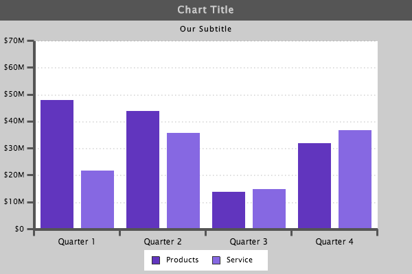
Now we can add the positioning attributes "x":" " and "y":" " to move the legend to a place on the chart where it is a better fit. There are a few different ways to do this but here is one way to start.
{
"type":"bar",
"background-color":"#ccc",
"title":{
    "text":"Chart Title",
    "background-color":"#555",
    "font-color":"#ccc"
},
"subtitle":{
    "text":"Our Subtitle",
    "font-color":"#000"
},
"legend":{
    "layout":"1x2",
    "x":"210px",
    "y":"365px",
    "border-width":0,
    "shadow":0,
    "alpha":1,
    "item":{
        "color":"#000"
    }
},
"scale-x":{
    "values":["Quarter 1","Quarter 2","Quarter 3","Quarter 4"],
    "line-color":"#555",
    "line-width":"4px",
    "item":{
        "color":"#000",
        "font-size":"12px"
    },
    "guide":{
        "visible":false
    },
    "tick":{
        "size":10,
        "line-width":3,
        "line-color":"#555",
        "placement":"outer"
    }
},
"scale-y":{
    "values":"0:75000000:10000000",
    "format":"$%v",
    "multiplier":true,
    "line-color":"#555",
    "line-width":"4px",
    "item":{
        "color":"#000"
    },
    "guide":{
        "line-color":"#555",
        "line-style":"dotted",
        "line-width":"2px"
    },
    "tick":{
        "size":10,
        "line-width":3,
        "line-color":"#555",
        "placement":"outer"
    },
    "item":{
        "padding":"5px",
        "color":"#000"
    }
},
"plotarea":{
    "background-color":"#fff"
},
"series":[
    {
    "values":[48000000,44000000,14000000,32000000],
    "text":"Products",
    "background-color":"#6135be"
    },
    {
    "values":[22000000,36000000,15000000,37000000],
    "text":"Service",
    "background-color":"#8668e2"
    }
]
}
By adding an "x":" " and "y":" " attribute, you can position an object an absolute distance from the upper left corner of the chart. The "x":" " attribute moves the object along the x-axis, and the "y":" " attribute moves the object along the y-axis. In this example we used pixels. However, you can also use percentages, as in "x":"50%".
Background Color & Alpha
Now that we have the legend in place, let's go ahead and remove the background color. We can do this by changing the "alpha":1 to "alpha":0
{
"type":"bar",
"background-color":"#ccc",
"title":{
    "text":"Chart Title",
    "background-color":"#555",
    "font-color":"#ccc"
},
"subtitle":{
    "text":"Our Subtitle",
    "font-color":"#000"
},
"legend":{
    "layout":"1x2",
    "x":"210px",
    "y":"365px",
    "border-width":0,
    "shadow":0,
    "alpha":0,
    "item":{
        "color":"#000"
    }
},
"scale-x":{
    "values":["Quarter 1","Quarter 2","Quarter 3","Quarter 4"],
    "line-color":"#555",
    "line-width":"4px",
    "item":{
        "color":"#000",
        "font-size":"12px"
    },
    "guide":{
        "visible":false
    },
    "tick":{
        "size":10,
        "line-width":3,
        "line-color":"#555",
        "placement":"outer"
    }
},
"scale-y":{
    "values":"0:75000000:10000000",
    "format":"$%v",
    "multiplier":true,
    "line-color":"#555",
    "line-width":"4px",
    "item":{
        "color":"#000"
    },
    "guide":{
        "line-color":"#555",
        "line-style":"dotted",
        "line-width":"2px"
    },
    "tick":{
        "size":10,
        "line-width":3,
        "line-color":"#555",
        "placement":"outer"
    },
    "item":{
        "padding":"5px",
        "color":"#000"
    }
},
"plotarea":{
    "background-color":"#fff"
},
"series":[
    {
    "values":[48000000,44000000,14000000,32000000],
    "text":"Products",
    "background-color":"#6135be",
    },
    {
    "values":[22000000,36000000,15000000,37000000],
    "text":"Service",
    "background-color":"#8668e2",
    }
]
}
Gradient
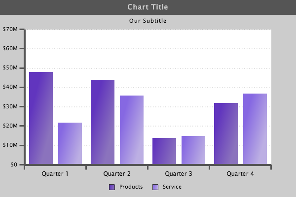
Now that all of our elements are present, our data is well represented, and our chart has great legibility, let's go ahead and make a change that will give the chart a bit more style. Much earlier, we changed the color of the bars in the chart. However, we had a basic single color for each series. Now we are going to change the bars so they each have a gradient. This is very simple to do.
{
"type":"bar",
"background-color":"#ccc",
"title":{
    "text":"Chart Title",
    "background-color":"#555",
    "font-color":"#ccc"
},
"subtitle":{
    "text":"Our Subtitle",
    "font-color":"#000"
},
"legend":{
    "layout":"1x2",
    "x":"210px",
    "y":"365px",
    "border-width":0,
    "shadow":0,
    "alpha":0,
    "item":{
        "color":"#000"
    }
},
"scale-x":{
    "values":["Quarter 1","Quarter 2","Quarter 3","Quarter 4"],
    "line-color":"#555",
    "line-width":"4px",
    "item":{
        "color":"#000",
        "font-size":"12px"
    },
    "guide":{
        "visible":false
    },
    "tick":{
        "size":10,
        "line-width":3,
        "line-color":"#555",
        "placement":"outer"
    }
},
"scale-y":{
    "values":"0:75000000:10000000",
    "format":"$%v",
    "multiplier":true,
    "line-color":"#555",
    "line-width":"4px",
    "item":{
        "color":"#000"
    },
    "guide":{
        "line-color":"#555",
        "line-style":"dotted",
        "line-width":"2px"
    },
    "tick":{
        "size":10,
        "line-width":3,
        "line-color":"#555",
        "placement":"outer"
    },
    "item":{
        "padding":"5px",
        "color":"#000"
    }
},
"plotarea":{
    "background-color":"#fff"
},
"series":[
    {
    "values":[48000000,44000000,14000000,32000000],
    "text":"Products",
    "background-color-1":"#6135be",
    "background-color-2":"#8b73bd",
    "fill-angle":15
    },
    {
    "values":[22000000,36000000,15000000,37000000],
    "text":"Service",
    "background-color-1":"#8668e2",
    "background-color-2":"#bcafe3",
    "fill-angle":15
    }
]
}
We made two adjustments to add the gradient. First, we added a second "background-color" to each series. We also included a "fill-angle" to each series. With these two simple attributes, there is a pretty wide variety of styling options. You can also use more than two colors and the "gradient-stops": attribute. This will allow for an almost limitless combination of styles. We will show you this in our next tutorial.
Alright ZingCharters, that is all for now. You have seen a variety of different ways to work with different objects and attributes, and a variety of ways to apply some simple styling characteristics to your charts. I would recommend checking out our Online Reference and getting familiar with the different objects and attributes that can be used to build charts. Until next time...
Happy Charting,
ZingChart Team
