Responsive design is one of the foundations for modern web development. It is a fundamental part of user experience that allows for users to enjoy content across all devices. If your website is responsively designed, shouldn't your charts be too?
With responsive design in mind, we built media rules (similar to CSS media queries) into the newest build of ZingChart (only compatible with version 2.4.0).
What Are Media Rules?
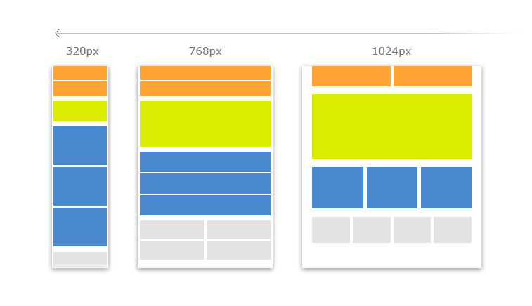
In the most basic sense, they are rules that state how a website should act within certain parameters. In CSS, these rules are used to change the layout and attributes of a web page based on device browser size (as illustrated in the diagram above). ZingChart media rules are used to change three things:
-
Chart Positioning
-
Chart Objects
-
JSON Attributes.
Media Rules act once they reach a break point. This is usually the maximum width you want your rule to work at.
Below is a responsive pie chart with no break points. Re-size the page. The only working responsiveness is the ratio of pie chart sizes across the board.
Implementing Media Rules
Let's move into how to execute on media rules. Our first example deals with a very simple set of pie charts. We are going set the break point at 500 pixels to change all of the background colors to white.
var myConfig1 = {
  graphset: [
  {//pie #1
 	  type: 'pie',
 	  backgroundColor: 'green',
 	  x: '0%',
 	  y: '0%',
 	  width: '25%',
 	  height: '100%',
 	  mediaRules: [
 	  {//changes background color to white at 500 pixels or less
 	    maxWidth: 500,
 	    backgroundColor: 'white'
 	  }
 	  ],
	  series : [
		{
			values : [35]
		},
		{
			values : [65]
		}
    ]
  },
  {//pie #2
    type: 'pie',
    backgroundColor: 'red',
    x: '25%',
    y: '0',
 	  width: '25%',
 	  height: '100%',
 	  mediaRules: [
 	  {//changes background color to white at 500 pixels or less
 	    maxWidth: 500,
 	    backgroundColor: 'white'
 	  }
 	  ],
	  series : [
		{
			values : [40]
		},
		{
			values : [60]
		}
    ]
  },
  {//pie #3
    type: 'pie',
    backgroundColor: 'black',
    x: '50%',
    y: '0',
 	  width: '25%',
 	  height: '100%',
 	  mediaRules: [
 	  {//changes background color to white at 500 pixels or less
 	    maxWidth: 500,
 	    backgroundColor: 'white'
 	  }
 	  ],
	  series : [
		{
			values : [70]
		},
		{
			values : [30]
		}
    ]
  },
  {//pie #4
    type: 'pie',
    backgroundColor: 'gray',
    x: '75%',
    y: '0%',
 	  width: '25%',
 	  height: '100%',
 	  mediaRules: [
 	  {//changes background color to white at 500 pixels or less
 	    maxWidth: 500,
 	    backgroundColor: 'white'
 	  }
 	  ],
	  series : [
		{
			values : [45]
		},
		{
			values : [55]
		}
    ]
  },
]
};
zingchart.render({
	id : 'myChart1',
	data : myConfig1,
	height: '400px',
	width: '100%'
});
Below is what the chart will look like. The background on every pie chart now changes to white at a break point of 500px.
Media Rules In A Real Use Case
Changing background color probably wouldn't be a practical use case. However, changing positioning and size of your charts is something you may encounter.
In the example below I have added rules that change the positioning and size of the pie charts. It will now change from 4 charts in one row to two pairs of pie charts stacked on each other. Re-size the page. Notice the charts stack when you reach the break point of 500 pixels.
Inspect the code below and see the implemented changes to x & y and height & width.
var myConfig2 = {
  graphset: [
  {//pie #1
 	  type: 'pie',
 	  backgroundColor: 'green',
 	  x: '0%',
 	  y: '0%',
 	  width: '25%',
 	  height: '100%',
 	  mediaRules: [
 	  {//changes layout at 500 pixels or less
 	    maxWidth: 500,
 	    x: '0%',
 	    y: '50%',
 	    width: '50%',
 	    height: '50%',
 	  }
 	  ],
	  series : [
		{
			values : [35]
		},
		{
			values : [65]
		}
    ]
  },
  {//pie #2
    type: 'pie',
    backgroundColor: 'red',
    x: '25%',
    y: '0',
 	  width: '25%',
 	  height: '100%',
 	  mediaRules: [
 	  {//changes layout at 500 pixels or less
 	    maxWidth: 500,
 	    x: '50%',
 	    y: '50%',
 	    width: '50%',
 	    height: '50%',
 	  }
 	  ],
	  series : [
		{
			values : [40]
		},
		{
			values : [60]
		}
    ]
  },
  {//pie #3
    type: 'pie',
    backgroundColor: 'black',
    x: '50%',
    y: '0',
 	  width: '25%',
 	  height: '100%',
 	  mediaRules: [
 	  {//changes layout at 500 pixels or less
 	    maxWidth: 500,
 	    x: '0%',
 	    y: '0%',
 	    width: '50%',
 	    height: '50%',
 	  }
 	  ],
	  series : [
		{
			values : [70]
		},
		{
			values : [30]
		}
    ]
  },
  {//pie #4
    type: 'pie',
    backgroundColor: 'gray',
    x: '75%',
    y: '0%',
 	  width: '25%',
 	  height: '100%',
 	  mediaRules: [
 	  {//changes layout at 500 pixels or less
 	    maxWidth: 500,
 	    x: '50%',
 	    y: '0%',
 	    width: '50%',
 	    height: '50%',
 	  }
 	  ],
	  series : [
		{
			values : [45]
		},
		{
			values : [55]
		}
    ]
  },
]
};
zingchart.render({
	id : 'myChart2',
	data : myConfig2,
		height: '400px',
	width: '100%'
});
Implementing Multiple Sets of Media Rules
Awesome! So now we have a fully responsive chart that can be viewed across desktop AND tablet sizes. What about mobile? How do we add two sets of media rules? All we have to do is add another set of media rules with different parameters. Check out the code below to see the changes.
var myConfig3 = {
  graphset: [
  {//pie #1
 	  type: 'pie',
 	  backgroundColor: 'green',
 	  x: '0%',
 	  y: '0%',
 	  width: '25%',
 	  height: '100%',
 	  mediaRules: [
 	  {//changes layout at 500 pixels or less
 	    maxWidth: 500,
 	    x: '0%',
 	    y: '50%',
 	    width: '50%',
 	    height: '50%'
 	  },
 	  {//media rule #2: changes layout at 420 pixels or less
 	   maxWidth: 420,
 	    x: '0%',
 	    y: '0%',
 	    width: '100%',
 	    height: '25%',
 	    plot: {
 	      valueBox: {
 	        visible: false
 	      }
 	    }
    }
 	  ],
	  series : [
		{
			values : [35]
		},
		{
			values : [65]
		}
    ]
  },
  {//pie #2
    type: 'pie',
    backgroundColor: 'red',
    x: '25%',
    y: '0',
 	  width: '25%',
 	  height: '100%',
 	  mediaRules: [
 	  {//changes layout at 500 pixels or less
 	    maxWidth: 500,
 	    x: '50%',
 	    y: '50%',
 	    width: '50%',
 	    height: '50%'
 	  },
 	  {//media rule #2: changes layout at 420 pixels or less
 	   maxWidth: 420,
 	    x: '0%',
 	    y: '25%',
 	    width: '100%',
 	    height: '25%',
 	    plot: {
 	      valueBox: {
 	        visible: false
 	      }
 	    }
    }
 	  ],
	  series : [
		{
			values : [40]
		},
		{
			values : [60]
		}
    ]
  },
  {//pie #3
    type: 'pie',
    backgroundColor: 'black',
    x: '50%',
    y: '0',
 	  width: '25%',
 	  height: '100%',
 	  mediaRules: [
 	  {//changes layout at 500 pixels or less
 	    maxWidth: 500,
 	    x: '0%',
 	    y: '0%',
 	    width: '50%',
 	    height: '50%'
 	  },
 	  {//media rule #2: changes layout at 420 pixels or less
 	   maxWidth: 420,
 	    x: '0%',
 	    y: '50%',
 	    width: '100%',
 	    height: '25%',
 	    plot: {
 	      valueBox: {
 	        visible: false
 	      }
 	    }
    }
 	  ],
	  series : [
		{
			values : [70]
		},
		{
			values : [30]
		}
    ]
  },
  {//pie #4
    type: 'pie',
    backgroundColor: 'gray',
    x: '75%',
    y: '0%',
 	  width: '25%',
 	  height: '100%',
 	  mediaRules: [
 	  {//changes layout at 500 pixels or less
 	    maxWidth: 500,
 	    x: '50%',
 	    y: '0%',
 	    width: '50%',
 	    height: '50%'
 	  },
 	  {//media rule #2: changes layout at 420 pixels or less
 	   maxWidth: 420,
 	    x: '0%',
 	    y: '75%',
 	    width: '100%',
 	    height: '25%',
 	    plot: {
 	      valueBox: {
 	        visible: false
 	      }
 	    }
    }
 	  ],
	  series : [
		{
			values : [45]
		},
		{
			values : [55]
		}
    ]
  },
]
};
zingchart.render({
	id : 'myChart3',
	data : myConfig3,
	height: '400px',
	width: '100%'
});
The finished product is shown below complete with two sets of media rules. Your charts are now responsive across desktop, tablet, and mobile!
These are all the necessary steps to create the most basic of responsive design for your charts. Obviously, there will be many more parameters you will want to amend, but this tutorial should be enough to get you started on the concept. If you want to see more info on media rules, check out our docs page!
If you have any questions, leave a comment below! Or follow us on Twitter @zingchart and tweet us if you have any support questions! Subscribe to our newsletter below for ZingChart updates, news, and content!