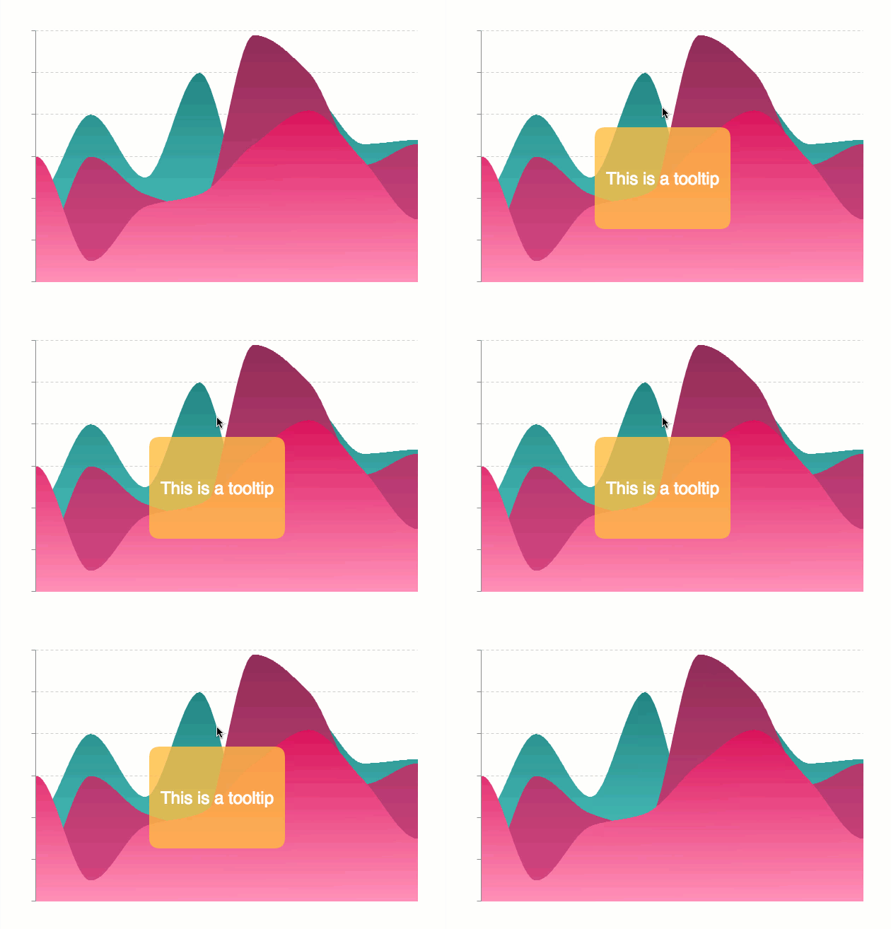
Hover labels are indicators that appear when a user mouses over the data points on a chart. Tooltips and crosshairs are the two most common types of hover labels. They are highly customizable.
Developers can also use tokens (string interpolation) with tooltips to add even more detail to visual chart data. Open a world of interactive graphs with fixed tooltips, fixed crosshairs, dynamic labels, and more.
Better Interactive Graphs

Tooltips and crosshairs are both hover labels. This means they appear when users hover over or near the data point (or node value) on a chart. The hovering action differentiates them from fixed label types such as:
-
Standalone labels
Tooltips and crosshairs have a special advantage. They provide information without taking up valuable chart space. That's because they only display when the user hovers over a particular node.
But since tooltips and crosshairs only appear when a user hovers over a node, users might not realize they are an option to use. Chart text can assist this interaction. Helper text such as “hover over a point for more information” can clue them in.
You can use both crosshairs and tooltips in interactive graphs. But which type you use may depend on the chart type you are creating. Crosshairs consist of plot and scale labels connected by long thin lines. As a result, crosshairs are best suited to X/Y-axis charts. These are charts where the scale or scales provide pertinent information in relation to a node.
Charts suited to crosshairs include:
-
Array of arrays (scatter plot)
Tooltips are best suited for:
Tooltips Best Practices
Tooltips appear simple at first glance. But users can really unlock the power of this label type by utilizing tokens and styling. Adhere to tooltip best practices by considering label styling factors, such as:
-
Size
-
Coloring
-
Placement
There are also best practices for text in your tooltips. For example, if you provide extensive description in a tooltip, make sure the text wraps. When selecting text for a tooltip, you may find our past review of “Writing About Numbers” helpful.
If the tooltip label is large, adjust the transparency. That way, the chart will still be visible underneath. When possible, use attributes in your charting library to customize tooltips for your specific data set. Or, take the availability of such options into consideration when choosing one.
In the pie chart below, the tooltips are sized and placed to overlap with the chart. However, they do not overtake the space. This is accomplished with customizations:
-
The background color matches to the corresponding pie slice
-
The alpha was adjusted so users could still view the entire pie chart
For more detail about adding tooltips with ZingChart, check out our tooltip docs.
Crosshairs
Crosshairs connect the plot and scale labels with long thin lines. They work best on charts with node values that tie back to the scale(s). Crosshair best practices ultimately depend on what you are communicating about your data. X-axis crosshairs generally appear by default across charting libraries, while Y-axis crosshairs are optional.
That is no coincidence. Sometimes a Y-axis crosshair is unnecessary. A busy chart is not a better chart. In fact, you may consider turning off the visibility of the plot and/or scale labels. This is a best practice if the information they provide is redundant or told elsewhere.
In the scatter plot example below, the scale labels on both the X- and Y-axis crosshairs are turned off. The plot label provides the same information. We used a Y-axis crosshair in this chart to help “pinpoint” the scatter plot node values. Finally, the label is slightly transparent. Users can still view the entire chart, even while interacting with it.
Want to add crosshairs to your interactive graph made with ZingChart? View crosshair-specific documentation.
Interactive Graphs in ZingChart
Crosshairs and tooltips can enhance your interactive graphs. Adhering to design best practices ensures information is clearly communicated to the user.
Sticky Tooltips
One way to communicate extra data using the ZingChart library is sticky tooltips. Sticky tooltips display labels for a specified period of time after a user moves the mouse off of a node.
Fixed Tooltips
Fixed tooltips or crosshairs appear at a specified spot on your chart. You can even layer crosshairs or tooltips on top of fixed labels. This creates dynamic labels that respond to the user’s mouse movements over a chart.
HTML Tooltips
HTML tooltips allow you to incorporate more styling and HTML elements. Tables and images are two common examples. Chart topics that would be enhanced by tooltips with images include:
-
Sports teams
-
Countries
-
Schools
Dynamic Labels
There is one important thing to keep in mind when creating dynamic labels.
A tooltip or crosshair does not appear until the user hovers over a node.
You can assist the user by providing introductory text, such as “hover over the data points.” Or, you can create a label outline where the tooltip/crosshair text will appear.
Below, outlines signify where information about the hovered over node value will display. And the tooltips display a little longer when you hover over an individual day. This illustrates the “sticky” option.
Conclusion
Tooltips and crosshairs are highly flexible chart elements. They can greatly enhance the readability and interactivity of your chart. To maximize that readability, always keep in mind charting best practices. Following best practices helps ensure your information is successfully communicated to the user.