Stock graphs and charts don’t have to be static snapshots that leave the user to make assumptions or estimates. Interactive graphing libraries can make these visualizations precise and informative. We’re sharing a few ways you can make this happen in your next stock graph.
Stock Graphs with More to Offer
When analyzing stocks, users are often interested in the relationship between the price and volume of the stock being sold. Stock and volume charts illustrate this relationship so that users can identify patterns and trends to determine in what direction a market might be moving. Below are two ways you can boost what your stock graphs offer to users in addition to the data you are visualizing.
Blended Scales
Blended scales are a new ZingChart feature that allows you to “blend” or “stick” secondary scales to the same axis line as the primary y-axis or x-axis scale.
Why Blended Scales Help Users
Blended scales can simplify the creation of certain visualizations, such as stock and volume graphs. Instead of creating a graphset to create two entirely separate charts, you can put two graphs in one when they share certain characteristics, e.g., a time-series scale.
How to Make a Chart with Blended Scales
ZingChart provides the functionality to create highly customized stock and volume charts. The easiest way is to use our mixed chart type and blended scales. The stock chart portion displays the price (the opening, highest, lowest, and closing prices). The volume chart portion can be displayed with a different chart type, such as area or bar.
Blended scales are a new feature that was added with our latest build 2.3.0.
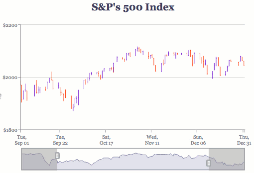
Stock Graphs with Preview
A preview chart is a miniaturized chart usually placed below the main chart.
Why You Should Use Preview
Including a preview graph allows you to zoom in and show stock price and/or volume data over a certain time period (one that saw great growth or loss, for example). But a preview chart also allows you to see the bigger picture, or the longer time period (one year, ten years, since inception) that the sampling is taken from.
Preview Charts in ZingChart
The preview chart feature was newly added to stock graphs in the 2.3.0 build. It has several stock graph-specific aspects. For one thing, the preview chart appears as an area chart (default) or line graph. You can also style the preview chart’s lines and background colors. Read our Stock Charts Documentation for more information.
All the Info on Stock Graphs and Interactive Charts
Did you know ZingChart supports interactive features such as crosshairs, zooming, scrollbars, and preview charts? See our Stock Charts Tutorial, which explains how to create candlestick charts, open-high-low-close charts, and stock graphs and volume graphs.