ZingChart is capable of far more than producing static plain image charts. Animating charts, interacting with charts, and having your charts react to your data are all not only possible, but straightforward and simple with Zing.
Here I'll be giving showing off some of the more unique abilities of gauge charts, and providing demos so you can play around with them yourselves.
Animating Your Gauge Charts
Animating your gauge charts can significantly elevate both their impact and usability - below we're showing how to draw the user's eye (and build a little suspense) to a gauge chart that has a positive outcome.
Rating Meter
The "rating meter" gauge chart is sliced into sections where-in all values are categorized into these sections - this makes it helpful to assign outcomes to a wide variety of scores. By saturating the selected section and desaturating others we can emphasize which one is selected making the progress even more meaningful.
Using rules in the ring of our radius scale (more on conditional styling) we can create slices in our gauge chart. We can use the %v token (more on tokens) to set the range of each slice. The ranges can be anywhere from the minValue to the maxValue of the radius scale.
This will serve as the starting point for our animation, so I will choose a saturated rich color for the first slice and increase its size. The rest of the slices will be the default size of 150 and much lighter in color.
let chartConfig = {
  scaleR: {
    ring: {
      aperture: 180, // Only show a half circle
      minValue: 0, // Lowest value of first slice
      maxValue: 100, // Highest value of last slice
      size: 150, // Default size of slice
      rules: [{
        "rule": "%v >= 0 && %v < 20",
        "background-color": "#cf2020", // Red
        "size": "260"
      },{
        "rule": "%v >= 20 && %v < 40",
        "background-color": "#fbbb9d" // Light Orange
      },
      {
        "rule": "%v >= 40 && %v < 60",
        "background-color": "#ffdf8f", // Light Yellow
      },
      {
        "rule": "%v >= 60 && %v < 80",
        "background-color": "#e9f099" // Light Chartreuse
      },
      {
        "rule": "%v >= 80 && %v <= 100",
        "background-color": "#9edca2" // Light Green
      }]
    }
  }
};
To animate the chart we need to be able to do three things:
- Modify the chart data (in our case where the needle is pointing)
- Modify the conditional styling rules (the colors and size of each slice)
- Have the chart re-render efficiently
We can use the zingchart.exec() function to execute methods on our chart at specific times and in specific ways. For our needs we'll be using the 'modify' method to update the conditional style rules and 'setseriesvalues' to update where the gauge needle is pointing.
zingchart.exec('myChart', 'setseriesvalues', {
  plotindex: 0,
  values: [ /* ... */ ], // Update where needle points
  update: false // Prevent chart from re-rendering too early
});
zingchart.exec('myChart', 'modify', {
  data: {
    scaleR: {
      ring: {
        rules: [ /* ... */ ] // Update slice colors + sizes
      }
    }
  }
});
Put together with setInterval and a few other various chart options, we arrive at the demo below:
Progress Chart
Instead of immediately showing that a goal has been reached—build suspense with an animation of the gauge filling. Waiting to find out where the actual total lands can be a great way to create excitement.
This uses the same technique that is in the first demo by dynamically updating the chart on a regular interval using zingchart.exec(), but this time something extra is added in the 'modify' method—plot. This is so that we can update the text in the chart's valueBox to display a "Goal Achieved" type message.
const GOAL = 500;
zingchart.exec('myChart', 'modify', {
  data: {
    scaleR: {
      ring: {
        "rules": [{
          "rule": `%v >= 0 && %v <= ${value}`,
          "background-color": value == GOAL ? "#1bd161" : "#FFA300"
        }]
      }
    },
    plot: value == GOAL ? {
      valueBox: {
        text: 'Goal Achieved! $%vk'
      }
    } : {},
  },
});
}
And is the finish demo:
Interacting with Gauge Charts
Not all gauge charts need to be static pieces of content; having our charts react in real time to new data lets us fully make use of what the web has to offer as a medium. On top of this, we can achieve the affect with just the techniques we learned above.
Sentiment Analysis
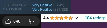
Whether it is game, a video, or an online product there are many different ways to show user sentiment online. They all share the same core idea: collect reviews from users, then display some sort of metric to get across the overall sentiment at a glance.
Here we are going to use a gauge chart to reflect our sentiment analysis. Our chart will range from -100% (only thumbs down) to +100% (only thumbs up), with 0% being equal of each.
By abstracting to an simple update function, we can attach this to anything we like - A callback function for network responses, click events, anything.
// Function to update the gauge value and background
function updateGauge(value) {
  zingchart.exec('my-chart', 'setseriesvalues', {
    plotindex: 0,
    values: [value],
    update: false
  });
  zingchart.exec('my-chart', 'modify', {
    data: {
      scaleR: {
        ring: {
          'rules': [{
            'rule': `%v >= 0 && %v <= ${value}`,
            'background-color': value == GOAL ? '#1bd161' : '#FFA300'
          }]
        }
      },
      plot: value == GOAL ? {
        valueBox: {
          text: 'Goal Achieved! $%vk'
        }
      } : {},
    },
  });
}
The interactable demo:
Multipurpose Gauge Charts
Gauge charts are often recognized for their simplicity, typically used to display a single metric. However, their potential extends far beyond this basic functionality. Nested gauge charts enable the visualization of multiple data points simultaneously, saving both space and cognitive load on the user.
Weather Report
To give a more engaging example to multipurpose gauge charts, I've created a demo that displays the daily high and daily low temperature forecast for the day in the same chart.
Code-wise ZingChart makes nesting Gauge charts a breeze as you can add a second radius scale right in the same config. You can simply keep adding as many additional nested scales as you would like (simply keep incrementing the scale-r-#, e.g. scale-r-3, scale-r-4, etc)
For more info on using multiple scales, the docs go into lots of detail.
let chartConfig = {
  /* ... */
  "scale": {
    "size-factor": 0.7 /* Set the first scale to be the smaller one */
  },
  "scale-2": {
    "size-factor": 1
  },
  "scale-r": {
    /* Settings for inner chart */
  },
  "scale-r-2": {
    /* Settings for outer chart */
  },
  "series": [
    {
      values: [/* ... */],
      /* ... */
    },{
      values: [/* ... */],
      /* Explicitly write which scale your data should go to if not
        the default scale */
      scales: ["scale-2", "scale-r-2"]
      /* ... */
    }
  ]
};
Put together, the chart should look something like this: