Themes can be useful if you have a bunch of charts that need to be consistent. ZingChart gives you the ability to design your own themes by creating a JSON (JavaScript Object Notation) file where you store all your theme properties. By creating a ZingChart theme, you will be able to have your chart data in one file and theme properties in the other, as well as apply your these files to any chart. In this tutorial, I will be talking about the basics of ZingChart theming.
Step 1. Create Chart and Chart Data File
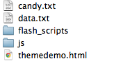
Below is what my folder structure looks like after creating the data file and the my chart HTML file. I have named my JSON data file data.txt.

The bar is an easy chart to manipulate, so we will start with that graph type for demonstration purposes. This is what my data.txt file looks like:
{
    "type"  : "bar",
    "title" : {
        "text" : "Bar Demonstration"
    },
    "legend" : {
            "header" : {
            "text" : "Legend"
            }
    },
    "scale-x"  : {
        "text" : "Scale-x"
    },
    "scale-y"  : {
        "text" : "Scale-y"
    },
    "series" : [
    {
    "values" : [28.2, 1, 3.9, 0.6, 0.25, 0.65]
    },
    {
    "values" : [20, 3, 24, 13, 25, 3]
    },
    {
    "values" : [1, 6, 3, 12, 18, 23]
    },
    {
    "values" : [22, 29, 2, 23, 14, 4]
    },
    {
    "values" : [18.2, 1, 2.9, 1.6, 3.25, 5.65]
    }
    ]
}
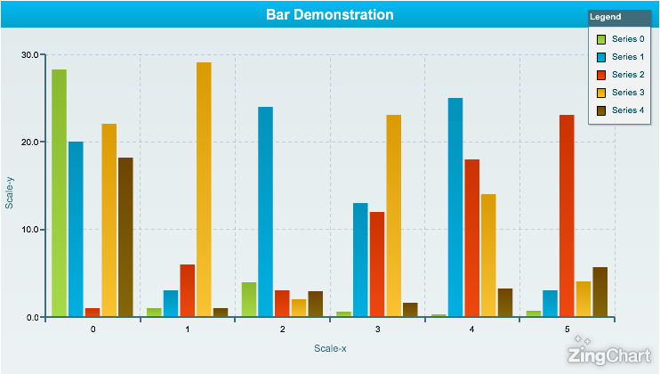
As you can see from my example, I have set my data.txt file to output as a bar graph by setting "type" : "bar", and the title of my chart will be Bar Demonstration by setting "text" : "Bar Demonstration" in my title object. The chart legend will be visible and I have set 5 different series of values. Since you have not set any design properties yet, your chart will automatically go to ZingChart's default theme. Your chart should look like the chart shown below.

Step 2. Create Theme JSON File
Let's create a theme called Candy and name the file candy.txt. Leave the file blank for now because there is a very important step that you must do before creating your theme. Below is a what my folder structure now looks like.
Step 3. Link Theme JSON File to Chart File
The next step is to open up your chart file (my chart file is called themedemo.html) in your text editor. Find the JavaScript function that has your chart configuration settings in it. Inside zingchart.render(), you will want to add the highlighted line:

zingchart.render({
        output      : 'canvas',
        width       : 740,
        height      : 420,
        dataurl     : 'data.txt',
        id          : 'themeChart',
        defaultsurl : 'candy.txt'
    });
This tells ZingChart that you want to override the default theme with your own. You are now ready to start building your own theme!
Step 4. Create your theme palette
JSON files always start with { and end with }. In these parameters, you will set any property that you wish to be different from the default theme. You will be creating a style for anything that has a color, background-image, border, font, etc.
A ZingChart theme file contains a palette object. In the palette object, you will have your theme colors for certain graphs. Our next step is to add the following content to our Candy theme file:
{
    "palette" : {}
}
Once you add your palette object, you will have to define each kind of graph you want to apply your theme to. Since we are theming a bar, we will need to add a bar object. The bar object has two options, vertical or horizontal bar. Let's stick with the traditional vertical bar. Inside of the graph type object, you will need to add your color scheme.
{
    "palette"  : {
        "vbar" : [
            ["#ffffff", "#c71631", "#c71631", "#e03457"],
            ["#ffffff", "#47cc27", "#47cc27", "#88dc68"],
            ["#ffffff", "#f88911", "#f88911", "#fa9f5c"],
            ["#ffffff", "#f2ef85", "#f2ef85", "#fdef31"],
            ["#ffffff", "#1682a9", "#1682a9", "#30a3d8"]
        ]
    }
}
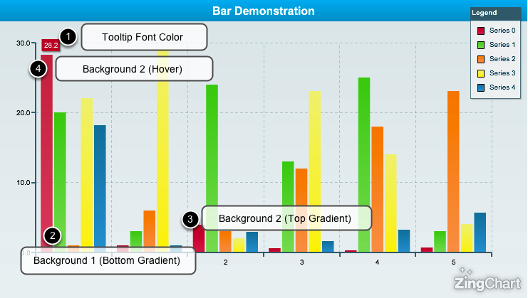
The number of color palettes under your graph type will dictate how many plots you are theming. The first set of values will be for the first set of plots, the second set will be the for the second, so on and so forth. Now what does this do? Let's take a look at the first set of colors...

The demonstration above describes the vertical bar graph type.
Step 5. Add Additional Graph Types
You can add as many graph types as you like. Make sure you style each graph type you want to use with this theme or the chart will apply the default style.
As you may have noticed, this only sets the color for the plot values. You're probably asking, where do you put the rest of the theme?
Step 6. Add Graph Object
Now that you are satisfied with your color scheme, it is time to add all the graph properties. This includes the graph title, legend, scale-x, scale-y, etc. Anything that you want included in your theme will go in this object:
"graph" : {}
This object belongs after the palette object. Make sure you do not forget to put a comma after the palette object or your theme will break. Your theme file should now look like this:
{
    "palette" : {
        "vbar" : [
            ["#ffffff", "#c71631", "#c71631", "#e03457"],
            ["#ffffff", "#47cc27", "#47cc27", "#88dc68"],
            ["#ffffff", "#f88911", "#f88911", "#fa9f5c"],
            ["#ffffff", "#f2ef85", "#f2ef85", "#fdef31"],
            ["#ffffff", "#1682a9", "#1682a9", "#30a3d8"]
        ]
    },

    "graph" : {

    }
}
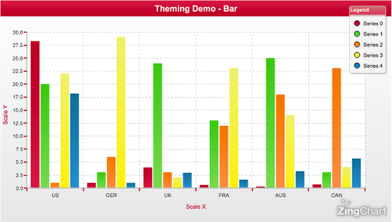
If you test out your Candy theme, it should look exactly the same as it did before you did this step. This is because you have not set any graph properties yet.
Step 7. Add Graph Properties
Let's start with the basics. I want to make my chart background have a light gradient and my title bar be a gradient that matches my set color palette. To do this, I will pick the two colors I want to use for each object and I will add these properties to my graph object. Since the title is it's own object, we will add a title object to our graph.
"graph" : {
    "background-color" : "#ffffff #ececec",
    "title" : {
        "background-color" : "#e03457 #c71631"
    }
}
Make sense?
Let's fast forward a little bit and add some more graph properties...
"graph" : {
    "background-color" : "#ffffff #ececec",
    "title" : {
        "background-color" : "#e03457 #c71631"
    },
    "chart" : {
        "background-color" : "#ffffff"
    },
    "legend" : {
        "border-radius" : "5",
        "border-color" : "#cccccc",
        "header" : {
            "background-color" : "#d88684 #e64c6d",
            "border-color" : "#cccccc",
            "border-radius-top-left" : "5",
            "border-radius-top-right" : "5"
        },
        "item" : {
                "border-color" : "#cccccc",
                "font-color" : "#282828",
                "marker-style" : "circle"
        }
    },
    "scale-x" : {
        "font-color" : "#c71631",
        "item" : {
            "font-color" : "#515151"
        },
        "line-color" : "#cccccc",
        "tick" : {
            "line-color" : "#c71631"
        }
    },
    "scale-y" : {
        "font-color" : "#c71631",
        "item" : {
            "font-color" : "#515151"
        },
        "line-color" : "#cccccc",
        "tick" : {
            "line-color" : "#c71631"
        },

    }
}

Step 8. Add Graph Specific Properties
Now that you have the graph properties to your liking, it is time to add graph specific properties. What this means, is that each graph type has a set of specific properties that you can add to your theme. For example, if you wanted your bar graph to animate, you would call this in the graph type property.
After the graph object, you will call your graph type object which will look like this (assuming you are still theming the vertical bar):
"vbar" : {}
Now that you have set the vbar object, you will want to set your properties for the vertical bar inside that object. Since I want the plots to animate, I will set a plot object with my properties. Animate will be set to true, to turn on animation, and effect will be effect #2. Animation effects are preset so you can choose between a number of different effects depending on what kind of graph it is.
You can see how I added this object below:
{
"palette" : {
    "vbar" : [
        ["#ffffff", "#c71631", "#c71631", "#e03457"],
        ["#ffffff", "#47cc27", "#47cc27", "#88dc68"],
        ["#ffffff", "#f88911", "#f88911", "#fa9f5c"],
        ["#ffffff", "#f2ef85", "#f2ef85", "#fdef31"],
        ["#ffffff", "#1682a9", "#1682a9", "#30a3d8"]
         ]
},

"graph" : {
    "background-color" : "#ffffff #ececec",
    "title" : {
        "background-color" : "#e03457 #c71631"
    },
    "chart" : {
        "background-color" : "#ffffff"
    },
    "legend" : {
        "border-radius" : "5",
        "border-color" : "#cccccc",
        "header" : {
            "background-color" : "#d88684 #e64c6d",
            "border-color" : "#cccccc",
            "border-radius-top-left" : "5",
            "border-radius-top-right" : "5"
        },
        "item" : {
                "border-color" : "#cccccc",
                "font-color" : "#282828",
                "marker-style" : "circle"
        }
    },
    "scale-x" : {
        "font-color" : "#c71631",
        "item" : {
            "font-color" : "#515151"
        },
        "line-color" : "#cccccc",
        "tick" : {
            "line-color" : "#c71631"
        }
    },
    "scale-y" : {
        "font-color" : "#c71631",
        "item" : {
            "font-color" : "#515151"
        },
        "line-color" : "#cccccc",
        "tick" : {
            "line-color" : "#c71631"
        },

    }
},

"vbar" : {
    "plot" : {
        "animate" : true,
        "effect" : 2
    }
}

}
Step 9. Add More Graph Types and Test

Now that you have your Candy theme set up, try adding another graph type and see what you can do with it. Apply the theme to another chart you already have set up or create an entirely new chart to play with.