Everybody knows that a data visualization is only as good as the 'chartographer' who creates it. While the goal is (hopefully) to turn raw data into an easily consumable visual, that's not always the outcome. With our new series of "How-to" posts, we hope to help designers and developers build charts that portray data accurately and look great as well.
Exploring the Piano Chart
First off; what are piano charts? They are table-style charts that allow the reader to easily consume differences in data-density by creating a scale using brightness, size, color, transparency, or imagery. The more or higher values there are for a given point, the more intense, dark, opaque, etc., the corresponding fill.
Some call this chart type a matrix, others call it a heat map. Microsoft calls it a piano roll. We're calling our chart type a piano as well because 'heat map' refers to a broader style of visualizing data that goes beyond a table.
Whatever you call them -- piano charts are a great, yet underutilized data visualization tool. Who knows why, maybe because they're misunderstood or underestimated. Whatever the case, after reading this post we hope you'll be excited to add ZingChart pianos to your arsenal of dataviz tools.
Heat map-style piano charts help draw quick conclusions
Usually, heat maps consist of blocks of a color (or colors) that range in brightness/intensity to portray the density of data for a given point. The darker or larger areas represent more heavily-populated data, and vice-versa. There are other interesting ways to identify data-density, however, such as the transparency of an image. We see this becoming more useful as we navigate the pros and cons of "chart junk" in data visualization (see Robert Kosara's post: Chart Junk Considered Useful After All).
EDITOR'S NOTE: This post contained some charts that used a very old build. For new heat map and piano chart examples, please view our gallery.
There are definitely use-cases and pros and cons to each chart, but one thing seems clear about the imagery-infused chart: it almost negates the need for a y-axis. It's easy to see that January and June will bring some sunlight, and that May might not be the best month for solar-panel output.
How-to
How much additional JSON code does this take? Aside from dressing up the colors and adding a background image, not much at all. Here are the two steps you need to know to go from a standard heat map to an interesting visual that'll draw your reader's attention while delivering accurate data (additional required code in green):
1. Add a background-image for each series.
We wanted our image to be centered and transparent so our blue-sky background would show through, so we set background-repeat to false, and background-transparent to true (one out of four series shown).
"series":[
    {
    "values":[10,8,8,7,6,10],
    "text":"Clear Days",
    "background-transparent": true,
    "background-image": "images/sunny.png",
    "background-repeat": false
    }
   ]
2. Set the "aspect": attribute to "alpha."
The "aspect": attribute is the key (awful pun intended) to building a piano chart. It allows you to determine what scale the chart will use for portraying data density. Available aspect options are brightness, size, width, height, and alpha (transparency). For this example we've used alpha.
"plot":
    {
    "tooltip-text":"%v %y days <br>in %k",
    "aspect":"alpha",
    "animate":1,
    "effect":1
    },
Other available aspects:
"aspect":"brightness", (default)
"aspect":"size",
"aspect":"vertical",
"aspect":"horizontal",
See examples in our docs.
Or you can copy out the JSON using our new right-click View Source feature:
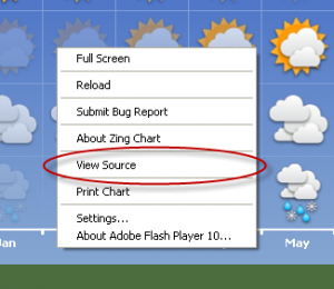 Right-click on any ZingChart to view its JSON code.
We welcome comments, ideas, thoughts, and constructive criticism. Also feel free to email us at support@zingchart.com
Andrew
Follow on Twitter
PS: Keep an eye on our blog via RSS as we'll continue to post tutorials and information featuring advanced ZingCharting!