Also known as column charts, bar charts come in many shapes and sizes. In this post, I will be going over how to create a simple vertical bar chart using ZingChart. Even with little knowledge of HTML, CSS and JavaScript, you can easily bring your data to life in just a few short steps.
The steps I will cover are as follows:
- Referencing the ZingChart library
- Placing your chart on your HTML page
- Adding data and rendering your chart
- Basic customization of your chart
1. Referencing the ZingChart library
If you have little knowledge of HTML layouts, I have provided one below with the ZingChart library referenced already.
<!DOCTYPE html>
<html>
 <head>
  <meta charset=”utf-8">
  <title>ZingChart: My Bar Chart</title>
  <script src=”https://cdn.zingchart.com/zingchart.min.js"></script>
 </head>
 <body>

 </body>
</html>
When referencing the ZingChart library, make sure to include the code snippet included in the HTML layout shown above.
You can also download the ZingChart library or use a package manager, like NPM.
2. Placing your chart on your HTML page
Before you begin entering any sort of data, you are going to want to reference your chart within the <body> of your code so that the chart can actually render on the page.
<!DOCTYPE html>
<html>
 <head>
  <meta charset=”utf-8">
  <title>ZingChart: My Bar Chart</title>
  <script src=”https://cdn.zingchart.com/zingchart.min.js"></script>
 </head>
 <body>
  <div id=”myChart”>
  </div>
 </body>
</html>
To do so, you will want to create an opening and closing <div>. Within that <div> tag, you will also want to include your chart’s name as an id. As far as HTML goes, you are done! Reference the example above.
3. Adding data and rendering your chart
Here is where some knowledge of JavaScript comes into play; however, it is still simple to implement.
Your next step will be including <script> tags. This is where you are going to place your JavaScript. When adding the <script> tag, make sure to include it after the <div> to render the chart.
<script>
var chartData = {
type: 'bar',
series: [
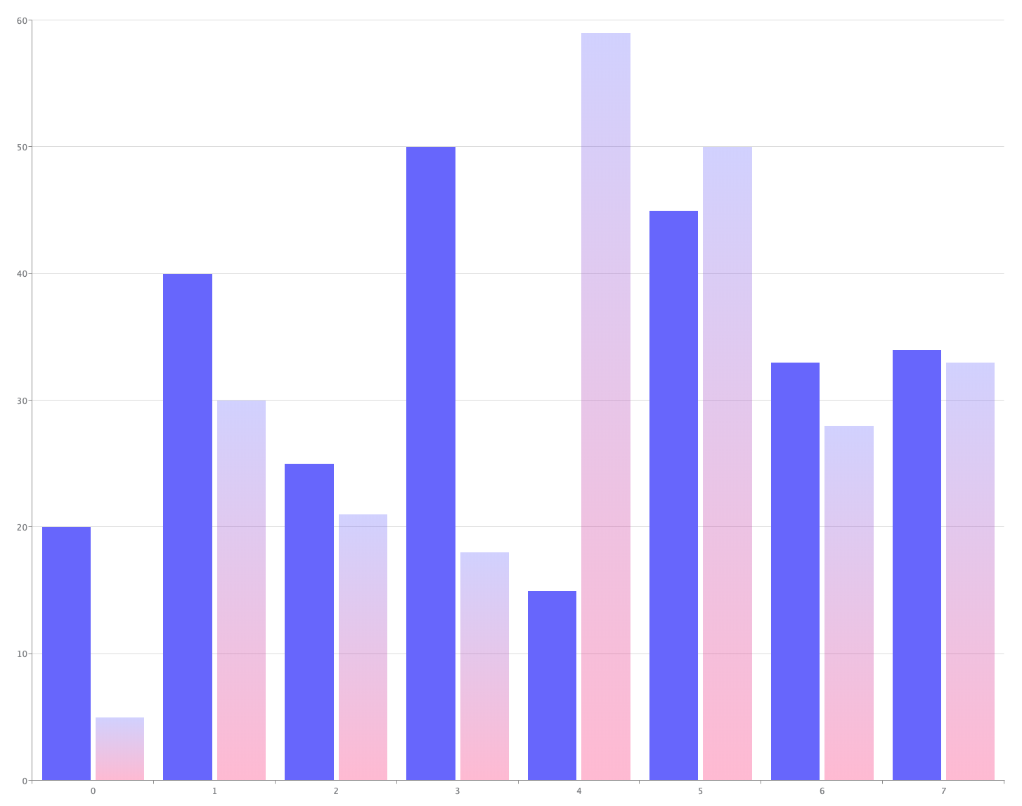
{ values: [35, 43, 70, 65] },
{ values: [25, 57, 49, 60] }
]
};
zingchart.render({
id: 'myChart',
data: chartData,
height: 400,
width: 600
});
</script>If you include the code within the <script> tag above and run this file in your browser, you will have created a fully functional bar chart!
Now let’s break down exactly what’s happening above.
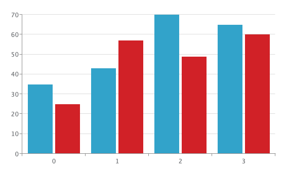
var chartData = {    //Sets a variable with all of the chart data
  type: 'bar',       //Tells ZingChart the type of chart
  series: [          //Creates different series of data
   { values: [35, 43, 70, 65] },    //Values for the first bar
   { values: [25, 57, 49, 60] }     //Values for the second bar
  ]
 };
I have set up a variable or var named chartData. This is where all of your data, attributes, and objects will be referenced (don’t worry, I will go over more attributes later).
After you have created the chartData variable, you will want to establish what type of chart you will be working with.
This variable will be created as a JavaScript object and all the attributes and data will be listed as values within the object. For more information on JavaScript objects, check out this article.
var chartData = {
  type: 'bar',       //Tells ZingChart the type of chart
  series: [
   { values: [35, 43, 70, 65] },
   { values: [25, 57, 49, 60] }
  ]
 };
In this case, you want to create a bar chart. This can be done by including type: ‘bar’ as an attribute within the object. I will list out ZingChart’s many other options available later in this post.
var chartData = {
  type: 'bar',
  series: [          //Creates different series of data
   { values: [35, 43, 70, 65] },    //Values for the first bar
   { values: [25, 57, 49, 60] }     //Values for the second bar
  ]
 };
Moving forward, you will also want to include data in your object. This can be done using the series attribute. You will notice that this attribute is listed as an array with more objects listed within. Feel free to play around with a different number of objects within a series to see how it affects what is rendered on the page.
Lastly, you are going to want to render your chart to the page.
zingchart.render({   //Render method used to show chart on page
  id: 'myChart',     //Reference the id used in the <div> tag
  data: chartData,   //Reference the chartData object created above
  height: 400,       //Sets height for chart
  width: 600         //Sets width for chart
 });
This can be done by calling the zingchart.render method shown above. This method takes in certain attributes as arguments for the render function.
The id: “myChart” is used to reference your div within the HTML.
The data: chartData is used to reference what data you will want to pull when rendering the chart. This value should be set to the object variable created previously.
The height and width arguments are used to set the size of the chart itself.
Once all this has been filled in, you can run a fully workable chart in the DOM.
Before I continue..
The easiest way to play around with the different types of charts available is to sign up for ZingChart’s free web-app, the ZingSoft Studio.
This will give you full access to the ZingChart library in a sandbox-like environment. The Studio allows you to build out fully functioning charts and grids without starting from scratch.
Check out the Studio and start charting!
4. Basic Customization of Your Chart
Now that I’ve covered the basics, I will look a little deeper into how powerful ZingChart truly is. I will only be able to cover a small portion of the customizations available, but I encourage you to check out the ZingChart docs to answer any questions you may have.
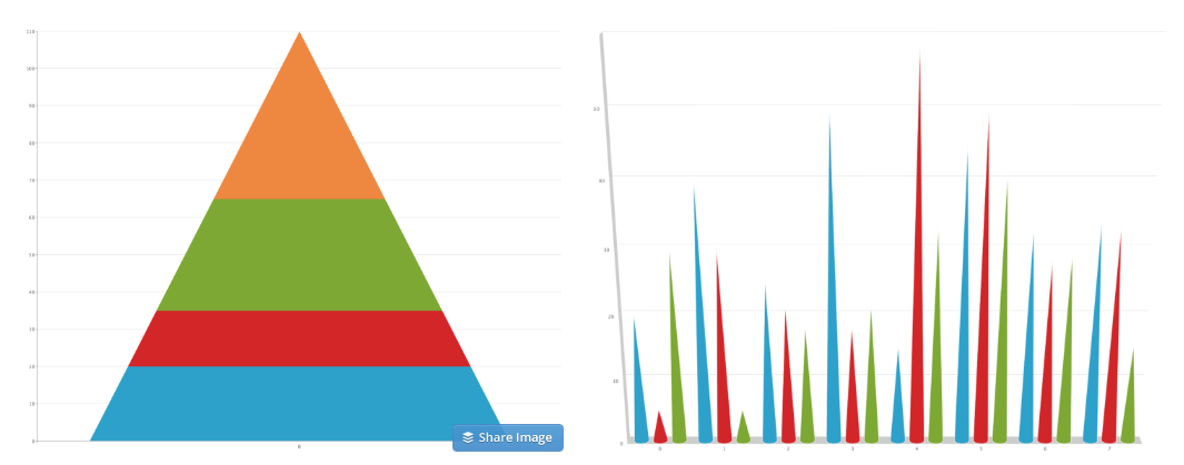
Earlier, I discussed the many different types of bar charts available. To switch the standard bar chart I created earlier into one of these different types, you will want to adjust the type attribute. Take a look at a few examples below to see what happens when you set the type attribute to a few other bar chart types.
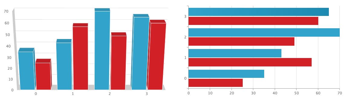
There are other things you can do to change the shape of the bars within the chart. You may change the shape of the chart by adding the aspect attribute to the plot object. Setting the value to cone, histogram, cylinder, or pyramid will change the shape of the bar accordingly.
You also have the option to incorporate all kinds of styles into your charts. Changing bar colors is as easy as setting the background-color attribute of your dataset to the color of your choosing. You can also set the opacity of the bar by using the alpha attribute and choosing a level of opacity between 0 and 1.
Styling the ‘x’ and ‘y’ axes is as easy as adjusting the scale-x or scale-y object to include the scale you are looking for.
By setting the min-value attribute to a number in Unix time and setting the step attribute to a value of day, you can set your chart to follow a time-series.

Note: To adjust the format of each x-axis value, you will need to use the transform object and set the type to date as well as change the all attribute to %M %d. This will allow the x-axis to display the months and days of each bar.
There are tons of other features available when making a bar chart and I strongly encourage you to both check out the docs as well as create a chart or two in the Studio.
A pioneer in the world of data visualization, ZingChart is a powerful JavaScript library built with big data in mind. With over 35 chart types and easy integration with your development stack, ZingChart allows you to create interactive and responsive charts with ease.