This is the second post in ZingChart’s Stopwatch Features series. This series of posts is intended to show you how quickly and easily you can create and animate a chart using the powerful JavaScript library, ZingChart.
Watch the video below to see how easily this can be achieved. For a step-by-step walk through, scroll past the video to the content below.
I will be going over 3 main items throughout this article:
1. Adding your HTML that contains your chart
2. Using JavaScript and ZingChart to add data, properties and animations
3. Rendering your gauge chart on the page
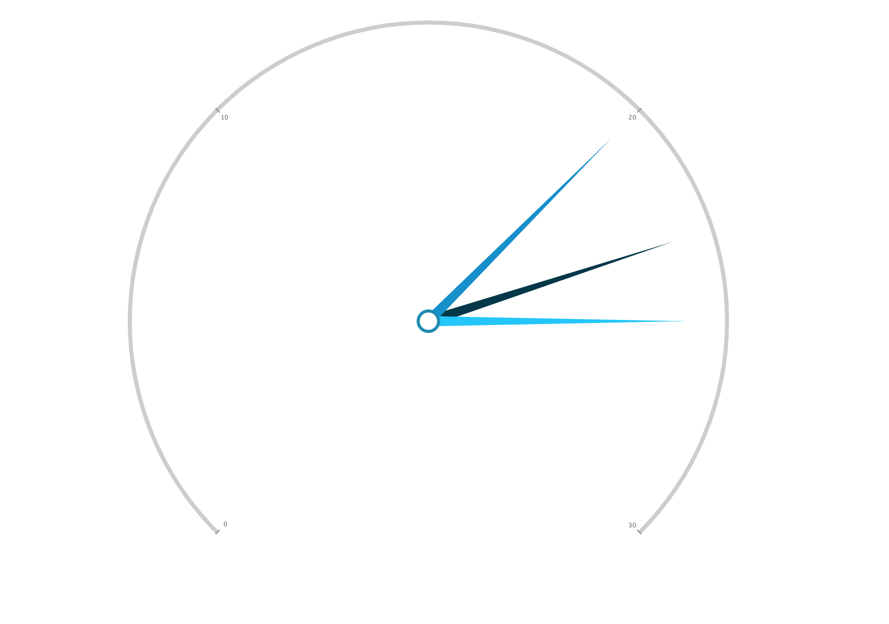
For the purpose of this demo, you will be creating the gauge chart shown below and filling it with dummy data.
Before I begin…
Every time I experiment with the ZingChart library, I always do so in their free web-app, the ‘ZingSoft Studio’.
This free sandbox-like environment will give you full access to the ZingChart library and let you experiment with all of ZingChart’s features, animations, and chart types.
Check out the Studio and start charting!
1. Adding Your HTML
To start this process, you will need to create a basic HTML layout if you have not done so already. Feel fee to copy the one I have below.
<!DOCTYPE html>
<html>
 <head>
   <meta charset=”utf-8">
   <title>ZingSoft Demo</title>
   <script src=”https://cdn.zingchart.com/zingchart.min.js"></script>
 </head>
 <body>
   <div id=”myChart” class=”chart — container”></div>
 </body>
</html>
Notice that I have included the CDN to reference the ZingChart library within the script tag.
I have also included a div within the body of the HTML that will render the chart. This div also includes a pre-defined class named chart — container. Reference here to see the basic CSS classes added to this chart.
As far as HTML setup, you are done!
2. Adding JavaScript
Now that you have finished setting up my HTML, you will spend the rest of your the time using and creating JavaScript.
To start, you can either set up a script beneath initial setup of your div, or you can reference an outside JavaScript document.
ZingChart is an extremely powerful and complex library. For the purpose of this demo, you will only be using a handful of properties available. For a full list of JSON properties available through ZingChart, check out the JSON attributes page.
You will start by creating and naming an object variable. Within this object, you will include 3 main properties: type, series, and plot. Reference the format below.
var chartConfig = {
  type: ‘gauge’,
  series: [
    {
      text: ‘Day 1’,
      values: [23],
      backgroundColor: ‘#00384A’
    },
    {
      text: ‘Day 2’,
      values: [20],
      backgroundColor: ‘#008ECC’
    },
    {
      text: ‘Day 3’,
      values: [25],
      backgroundColor: ‘#06C5FC’
    }
  ],
  plot: {
  },
};
The type property will determine which chart type you will render to the page. ZingChart has over 35 different chart types available, but I will be going over gauge charts in this article. If you reference above, you will notice I have set the type property to have a property value of gauge.
The series property is the next item in you chartConfig object. This property is where all your data and data styling will live. There are a ton of features you include here to add hover states, legend markers, tool tips, value boxes, and more directly to your data points.
You will want to follow the format I have created above to ensure the three needles are added to the graph.
plot will be used in the next section to add animations to your graph.
If you render your chart as the variable is now, it will fully display without animations.
2. Adding Animations
ZingChart has made it incredibly east to add animations to all the chart types. Using the plot object, you will include another object as a property within plot called animation.
Within the animation object, the first property you will include is effect. Effect can either take a string or a number (either 1 or 2) as a value.
In the code below, I have added the animation and set the effect to have a property value of 2. If you run the demo with the below code, you will see that the needles have a basic animation that runs.
var chartConfig = {
  type: ‘gauge’,
    series: [
      {
        text: ‘Day 1’,
        values: [23],
        backgroundColor: ‘#00384A’
      },
      {
        text: ‘Day 2’,
        values: [20],
        backgroundColor: ‘#008ECC’
      },
      {
        text: ‘Day 3’,
        values: [25],
        backgroundColor: ‘#06C5FC’
      }
    ],
    plot: {
      animation: {
      effect: 2
    }
  }
};
Below are the animation characteristics for the effect property:
- 1 = Fade in
- 2 = Rotate from left to right
…,
  plot: {
    animation: {
      effect: 2,
      sequence: 1
    }
  }
…- 1 = Renders individual nodes
- 2 = Renders all nodes at once
…,
  plot: {
    animation: {
      effect: 2,
      sequence: 1,
      method: 1
    }
  }
…
The next animation property you can take advantage of is the method property. method determines how the nodes act at the end of the animation and can only be applied when effect: 2 is active. This property takes in values between 1 and 5.
The best way to understand method is to try it out for yourself.
Here are the characteristics for each value:
- 1 = Node has long bounce at end of animation
- 2 = Node has quicker bounce at end of animation
- 3 = Node has very quick bounce at end of animation
- 4 = Node slows down towards end of animation
- 5 = Node slows down even more towards end of animation
- 6 = Node maintains consistent speed throughout the animation
3. Rendering Your Chart
The last piece of JavaScript you will be adding to this demo is the zingchart.render() method.
Within this built-in method, you will want to include the id that was included within the div in your HTML. This is what renders the chart to your HTML.
In addition to this, you need to reference the JavaScript variable you created previously. This can be done by adding the data property and setting its value to the name of the variable. In this case, you will set it to chartConfig.
Two additional properties you can add to this object are height and width. These properties take in numerical values like normal CSS properties.
Your JavaScript should now look like this:
var chartConfig = {
  type: ‘gauge’,
  series: [
    {
      values: [23],
      backgroundColor: ‘#00384A’
    },
    {
      values: [20],
      backgroundColor: ‘#008ECC’
    },
    {
      text: ‘Day 3’,
      values: [25],
      backgroundColor: ‘#06C5FC’
    }
  ],
  plot: {
    animation: {
      effect: 2,
      sequence: 1,
      method: 1
    }
  }
};

zingchart.render({
  id: ‘myChart’,
  data: chartConfig,
  height: ‘100%’,
  width: ‘100%’,
});
There are many different combinations of effect, method, and sequence that you can implement. There are also other properties you can add to the plot object such as speed and delay. To read more about these, visit the ZingChart animation docs.
To check out a more customized version of this chart, check out the demo. Feel free to fork, edit, and customize the demo with your own design and data!
A pioneer in the world of data visualization, ZingChart is a powerful JavaScript library built with big data in mind. With over 35 chart types and easy integration with your development stack, ZingChart allows you to create interactive and responsive charts with ease.