
Creating custom dashboards is hard work! Whether it be an analytics dashboard to monitor your site’s traffic and social presence, or a SaaS dashboard to see how your product is growing, creating a dashboard from scratch can be quite complex and time-consuming. This is the second article in our series about integrating ZingChart with Vue to create an interactive dashboard. If you'd like to learn more about the zingchart-vue component, check out the first article in this series.
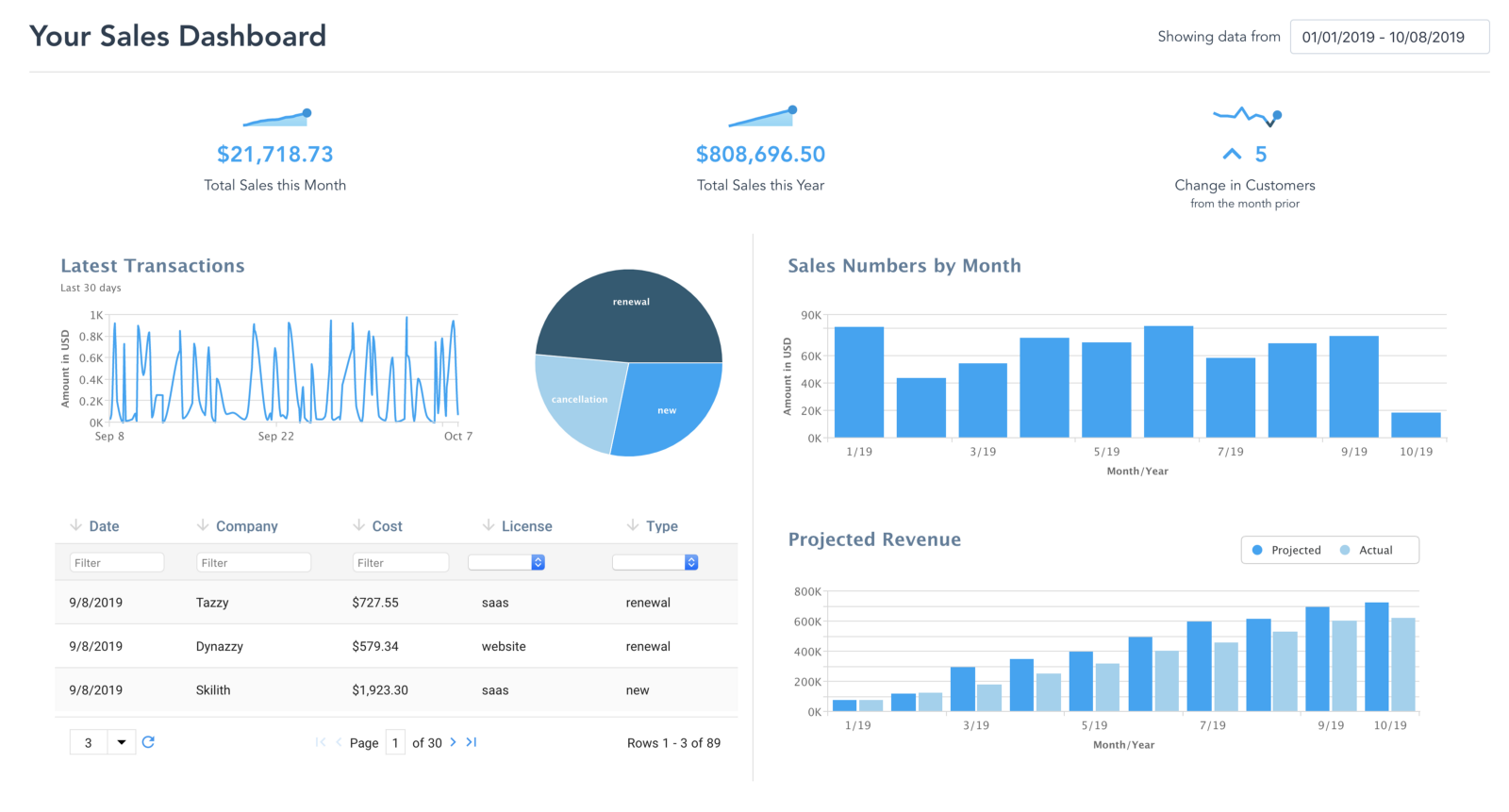
With the use of third party libraries, we can alleviate most of the heavy lifting and create dashboards that have complex interactivity with minimal effort. This article will be an overview of the libraries needed to create almost any type of dashboard.
- Vue.js — We will be using the popular Vue JavaScript framework to build our dashboard around. With its robust data handling and rich developer community with UI widgets, this is the perfect framework to set the groundwork.
- ZingChart — To create dashboards with unique visualizations, we will need a library that covers all use cases. ZingChart provides over 30 different chart types, including the basics such as Line, Bar, and Pie Charts, but also more unique visualizations such as Word Cloud, Gauge, and Radar. The library even has Maps!
- ZingGrid — Dashboards aren’t complete without a data table to display details about our data in a logical format. A complementary product to ZingChart, ZingGrid will provide a useful set of features to handle our data including filtering, sorting, and searching. With its unique compatibility with ZingChart allowing rich interactivity between the two products, it’s a no-brainer to add this library to our arsenal.
Visualizing Your Data with ZingChart
We can easily customize and add charts to our dashboard using the zingchart-vue component. The component allows for easy data-binding, and exposes out ZingChart’s events and methods to the component level. For more information about the ZingChart Vue component, check out the previous article in this series:

Inspecting Your Data with ZingGrid
Charts and data visualizations are great for understanding your data, but when you need to see specific details of an event, it can be tedious. Data grids and tables are useful for organizing large amounts of data and for finding specific entries in that data.
Adding Data to the Grid
Unlike ZingChart, ZingGrid is built as a web component and is portable in any framework, including Vue. We can easily add data to our grid with the data attribute and the .prop modifier, which stringifies the data before being sent to ZingGrid. This not only allows ZingGrid to retain a fresh copy of the data, but automatically converts it to a format that web components can understand.
<zing-grid :data.prop="myData"></zing-grid>Filtering, Sorting, and Pagination, Oh My!
A list of data entries isn’t useful unless there is a way to navigate through the list easily. ZingGrid provides multiple useful features that let you easily sort through your data. Best of all, adding these features is as simple as adding an attribute to the zing-grid element.
<zing-grid :data.prop="myData" filter sort pager></zing-grid>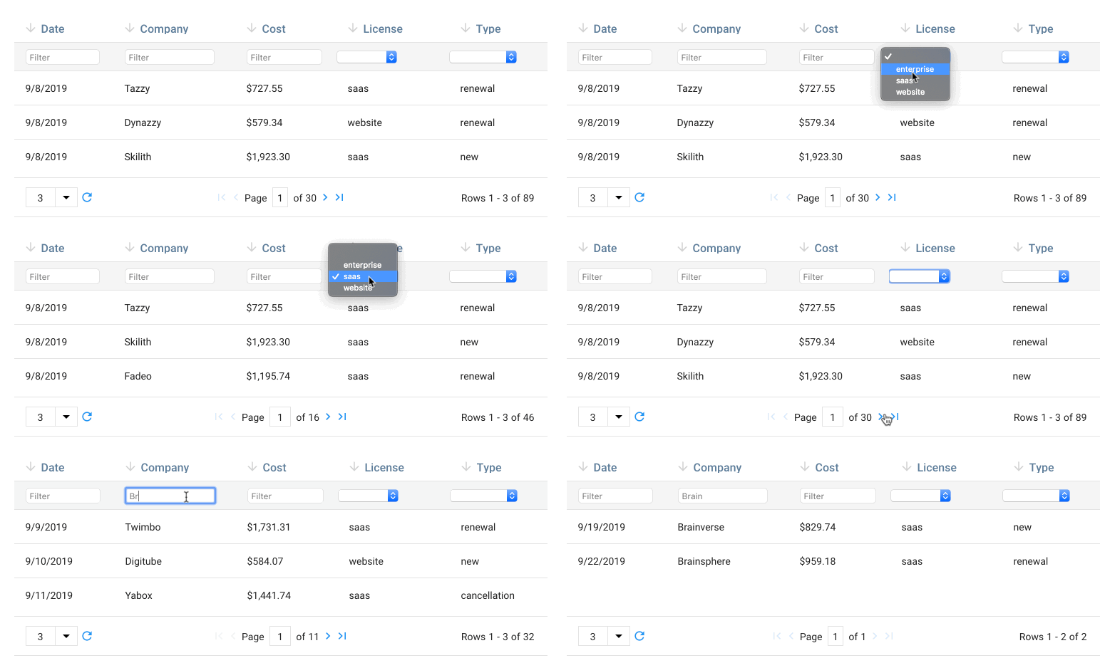
Interactivity with Other Components
Like ZingChart, ZingGrid allows for deep integration to its environment with API methods and events. You can learn more about these in the docs: https://www.zinggrid.com/docs/api-methods
Now that we have a basic understanding of the tools we’re going to utilize, let’s build our dashboard!
Getting Started
For this tutorial, you will need the vue-cli installed on your computer. This will allow us to quickly scaffold, run, and test our dashboard with ease. If you don’t have this cli tool installed, head over to https://cli.vuejs.org/#getting-started to start there.
Once it’s installed, we’ll create a project with our dashboard starter code.
vue create --preset zingsoftinc/vue-dashboard#starter myDashboardAfter this tutorial, you should be familiar with:
- Basic data flow and manipulation in a dashboard
- Creating ZingChart and ZingGrid in Vue
- Communicating across multiple widgets in the dashboard
The starter code contains styling and structure already defined to help you focus on the important highlights of creating your dashboard.
Project Overview
myDashboard/
├── src/
│   ├── App.vue
│   ├── main.js
│   │── data/
│   │  └── transactions.js
│   ├── components/
│   │  ├── LatestTransactionsChart.vue
│   │  ├── TransactionDetailsGrid.vue
└───└──└── TransactionBreakdownChart.vueApp.vue— The root Vue component which contains our dashboardmain.js— The entry point for our Vue applicationcomponents/— Various charts and grids that we will learn how to connect togetherdata/— The dataset that our dashboard will build off of. In future tutorials, we’ll learn how to connect and filter data to remote sources, including databases.
The starter code has three components pre-defined and styled for you. Our focus will be on how to manipulate our dataset to pass data to each component, and to tie-in interactions across those components.
Our Dataset
For this tutorial, we’ll be creating a sales analytics dashboard based on a set of transactions. Our dataset is simply an array of these objects:
{
  "id":1,
  "first_name":"Ketti",
  "last_name":"Latham",
  "email":"klatham0@time.com",
  "company":"InnoZ",
  "amount":"1529.29",
  "timestamp":1554550724000,
  "license_type":"saas",
  "purchase_type":"new"
}
Important attributes :
license_type— Either SaaS, internal, website, or enterprisepurchase_type— Either new, renewal, or cancellation (if the user has opted out from a renewal)
Our Components
We will be focusing on three different components in this tutorial, comprised of ZingChart and ZingGrid.
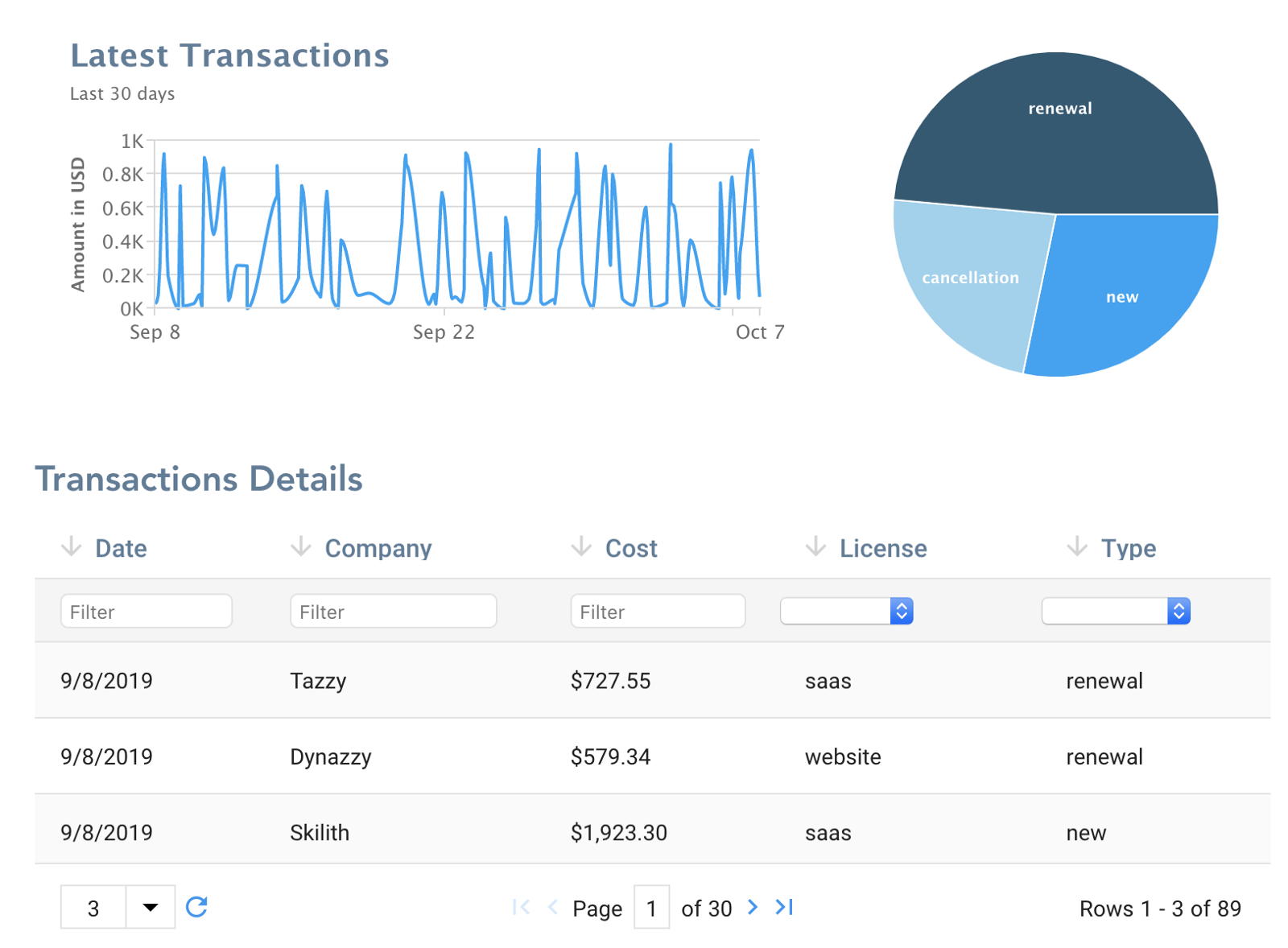
LatestTransactionsChart.vue— A line chart comparing the amount earned in dollars over timeTransactionBreakdownChart.vue— A pie chart breaking down the occurrence of each transaction typeTransactionDetailsGrid.vue— A grid listing each transaction during the period
Step 1: Passing Data to the Components
For our components to render any charts or grids, we need to pass the data to each component individually since specific charts and grids may need to have the data formatted differently.
First, we’ll import our data from the transactions file into our App.vue, along with our chart components. We also register the components in our Vue app to be used.
// App.vue
<script>
  import transactions from './data/transactions.js';
  import LatestTransactionsChart from "./components/LatestTransactionsChart.vue";
  import TransactionBreakdownChart from "./components/TransactionBreakdownChart.vue";
  import TransactionDetailsGrid from "./components/TransactionDetailsGrid.vue";
export default {
    name: 'app',
    // Register the components to be used
    components: {
      LatestTransactionsChart,
      TransactionBreakdownChart,
      TransactionDetailsGrid,
    },
    data() {
      return {
        transactions,
      }
    }
  }
</script>
Then we’ll pass the transactions object into each of our three components.
// App.vue
<template>
  <div id="app">
    <section class="dashboard">
      ...
      <div class="dashboard__row">
        <latest-transactions-chart ref="latestTransactions" :entries="transactions"/>
        <transaction-breakdown-chart ref="transactionBreakdown" :entries="transactions"/>
      </div>
      <div class="dashboard__row">
        <transaction-details-grid :entries="transactions"/>
      </div>
    </section>
  </div>
</template>
Let’s dive into each of our three components to manipulate the data to render out a chart or a grid.
Latest Transactions Chart
For the “Latest Transactions Chart”, we need to format our transactions array into a single dimensional array containing a pair of values: the timestamp, followed by the dollar amount for each transaction.
// LatestTransactionsChart
<template>
  <zingchart :data="chartConfig"></zingchart>
</template>
<script>
  export default {
    props: ['entries'],
    computed: {
     values() {
        return this.entries.map(o => {
          return [o.timestamp, parseFloat(o.amount.slice(1,-1))]
       });
     },
     chartConfig() {
       ...
       series: [{
         values: this.values,
       }],
       ...
     },
    },
  }
</script>
We write both the values and chartConfig as computed properties rather than data so we can automatically track any changes that occur to the data from the parent App.vue component.
Transaction Breakdown Chart
Similarly for our “Transaction Breakdown” Chart, we need to format the data as an array of objects, with each value containing the total value of the transaction types. ZingChart will calculate the overall percentage for us, but we’ll need to do a bit of summations over the transactions:
// TransactionBreakdown
<template>
  <zingchart :data="chartConfig"></zingchart>
</template>
<script>
  export default {
    props: ['entries'],
    computed: {
     values() {
      const categories = this.entries.reduce((acc, transaction) => {
        acc[transaction.purchase_type] = acc[transaction.purchase_type] || 0;
        acc[transaction.purchase_type]++;
        return acc;
      }, {});
      return Object.keys(categories).map((name) => {
        return {
          values: [categories[name]],
          text: name
        }
      })
     },
     chartConfig() {
const colors = [
        {
          backgroundColor: '#04A3F5',
          hoverState: {
            backgroundColor: '#45D6C4'
          }
        },
        {
          backgroundColor: '#98D1EE',
          hoverState: {
            backgroundColor: '#45D6C4'
          }
        },
        {
          backgroundColor: '#295A73',
          hoverState: {
            backgroundColor: '#45D6C4'
          }
        },
      ];

       ...
        series: this.values.map((o,index) => Object.assign(o, colors[index])),
       ...
},
    },
  }
</script>
Transaction Details Grid
As for the “Transaction Details” Grid, ZingGrid natively accepts an array of objects so all we have to do is pass the data!
<transaction-details-grid :entries="transactions"></transaction-details-grid>Step 2: Adding an External Component to Control Our Data
If all went smoothly, you should see the charts and grids populated with a full year’s worth of transactions. But what if we only wanted to view a month’s view of transactions? We would need to control our data at the App level to do so.
We will be adding an additional library to help us select dates via a calendar component:


First let’s install the library to our project:
$ npm i v-calendar
And add the following lines to our main.js, just before the new Vue constructor is invoked.
import VCalendar from 'v-calendar';
Vue.use(VCalendar);
Inside of our App.vue file we’ll need to add a new field in our data object to keep track of the start and end dates that the calendar is displaying. We will default to showing the current month’s transactions.
data() {
    return {
      transactions,
      range: {
        start: new Date().setDate(1),
        end: new Date()
      }
    };
  }
We will be using the range property to control both the start and end dates with one widget. Next, we’ll add the v-calendar component to our template, binding both the start and end dates to our new data fields.
<header>
  <h4>Date Range</h4>
  <v-date-picker mode="range" v-model="range"/>
</header>
A new computed property called filteredTransactions will be needed to return a subset of the transactions, based on the date range.
computed: {
    filteredTransactions() {
      return this.transactions.filter(entry => {
        return (
          entry.timestamp >= this.range.start.getTime() &&
          entry.timestamp < this.range.end.getTime()
        );
      });
    },
...
Finally, we’ll update all the components to accept the new filtered date range:
<template>
  <div>
    <latest-transactions-chart :entries="filteredTransactions"></latest-transactions-chart>
    <transaction-breakdown-chart :entries="filteredTransactions"></transaction-breakdown-chart>
    <transaction-details-grid :entries="filteredTransactions"></transaction-details-grid>
  </div>
</template>
The charts and grids should now show a subset range of the transactions! This also demonstrates how data modeling works in Vue: one-way reactivity from the parent to its children.
Step 3: Adding Interactions Between the Components
Our dashboard is looking more complete, but to take it a step further we can add shared interactivity between the components. Both ZingChart and ZingGrid come with rich API Methods and Events, from reacting to MouseEvents to modifying state from external methods.
We will be demonstrating how to control mouseover events from ZingGrid to highlight the same entry in both our Latest Transactions and Transaction Breakdown Charts.
To begin, we need to listen for ZingGrid’s row mouseover event. ZingGrid calls this a record:mouseover event. We perform this in the component’s mounted() lifecycle callback once the grid has finished rendering.
// TransactionDetailsGrid.vue
mounted() {
    // Attach an event listener to ZingGrid
    this.$refs.myGrid.addEventListener('record:mouseover', (e) => {
      this.$emit('mouseover', e);
    });
  }
Since we have encapsulated each of our chart and grid components in their own respective components for code clarity, we need to emit this event back up into our App.vue parent component.
Back in our App.vue file, we need to delegate the mouseover event from ZingGrid to our children charts.
First, we define a callback that the mouseover event should listen to.
// App.vue
<transaction-details-grid @mouseover="handleEntryHover"></transaction-details-grid>
In our new method handleEntryHover, we reference both our charts and call on the ZingChart methods that are available thanks to the zingchart-vue component.
methods: {
  handleEntryHover(e) {
    // Obtain references to the charts
    let latestTransactions = this.$refs.latestTransactions;
    let transactionBreakdown = this.$refs.transactionBreakdown;
  }
}
Since ZingGrid emits CustomEvents, the information that we need will be under e.detail. Inside, we see a rich amount of information about the grid and the event.
For our Latest Transactions chart, we want a guide to appear on the chart when the user hovers over the corresponding row in our grid. To do so, we need to call the chart’s setguide method and pass it an object containing the specific keyvalue (x-axis value), or in this case, the timestamp.
// Set our guide corresponding to the correct timestamp
latestTransaction.setguide({
  keyvalue: e.detail.ZGData.data.timestamp
});
For our Transaction Breakdown chart, we will need to determine the row entry’s purchase_type and the corresponding index that the data is defined when we created the chart.
We utilize the getseriesdata method of the chart to obtain the data used to create the chart to find the index. Once found, we then call the showhoverstate to change the pie slice color to highlight the entry in focus. Recall that the data format of the pie chart is an array of a single entry. The showhoverstate method requires a nodeindex so we default at 0.
const indexInFocus = transactionBreakdown
  .getseriesdata()
  .findIndex(o => o.text === e.detail.ZGData.data.purchase_type);

transactionBreakdown.showhoverstate({
  plotindex: indexInFocus,
  nodeindex: 0
});
All together:
handleEntryHover(e) {
  // Obtain references to the charts
  let latestTransactions = this.$refs.latestTransactions;
  let transactionBreakdown = this.$refs.transactionBreakdown;
// Set our guide corresponding to the correct timestamp
  latestTransaction.setguide({
    keyvalue: e.detail.ZGData.data.timestamp,
  });
// Highlight the pie slice in focus
  const indexInFocus = transactionBreakdown
    .getseriesdata()
    .findIndex(o => o.text === e.detail.ZGData.data.purchase_type);
  transactionBreakdown.showhoverstate({
    plotindex: indexInFocus,
    nodeindex: 0
  });
}
And there you have it! Interactions across ZingGrid and ZingChart.
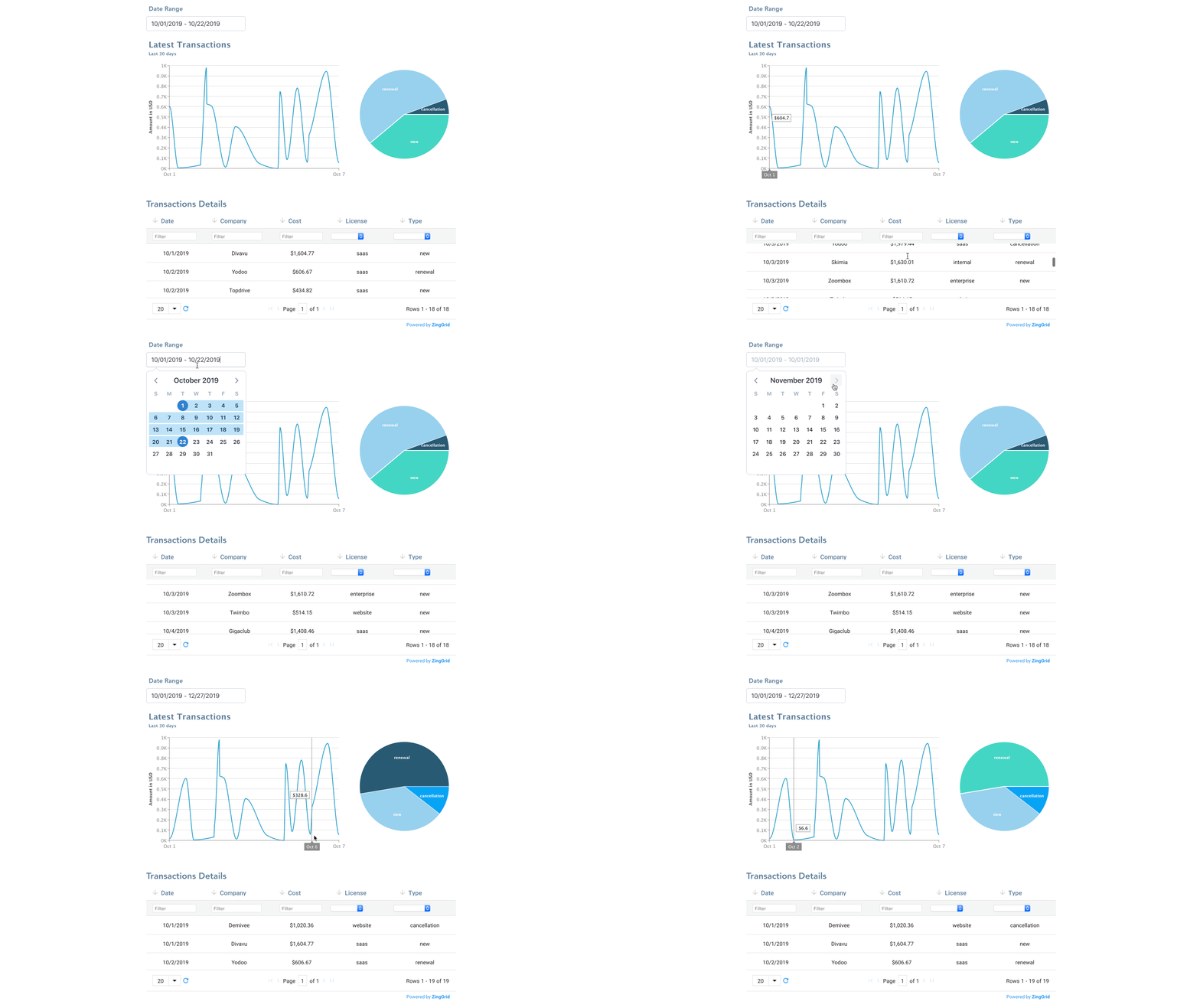
Check out a completed, working example of this Vue dashboard in the master branch of our starter code at https://github.com/zingsoftinc/vue-dashboard and at https://glitch.com/~vue-dashboard-starter
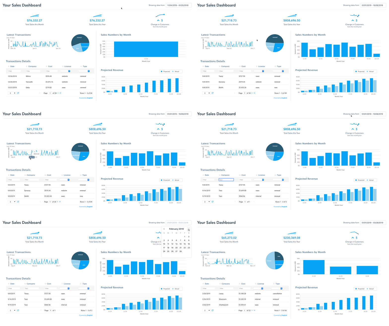
We took our example a step further and created a sales dashboard with custom sparklines and more interactions and features. You can check out a working example and the code for it here: https://glitch.com/~vue-dashboard
Next time, we’ll show you how to connect a live database, to search, filter, and query directly from your dashboard.
To be notified of future articles in this series, follow us on Twitter!

A pioneer in the world of data visualization, ZingChart is a powerful JavaScript library built with big data in mind. With over 35 chart types and easy integration with your development stack, ZingChart allows you to create interactive and responsive charts with ease.