Hey hey! It has now been a few weeks since I have put together a tutorial for you guys! I just recently worked with Bootstrap for a small landing page project, which sparked the idea to put together a Bootstrap admin template for you with some charts!
Like every tutorial, I try to keep it brief and informative to inspire a few ideas for usage! So this will just be a simple admin dashboard layout for you to branch off of!
Bootstrap Admin Dashboard
We have noticed a lot of our users have their own admin dashboards running with ZingChart. This seems to be the way a lot of companies are building the basis of their reporting and results. Bootstrap is a useful framework for putting together front-end web design projects fast.
This quick demo took me about an hour to put together with charts included, so Bootstrap is definitely really efficient to work with.
Note: You will need to load in the Bootsrap CDN link to your HTML <head> tags before beginning!
Bootstrap Grid System
Let's jump right in! The Bootstrap grid system is the basis of building out an admin template. It is based on three elements: the "container" <div>, the "row" <div>, and the "col" <div>.
These are actually three web components that Bootstrap has put together. That have inherent properties within them. Together they form the basis of the very popular Bootstrap grid system.
Most of these components are housed within a <div> that is given a Bootstrap specific class name. This comes with its own built-in attributes. It is similar to giving your regular <div> elements classes, except these come with some properties built in! Pretty cool!
"Container"
This is a very common class used in web development that is used for the same purpose in Bootstrap. The "container" <div> holds all of the content together. Very simple, very intuitive.
"Row"
"Row" is another component as well. This div just adds one horizontal row for all of your column components to be housed in. You can have multiple rows in one container based on the type of layout you want.
"Col"
The "column" component is essentially the main make-up of the Bootstrap grid system. This is where all of the functionality is placed. There is a small amount of math and logic that applies here, but it is quick to pick up.
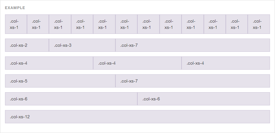
The system is based on the ability to house 12 columns across your "row". You can choose any combinations of numbers 1-12 that together, add up to 12.
There are also different sized columns to choose from. They come in extra-small, small, medium, and large. This dictates the width of your "columns" within the "row". Here are examples of the column class syntax:
-
Extra Small:
<div class="col-xs-4"></div>. -
Small:
<div class="col-sm-4"></div>. -
Medium:
<div class="col-md-4"></div>. -
Large:
<div class="col-lg-4"></div>.
Grid Example
Here is a visual below to show you how this grid system works! It is showing the system behind extra small columns.
Dashboard
Cool! You now have a brief rundown. Let's build out this dashboard! This will be comprised of two chart sections, a navbar, and a sidebar panel- just the pure essentials of a simple admin page.
Navbar
The navbar I used in this demo was the default Bootstrap navbar-default class. The <ul> contains another Bootstrap component for the navbar with some simple <li>. It also contains a "navbar-header" div where your logo would normally go (I chose to just place text link).
You can do a number of different things here, but I kept it pretty basic and put in some small CSS changes like background color and font. Other than that, the code is pretty basic. Here it is below:
<nav class="navbar navbar-default">

  <div class="navbar-header">

    <a class="navbar-brand" href="#">ZingChart.com</a>

  </div>

  <ul class="nav navbar-nav">

    <li class="active"><a href="#">Admin</a></li>
    <li><a href="#">Gallery</a></li>
    <li><a href="#">Docs</a></li>
    <li><a href="#">Blog</a></li>

  </ul>

</nav>
Sidebar Panel
The sidebar panel is also another feature Bootstrap has a component for. I used the panel panel-default class for this. Within this panel-default are components for panel-heading and panel-body, which I used. These just contain links. Here is the code below:
<div class="panel panel-default">

        <div class="panel-heading">
          <a href="#">Dashboard</a>
        </div>

        <div class="panel-body">
          <a href="#">Messages</a>
        </div>

        <div class="panel-body">
          <a href="#">Widgets</a>
        </div>

        <div class="panel-body">
          <a href="#">Analytics</a>
        </div>

        <div class="panel-body">
          <a href="#">Forms</a>
        </div>

      </div>
Columns
The columns are the next thing I added. This dashboard was (loosely) inspired by a shot I saw on Dribbble. I needed to set up a column grid system with three individual panels. Bootstrap makes this very easy with their responsive columns.
I wanted one smaller sidebar, one main chart that takes up a lot of space, and a set of three charts that makes up the rest. I figured the sidebar could be a col-xs-2, the main chart could be a col-xs-6, and the last set of charts could be a col-xs-4.
I used the extra-small columns here so it would fit within the iframe on this blog post. For standard web design, you should most likely use medium columns! Here is the set up of the code:
<div class="container">

  <div class="row">

    <div class="col-xs-2">

      <div class="panel panel-default">

        <div class="panel-heading">
          <a href="#">Dashboard</a>
        </div>

        <div class="panel-body">
          <a href="#">Messages</a>
        </div>

        <div class="panel-body">
          <a href="#">Widgets</a>
        </div>

        <div class="panel-body">
          <a href="#">Analytics</a>
        </div>

        <div class="panel-body">
          <a href="#">Forms</a>
        </div>

      </div>

    </div>

    <div class="col-xs-6">

      <div id='myChart'></div>

    </div>

    <div class="col-xs-4">

      <div id='myChart1'></div>

    </div>

  </div>

</div>
Here is the full functioning dashboard below!
ZingChart
I used ZingChart within this Bootstrap admin dashboard. I won't go too much into the creation of these charts (you can see check the "JS" tab to see). However, there are two things here that are vital to using the charts on this page.
-
You need to give the charts individual ID names and render names for them to both render on the page (common mistake).
-
If you give them a
heightandwidthof 100%, they will be truly responsive as the built-in Bootstrap components are (these components are inherently built to respond to different device sizes). -
If you want stacked charts in one
<div>you can use a graphset!
Data Sources
If you are in the process of creating an admin dashboard, you will definitely be pulling some of your data into this. ZingChart offers some pretty extensive docs on how to do this:
Conclusion
Right on! We now have the basis for a very basic Bootstrap admin dashboard! I hope you have more than enough information to get going on one of your own projects!
If you have any additional questions, post a comment below. Or, you can reach us through chat on our website!