The bubble pie chart is the latest addition to the ZingChart JavaScript charting library. Designed to display multi-variable data, this chart type is a combination of a bubble chart and a pie chart. Now you can:
-
Visually compare the sizes of different bubble values
-
Further analyze those values by sub-sections, or slices
-
Compare those slice values across all of your bubble pies
Until now, the only way to make this chart was in Microsoft Excel. This new bubble pie module is another unique chart type found exclusively in ZingChart. And like most charts, it only takes a few steps to make your own. But you might be wondering, “When would I even use this type of chart?” We have a few use cases to share.
Bubble Pie Chart
Bubble pie charts are a type of chart known as a compound chart. They combine the comparison features of a bubble chart with the segmentation features of a pie chart.

Bubble Pie Charts in The Real World
When would you use a bubble pie chart in real life? Bubble pie charts work best when you have data that you want to further breakdown into sub-groups or categories… all in one chart. You could also use the chart drilldown feature to visualize this type of data.
For example, you could show total average income, spending, exports, imports, or other data in a country or region. Then, that total could be further broken down by category to display as slices of a pie.
Bubble Pie Chart Examples
Tracking Consumer Spending
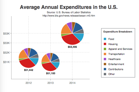
In the above example, the bubble pie chart displays average expenditures per consumer unit in the U.S. in 2012, 2013, and 2014. Those expenditures are further broken down into categories such as food, housing, and healthcare.
The bubble size values represent the total average expenditures for each year, and the pie slice values represent the different expenditure types.
A chart title and subtitle were added to explain what the chart was visualizing and the source of the data. The legend styled to the right of the chart area allows users to quickly identify the expenditure type for each pie slice.
Lastly, value boxes and tooltips provide further clarification, allowing users to combine ZingChart tokens with their own custom text.
Visualizing Survey Results
This demo tracks consumer sentiment over a period of five years, with bubble size reflecting the number of survey respondents. The pie charts allow the user to easily see the results of each year’s survey.
How to Make a Bubble Pie Chart
Our bubble pie chart is specified by the type attribute value: bubble-pie. Since bubble pies are not one of our core chart types, they require special modules to properly load:
-
A modules script in the document and
-
A load modules method that wraps around your render method(s) in the document.
Next, you can provide your bubble pie chart data. This consists of two parts: first, you’ll provide your bubble chart data (the bubble size values, and their placement on the x/y-axes), and second, you’ll provide your pie chart data (the pie slice values for each of your bubble pies).
See our new Bubble Pie Charts Documentation page for more detailed information on how to put together, customize, and style your bubble pie chart.
Bubble Pie Chart Best Practices
The key to making bubble pie charts that are also good data visualizations lies in paying attention to a few things:
-
Do not use too many slices in your pie. While many slices is a good thing with dessert pies, in dataviz it can be hard to compare the sizes of these segments when there are too many.
-
Make sure your bubbles are distinguishable. If they are close in size, consider using value labels, as seen in our example.
-
Double check the bubble volumes to ensure they are not distorted. In real life, bubble radii can increase quickly. So it is worth checking your data to make sure these are scaling properly.
What Comes Next?
Now that we’ve added bubble pie charts to our JavaScript charting library, what would you like to see next? We’d love to hear your comments about using bubble pies, or what additional features would be helpful in your charting applications.