Handling large datasets can be a daunting task. When facing thousands, tens of thousands, or even hundreds of thousands of data points, you must decide the best way to represent this data in a concise, easily interpretable way.
The ZingChart team faced this exact challenge after collecting information on every Olympic athlete that has competed in the Summer and Winter Olympic Games since their inceptions. Read on to see how we used our new box plot module to hurdle over this obstacle.
Box Plot Overview
The box plot is also known as:
- Box diagram
- Box-and-whisker plot
- Box graph
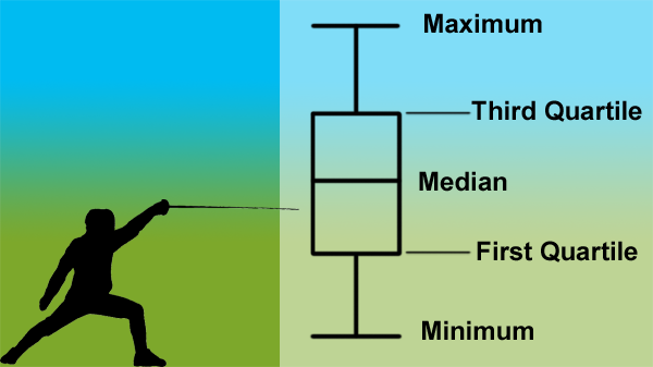
Box Plot
In the world of data visualization, the box plot is a relatively new type of graph. It is useful for condensing large sets of data down into an elegant, simple chart. The box segment consists of the first quartile (25th percentile or Q1), the median (50th percentile or Q2), and the third quartile (75th percentile or Q3). Together, these values make up the midspread of the data set, or 50% of the values. This is fairly standard across box plot implementations.
The whiskers of a box plot tend to have a larger level of variation in terms of what they represent. Among charts that do not utilize outlier values, whiskers will extend to the minimum and maximum values of the dataset.
Charts that choose to include outliers may have whiskers that extend to the 1st and 99th percentiles, to the 5th and 95th percentiles, to the 10th and 90th percentiles, or to the lowest and highest value within the lower and upper fences, determined by the interquartile range (IQR). The IQR is 1.5 times that of the 75th percentile minus the 25th percentile, or 1.5 * (Q3 – Q1).
In other words, the IQR amounts to boundaries that extend out 1.5 times the box width on both ends. The whiskers are then drawn to extend to the minimum and maximum points that fall within these boundaries. When used in this way, the box plot may be called a Tukey box plot, in reference to the creator of the box plot chart, John Tukey.
If you want to learn more about reading box plots, there is a great tutorial for understanding box plots at Khan Academy.
Our Big Data Set
Using Scrapy, an open source web scraping framework written in Python, we collected our data from Sports Reference's Olympic athlete information pages. Thanks to the uniformity of the data on that site, collecting the data was a breeze. We gathered information on every Olympic athlete that has competed in the Games since the inception of the modern games under the auspices of the International Olympic Committee, going back to the 1896 Summer and 1924 Winter Games.
When all was said and done, there was an enormous amount of data that had been collected. Our initial file amounted to nearly 40 megabytes of pure, unadulterated data. For each athlete, we collected the following:
- Full name
- Date of birth
- Gender
- Height
- Weight
- Country
- Games they competed in
- The age at which they competed
- The sport played in the games
As is usually the case with large datasets, we had to do quite a bit of data massaging to get the pertinent data into the form expected by the ZingChart box plot module. (Check out our previous post on data massaging if you want to read more on that topic!)
Using the date of birth, gender, games competed in, and the athlete’s sport, we’ve created this box plot chart showing the age distribution of Olympic athletes by sport and gender for each year of the Olympic Games:
Can you tell which sports have a greater disparity in age? We see a lot of value in the dataset that we collected, and will likely use other portions of the set in the future.
What data have you used a box plot to visualize? We’d love to hear about some other real-world uses for box plot charts.
Box Plots in ZingChart
We’re excited about the introduction of the box plot module into our library, and look forward to adapting the module to accommodate the needs of our users. To get started with box plots, check out how a box plot’s values are defined:
“series”: [
	{
	   “data-box”: [ [<Lower Whisker>, <Q1>, <Median>, <Q3>, <Upper Whisker>] ],
	   “date-outliers”: [ [<Index>, <Outlier Value>] ]
        }
]
Styling of the individual elements of the box plot is handled within the appropriate object in the chart JSON's options object:
| **Object** | **Description** |
|---|---|
| box | Accepts styling attributes to style the box section of the box plot. |
| outlier | Accepts styling attributes to style the outlier markers |
| line-median-level | Accepts styling attributes to style the Q2(M) line object. |
| line-min-level | Accepts styling attributes to style the line at the minimum value. |
| line-min-connector | Accepts styling attributes to style the whisker that connects the box plot and the minimum value line object. |
| line-max-level | Accepts styling attributes to style the line at the maximum value. |
| line-max-connector | Accepts styling attributes to style the whicker that connects the box plot and the maximum value line object. |
Summary
There are a number of improvements in the works for the box plot module, but the module is available now for you to get started with! To get your own copy, head on over to our try page or visit our CDN.
Also, please leave us a comment below to share your box plot ideas. What sort of data are you using for box plots? Which additional features would you like to see added?