Hey what's up? Today we are going to teach you how to make responsive JavaScript charts for mobile devices. A lot of our customers make web and mobile apps so the demand for responsive and functional mobile charts is high. Thus, the reason for this tutorial!
Alright! Let's run through building mobile charts with ZingChart. Along the way, I will provide you with some practical use-cases and all the key attributes necessary for construction.
In order to make mobile specific charts, you will need to use our mobile plug-in. This plug-in uses ZingTouch, which has seen some pretty big success around the web this past month.
ZingTouch is an accurate mobile gesture detection library built with JavaScript. It makes for responsive and fluid charts, which will make for an awesome experience!
Key Features:
- An easy-to-use hamburger nav bar, where you can choose to save or share your charts easily. (The hamburger nav bar is visible by default)
- Enhanced zooming that amplifies the interactive nature of our charts (this is my personal favorite feature).
- Easy scrolling along the x and y-axis. This really helps if you want to present larger data sets on mobile. It makes it easy to navigate through your data with a simple swipe gesture.
- Fun and interactive pie charts! The pieces rotate and can be swiped easily. The pie pieces themselves reduce the need for a legend or tool-tip.
Supported Chart Types:
Getting Started
Tip: Check the "JavaScript" tab of the example charts to see the full code used!
In order to get started using our mobile plug-in, you need to insert your ZingChart and ZingChart mobile plug-in links into the header of your HTML.
<head>

   <!--Assets will be injected here on compile. Use the assets button above-->
   <script src= "https://cdn.zingchart.com/zingchart.min.js"></script>
   <script> zingchart.MODULESDIR = "https://cdn.zingchart.com/modules/";
ZC.LICENSE = ["569d52cefae586f634c54f86dc99e6a9","ee6b7db5b51705a13dc2339db3edaf6d"];
   </script>
   <!--Inject End-->

   <!--ZingChart Mobile-->
   <script src="https://cdn.zingchart.com/zingchart.min.js"></script>
   <script src="https://cdn.zingchart.com/modules/zingchart-mobile.min.js"></script>
   <link rel="stylesheet" href="https://cdn.zingchart.com/modules/zingchart-    mobile.min.css">
   <!--ZingChart Mobile End-->

</head>
Use Cases
Sweet, now that we have inserted our libraries, we can start producing charts. You can make changes to your charts like you would normally do within ZingChart via JSON attributes. If you need a refresher on that, check out our docs page!
Big Data, Small screen
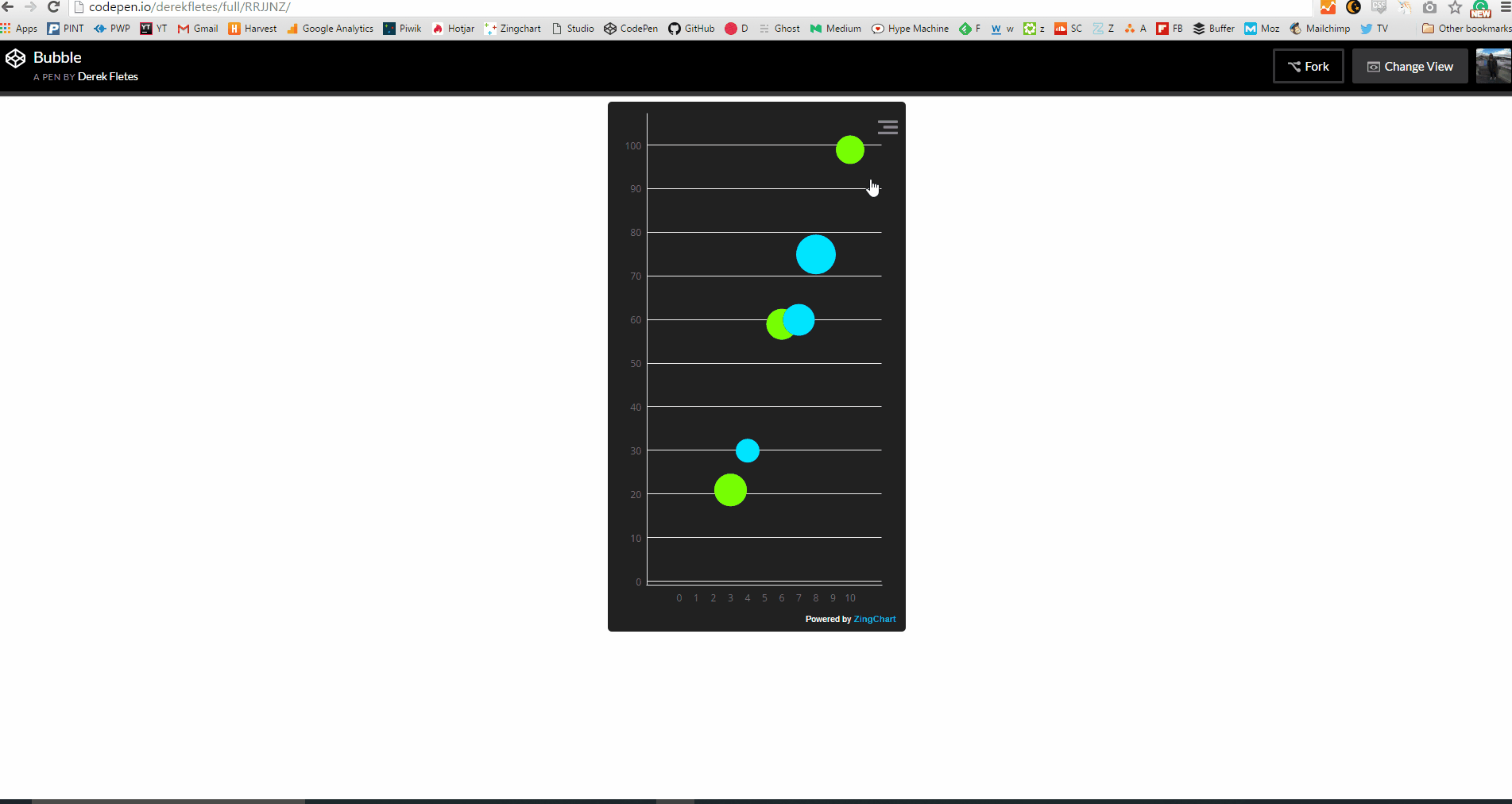
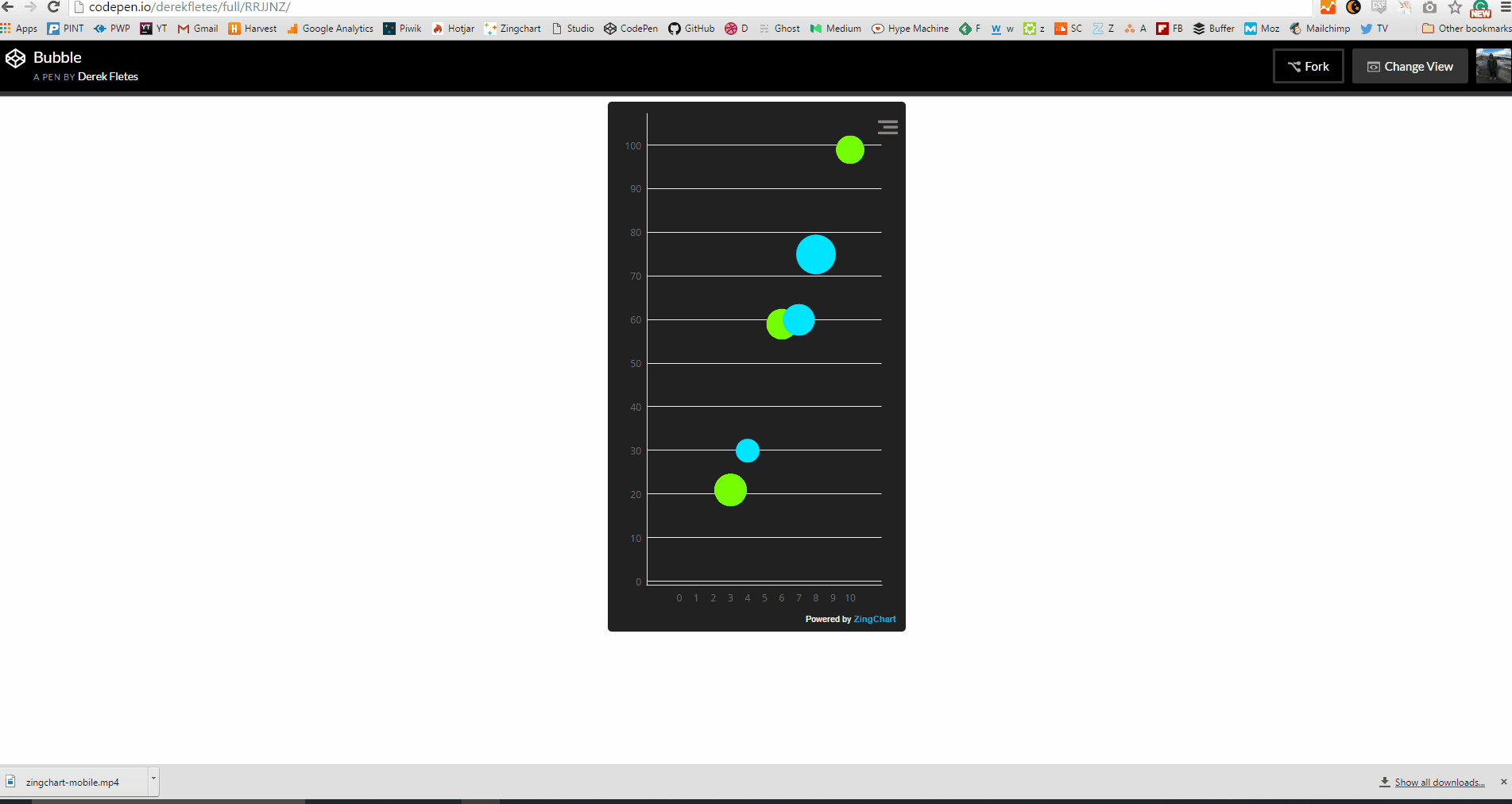
Oftentimes, mobile charting is limited in the datasets it can visualize. There's not a lot of space on the screen to exhibit data points.
ZingChart's mobile plug-in helps you get around that by implementing a scroll bar along the x and y-axis!
This scrolling feature, paired with zooming the x and y, allows the user to easily navigate through the data easily and efficiently.
How-To:
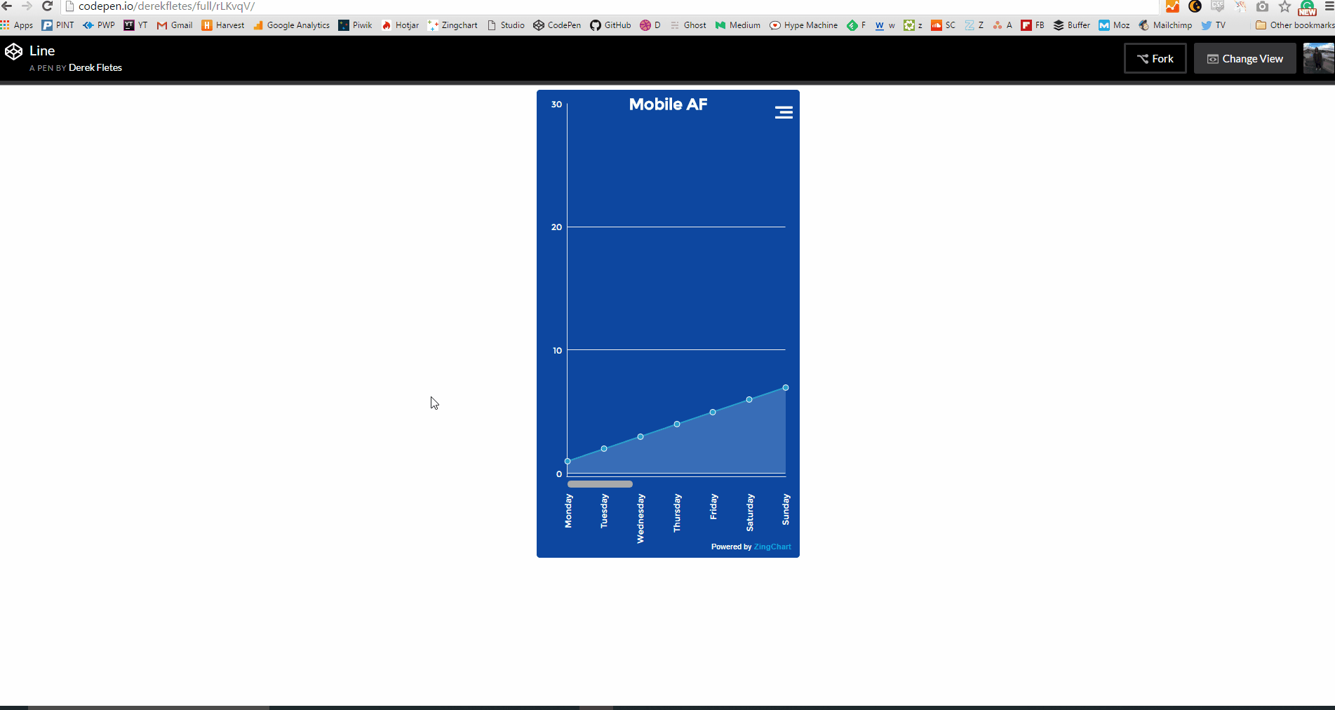
There's going to be some additional code I won't talk about used for styling. Ignore that and just focus on the attributes I mention for responsiveness. There will be three fundamental elements of your code that will be needed to achieve scrolling. That will be scrollX, scaleX, and scrollY. Here is the code below:
var myConfig = {
 	type: 'area',
 	title: {
 	  text: 'Mobile AF'
 	},
 	globals: {
 	  fontFamily: 'Montserrat',
 	  color: 'white',
 	},
 	backgroundColor: '#0D47A1',
 	options: {
 	  contextMenu: {
 	    button: {
 	      open: {
 	        lineColor: 'white'
 	      },
 	      close: {
 	        lineColor: 'white'
 	      }
 	    }
 	  }
 	},
 	plotarea: {
 	  margin: 'dynamic'
 	},
 	scaleX: {
 	  labels: ['Monday', 'Tuesday', 'Wednesday', 'Thursday', 'Friday', 'Saturday', 'Sunday','Monday', 'Tuesday', 'Wednesday', 'Thursday', 'Friday', 'Saturday', 'Sunday','Monday', 'Tuesday', 'Wednesday', 'Thursday', 'Friday', 'Saturday', 'Sunday'],
 	  zoomTo: [0,6],
 	  item:{
 	    fontAngle: -90
 	  }
 	},
 	scrollX:{
 	  bar:{
 	    height: 15,
 	    backgroundColor: '#0D47A1',
 	    borderWidth: 0,
 	    alpha: 0
 	  },
 	  handle: {
 	    height: 10,
 	    alpha: 4
 	  }
 	},
 	scaleY: {
 	  _values: '0: 20000: 5000'
 	},
	series : [
		{
			values : [1,2,3,4,5,6,7,8,9,10,11,12,13,14,15,16,17,18,19,20,21],
			backgroundColor: '#BBDEFB'
		}
	]
};
zingchart.render({
	id : 'myChart',
	data : myConfig,
});
As you see in the code, there's not really much to this chart (that's good for you). scaleX is used to make changes to the x-axis (specifically scrolling), scaleY is used to make changes on the y-axis, and zoomTo keeps the chart focused on the values you define. Here is the finished product below.
Implementing Zoom
Zooming is an integral part of mobile charting. Our plug-in is an improvement on the ZingChart native zooming system. It allows for a user to explore data quickly and efficiently. So let's teach you how to do that too!
How-To
This one is actually pretty easy. All you need to do is add:
scaleX: {
 	  zooming: true,//allows for zooming on the x-axis
 	  values: '0:10:1'
        }
AND
scaleX: {
 	  zooming: true,//allows for zooming on the x-axis
 	  values: '0:10:1'
        }
This gives you the ability to zoom along both the x and y-axis now. Here's the example:
Interactive Pie
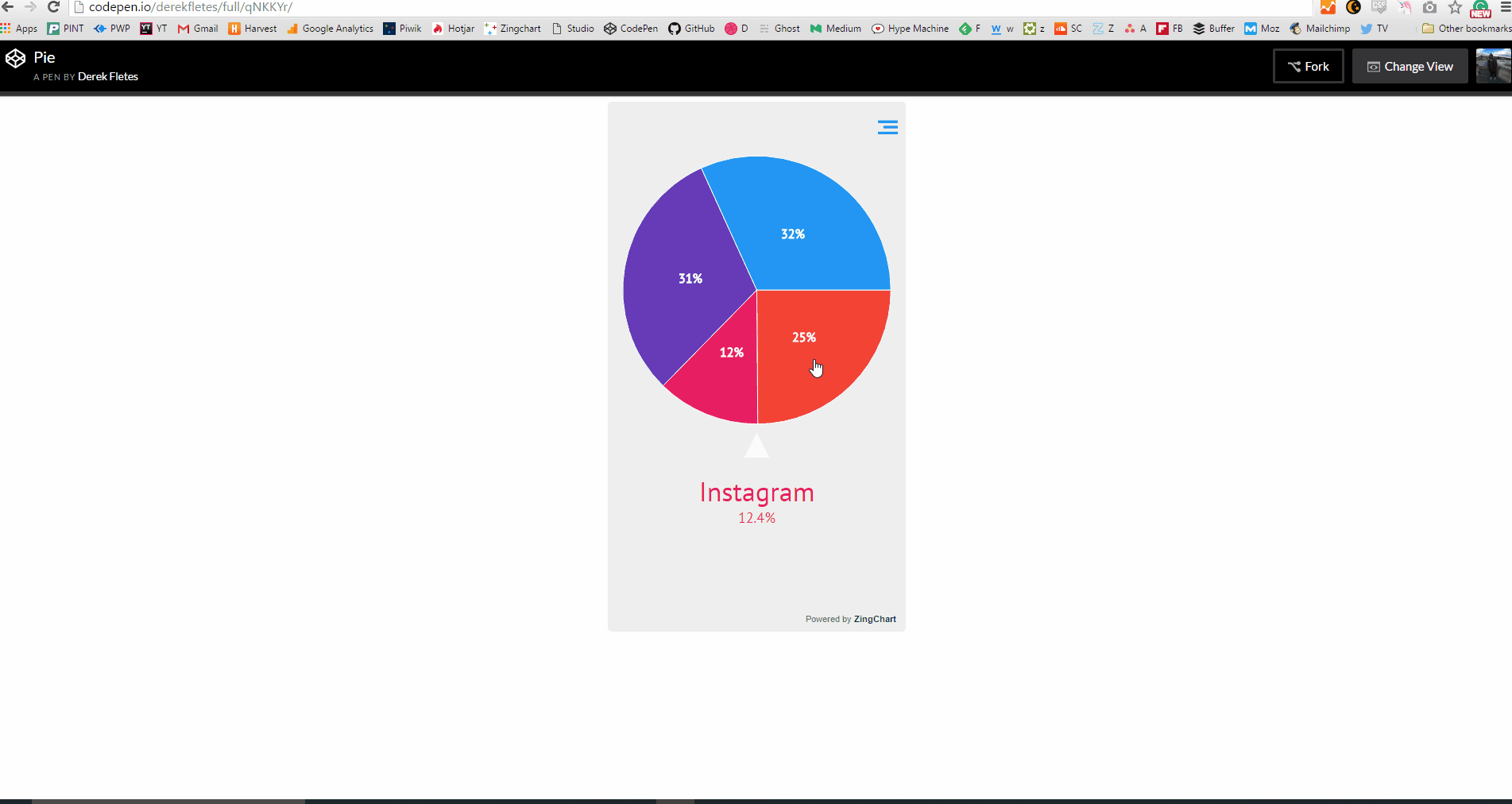
User experience is always important. ZingChart pie charts were updated in this new plug-in to add a little extra to the user experience. You can interact through a simple swipe or touch.
All of the functionality is already there for you! So, check the code below to see how to produce a very basic mobile pie chart!
var myConfig = {
 	type: 'pie',
  backgroundColor: '#EEEEEE',
 	globals: {
 	  fontFamily: 'PT Sans'
 	},
 	options: {
 	  contextMenu: {
 	    button: {
 	      open: {
 	        lineColor: '#2196F3',
 	      }
 	    },
 	  },
 	  mobile: true,
 	  indicator: {
      title: {
        fontSize: 34,
        fontFamily: 'PT Sans'
      },
      npv: {
        decimals: 1,
        fontSize: 18,
        fontFamily: 'PT Sans'
      },
      value: {
        visible: false
      }
    }
 	},
	series : [
		{
			'values': [54],
			backgroundColor: '#F44336',
			  text: 'Snapchat'
		},
		{
		  'values': [27],
		  backgroundColor: '#E91E63',
			  text: 'Instagram'

		},
		{
		  'values': [67],
		  backgroundColor: '#673AB7',
			  text: 'Twitter'
		},
		{
		  'values': [69],
		  backgroundColor: '#2196F3',
			  text: 'Facebook'
		}
	]
};

zingchart.render({
	id : 'myChart',
	data : myConfig,
});
Here's the example below:
Right on! I think you have enough information to start making your own mobile charts! Use these examples as a guide and go make some charts!

Let us know if you have any questions! You can reach us through support (we would love to chat with you) or via our Twitter @zingchart! Our docs page also has a mobile plug-in section if you want more info! Or, if you want some news and tutorials, subscribe to our newsletter below!