UPDATE:
Our team’s constant improvements and additions to ZingChart are great for users looking for the largest selection of features and options. But sometimes it means our “how-to” blog posts could use a little updating.
In order to make our older and highly viewed how-to posts more helpful, we are updating the Beginner’s Guide series. Updates include the most recent version of the syntax, which makes it even easier to use the cool styling capabilities of ZingChart. Follow the new tutorial series if you're interested in getting a substantial overview of using the ZingChart library.
Welcome back ZingCharters!
Our last tutorial Adding Chart Elements covered some of the basics in adding new elements to your charts.
In this tutorial, we are going to cover some of the basics of how to use objects and attributes to style your charts. ZingChart provides the ability to change the look and feel of your charts in just about every way.
This allows you to make your charts fit the user interface as well as the theme of your application. It also allows you to control the feel of your charts and provide the needed visual characteristics to represent your data in the right way.
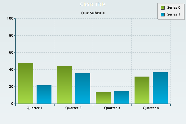
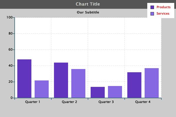
Here is where we left off with our chart last time:
{
	"type":"bar",
		"title":{
   			"text":"Chart Title"
		},
		"subtitle":{
    		"text":"Our Subtitle"
		},
		"legend":{

		},
		"scale-x":{
    		"values":["Quarter 1","Quarter 2","Quarter 3","Quarter 4"]
		},
		"scale-y":{
			"values":"0:100:20"
		},
		"series":[
   			{
        	"values":[48,44,14,32]
   			},
    		{
        	"values":[22,36,15,37]
    		}
		]
}

Background Color
This is a pretty good starting point. But let’s make some general changes to how the chart looks. We can start by changing the colors of the chart. Again, we are going to work with objects and attributes to change how certain parts of our chart looks.
One part of the chart we can change is the title. Maybe it is in a good spot, but the big blue bar does not fit with the feel of your application. Let’s start by changing that. First thing we are going to do is add the “background-color”: attribute to our “title”:{ }, object.
{
	"type":"bar",
	"title":{
		"text":"Chart Title",
		"background-color":"#555"
	},
	"subtitle":{
		"text":"Our Subtitle"
	},
	"legend":{

	},
	"scale-x":{
		"values":["Quarter 1","Quarter 2","Quarter 3","Quarter 4"]
	},
	"scale-y":{
		"values":"0:100:20"
	},
	"series":[
		{
		"values":[48,44,14,32]
		},
		{
		"values":[22,36,15,37]
		}
	]
}
You will notice while working with ZingChart we have used a very familiar CSS style for naming our attributes.

As you can see by adding the value #555 to our "background-color":" " attribute we have changed the background of the "title":{ }, object. We also could have simply removed the background. See example below.
"title":{
   "text":"Chart Title",
   "background-color":"none"
}
You can use a variety of different types of color formats. For more information on the formats you can use please visit our Reference Docs.
For now we will keep the background color of the title gray.
Font Color
If we wanted to change the font color we could do that too. We are changing the title so we are going to add more attributes to the "title":{ }, object.
{
	"type":"bar",
	"title":{
		"text":"Chart Title",
		"background-color":"#555",
		"font-color":"#ccc"
	},
	"subtitle":{
		"text":"Our Subtitle"
	},
	"legend":{

	},
	"scale-x":{
		"values":["Quarter 1","Quarter 2","Quarter 3","Quarter 4"]
	},
	"scale-y":{
		"values":"0:100:20"
	},
	"series":[
		{
		"values":[48,44,14,32]
		},
		{
		"values":[22,36,15,37]
		}
	]
}

As you can see we can simply add a CSS like attribute such as "font-color" within a certain object and customize the charts styling as needed.
Title
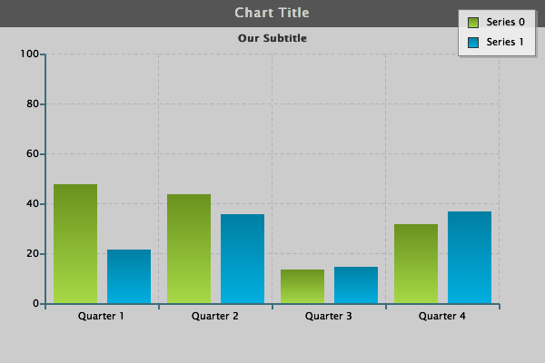
Now let's change the background color for the chart itself. When we make this change we are going to simply add the "background-color":" " attribute outside of any specific object. This will allow the change to affect the entire chart.
{
	"type":"bar",
	"background-color":"#ccc",
	"title":{
		"text":"Chart Title",
		"background-color":"#555",
		"font-color":"#ccc"
	},
	"subtitle":{
		"text":"Our Subtitle"
	},
	"legend":{

	},
	"scale-x":{
		"values":["Quarter 1","Quarter 2","Quarter 3","Quarter 4"]
	},
	"scale-y":{
		"values":"0:100:20"
	},
	"series":[
		{
		"values":[48,44,14,32]
		},
		{
		"values":[22,36,15,37]
		}
	]
}
Plot Area
We can also be more specific about which areas on the chart we want to change. For example, if we add a new object-- in this case “plotarea”:{ }, and change the “background-color”:” ” attribute within that object-- it will override the global “background-color”:” ” we set earlier, but only for that specific object.
This is very similar to how CSS works. The more specific a particular command, the higher it is on the list of priorities. Let’s take a look and see how that works.
{
	"type":"bar",
	"background-color":"#ccc",
	"title":{
		"text":"Chart Title",
		"background-color":"#555",
		"font-color":"#ccc"
	},
	"subtitle":{
		"text":"Our Subtitle"
	},
	"legend":{

	},
	"scale-x":{
		"values":["Quarter 1","Quarter 2","Quarter 3","Quarter 4"]
	},
	"scale-y":{
		"values":"0:100:20"
	},
	"plotarea":{
		"background-color":"#fff"
	},
	"series":[
		{
		"values":[48,44,14,32]
		},
		{
		"values":[22,36,15,37]
		}
	]
}

As you can see even though the "background-color":"#ccc" we added outside of the objects can control the background color for the entire chart, when we added a more specific command "plotarea":{"background-color":"#fff"}, to our chart the more specific command overrides the general command.
Legend
Now lets change some things in the legend. We have a legend but no idea what the data really represents. We can set specific text to each value set represented within the "series":[ ].
{
	"type":"bar",
	"background-color":"#ccc",
	"title":{
		"text":"Chart Title",
		"background-color":"#555",
		"font-color":"#ccc"
	},
	"subtitle":{
		"text":"Our Subtitle"
	},
	"legend":{

	},
	"scale-x":{
		"values":["Quarter 1","Quarter 2","Quarter 3","Quarter 4"]
	},
	"scale-y":{
		"values":"0:100:20"
	},
	"plotarea":{
		"background-color":"#fff"
	},
	"series":[
		{
		"values":[48,44,14,32],
		"text":"Products"
		},
		{
		"values":[22,36,15,37],
		"text":"Services"
		}
	]
}
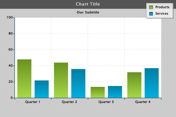
As you can see, the legend now has real life meaning to the data on the chart.
Series
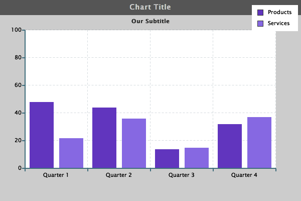
While we are at it, let’s also go through and change the colors of the bars. Again we can make changes directly inside of the "series"[ ],
{
	"type":"bar",
	"background-color":"#ccc",
	"title":{
		"text":"Chart Title",
		"background-color":"#555",
		"font-color":"#ccc"
	},
	"subtitle":{
		"text":"Our Subtitle"
	},
	"legend":{

	},
	"scale-x":{
		"values":["Quarter 1","Quarter 2","Quarter 3","Quarter 4"]
	},
	"scale-y":{
		"values":"0:100:20"
	},
	"plotarea":{
		"background-color":"#fff"
	},
	"series":[
		{
		"values":[48,44,14,32],
		"text":"Products",
		"background-color":"#6135be"
		},
		{
		"values":[22,36,15,37],
		"text":"Services",
		"background-color":"#8668e2"
		}
	]
}

Let's take a look at a few styling basics within the "legend":{ }, and then we will visit using objects inside of objects.
If we look at the legend there are a few subtle default styling elements that are already applied to the legend. If you look closely there is a border, a small shadow, and the background is partially transparent. Lets change those attributes first.
{
	"type":"bar",
	"background-color":"#ccc",
	"title":{
		"text":"Chart Title",
		"background-color":"#555",
		"font-color":"#ccc"
	},
	"subtitle":{
		"text":"Our Subtitle"
	},
	"legend":{
		"border-width":0,
		"shadow":0,
		"alpha":1
	},
	"scale-x":{
		"values":["Quarter 1","Quarter 2","Quarter 3","Quarter 4"]
	},
	"scale-y":{
		"values":"0:100:20"
	},
	"plotarea":{
		"background-color":"#fff"
	},
	"series":[
		{
		"values":[48,44,14,32],
		"text":"Products",
		"background-color":"#6135be"
		},
		{
		"values":[22,36,15,37],
		"text":"Services",
		"background-color":"#8668e2"
		}
	]
}
As you can see, we used a few simple attributes within the “legend”:{ } object to remove the default style. The “border-width”: we changed to 0. We also could have made the border larger by using a value such as “border-width”:”2px”,
Alpha
We removed the shadow by using a similar attribute and value.
Finally you see an attribute “alpha”: This is a great attribute that can be used in many different places. The “alpha”: attribute controls transparency. This number can range from 0 to 1 (0, .1, .2, .3, etc).
When you use 0 the object will be fully transparent. When you use 1 the object will be solid.
Now that we have the legend set to how we want it for now, let’s change how each of the items in the legend look. We can do this by adding an object within and object.
{
	"type":"bar",
	"background-color":"#ccc",
	"title":{
		"text":"Chart Title",
		"background-color":"#555",
		"font-color":"#ccc"
	},
	"subtitle":{
		"text":"Our Subtitle"
	},
	"legend":{
		"border-width":0,
		"shadow":0,
		"alpha":1,
		"item":{
			"color":"red"
		}
	},
	"scale-x":{
		"values":["Quarter 1","Quarter 2","Quarter 3","Quarter 4"]
	},
	"scale-y":{
		"values":"0:100:20"
	},
	"plotarea":{
		"background-color":"#fff"
	},
	"series":[
		{
		"values":[48,44,14,32],
		"text":"Products",
		"background-color":"#6135be"
		},
		{
		"values":[22,36,15,37],
		"text":"Services",
		"background-color":"#8668e2"
		}
	]
}
You may have noticed before we added the "item":{ } object to "legend":{ } we had "alpha":1
After we added the "item":{ } object we had to add the comma to "alpha":1,
This pertains to proper JSON syntax. This is a important part of ZingChart and incorrect JSON syntax can lead to frustrating errors.
Scale-X
Let's go ahead and add the "item":{ } object inside of "scale-x":{ } now. This will allow us to change things such as the color or the x-axis labels.
{
	"type":"bar",
	"background-color":"#ccc",
	"title":{
		"text":"Chart Title",
		"background-color":"#555",
		"font-color":"#ccc"
	},
	"subtitle":{
		"text":"Our Subtitle"
	},
	"legend":{
		"border-width":0,
		"shadow":0,
		"alpha":1,
		"item":{
			"color":"red"
		}
	},
	"scale-x":{
		"values":["Quarter 1","Quarter 2","Quarter 3","Quarter 4"],
		"item":{
			"color":"#fff"
		},
	},
	"scale-y":{
		"values":"0:100:20"
	},
	"plotarea":{
		"background-color":"#fff"
	},
	"series":[
		{
		"values":[48,44,14,32],
		"text":"Products",
		"background-color":"#6135be"
		},
		{
		"values":[22,36,15,37],
		"text":"Services",
		"background-color":"#8668e2"
		}
	]
}
Now we have used the "item":{ }, object inside of 2 separate objects and created unique individual styling. This practice can be very common. Whether you are trying to apply different styling throughout your chart or you want everything to match, it is important to look at the different elements as individual objects, and remember you need to change each aspect of your chart.

For now we will let you work with some of the new skills you have learned here. There is plenty more to learn when it comes to styling your charts. You can visit our Online Reference and review our documentation.
In our Online Reference you will find the different objects and attributes you can use to control your charts.
Happy Charting,
ZingChart Team