In our last post we showed you how to:
- Include the ZingGrid library in Astro
- Create an initial grid
- Add controls for sorting and pagination
- Create a template for one column to use
- Style the grid with Open Props
- Dynamically render a column with code
- Dynamically add classes to each row with code
In this post we're going to take a look at a new grid and
- Add zebra striping and vertical grid-lines
- Freeze some columns and make others draggable
- Dynamically add columns using Astro's Dynamic HTML
Create the Initial grid
We'll be using a slightly different dataset this time to show off some more useful ZingGrid features. To start we'll create a CurrencyGrid.astro component in our src/components directory and add the following code. We'll be passing our data to this component, so we create a prop for that, and we hand it to <zing-grid> using the data attribute.
src/components/CurrencyGrid.astro
---
const { data } = Astro.props;
---

<zing-grid
  data={data}
  layout-controls="disabled"
  page-size="7"
  pager
>
  <zg-caption>
    <h2>20 Years of Euro Foreign Exchange Reference Rates</h2>
    <p>
      <strong>Source:</strong> European Central Bank's Euro foreign exchange reference
      rates via Awesome JSON Datasets
    </p>
  </zg-caption>
</zing-grid>
Then inside of index.astro we will fetch our currency data (the data can be found in our source code)
src/pages/index.astro
---
import Layout from '../layouts/Layout.astro';
import CurrencyGrid from '../components/CurrencyGrid.astro';

import currencyData from '../data/currency.json';
const currencyDataStr = JSON.stringify(currencyData);
---

<Layout title="ZingGrid + Astro">
  <header> <!-- ... --> </header>
  <main>
    <CurrencyGrid data={currencyDataStr} />
  </main>
</Layout>
When we load up the page, we'll see a grid that looks like this. Nothing fancy yet, but surprisingly easy to get something going.

Add Zebra Striping and Vertical Grid-Lines
Two features easily added with a single attribute each on the <zing-grid> element.
zebra: Slightly darkens every other row to make reading easiergridlines: Accepts eitherverticalorboth(defaulting tohorziontal). Determines which grid lines appear in the grid.
<zing-grid
  data={data}
  layout-controls="disabled"
  page-size="7"
  pager
  zebra
  gridlines="both"
>
  <!-- truncated for brevity --->
</zing-grid>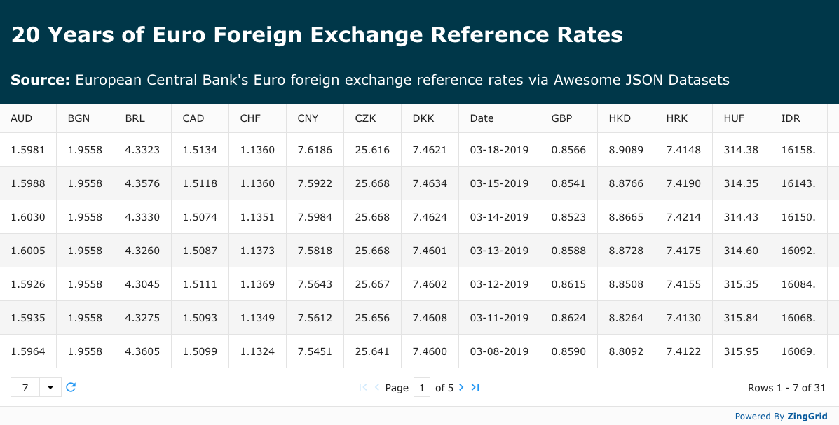
Drag and Freeze Columns
Next we'll start to configure our <zing-grid> element. With 100+ attributes to choose from the <zing-grid> element has a ton of configuration options available, so I'll pick out just a few I think will be useful to us here:
column-drag: Enables the dragging of columnscolumn-drag-action: acceptsboth,reorder, andhide. Reorder allows users to swap column positions, and hiding allows users to remove columns by dragging outside of the grid.
<zing-grid
  data={data}
  layout-controls="disabled"
  page-size="7"
  pager
  zebra
  gridlines="both"
  column-drag
  column-drag-action="reorder"
>
  <!-- truncated for brevity --->
</zing-grid>Freezing columns also requires only a single attribute modification, the only difference being that we place it on <zg-column> elements directly to specify exactly which columns we want frozen (Side Note: A few extra attributes have been added to split the date into two columns for a more interesting example).
<zing-grid
  data={data}
  layout-controls="disabled"
  page-size="7"
  pager
  zebra
  gridlines="both"
  column-drag
  column-drag-action="reorder"
>
  <zg-caption>
    <!-- truncated for brevity --->
  </zg-caption>
  <zg-colgroup>
    <zg-column
      index="Date"
      type="date"
      header="Year"
      type-date-format='YYYY'
      frozen
    ></zg-column>
    <zg-column
      index="Date"
      type="date"
      header="Date"
      type-date-format='MMMM DD'
      frozen
    ></zg-column>
  </zg-colgroup>
</zing-grid>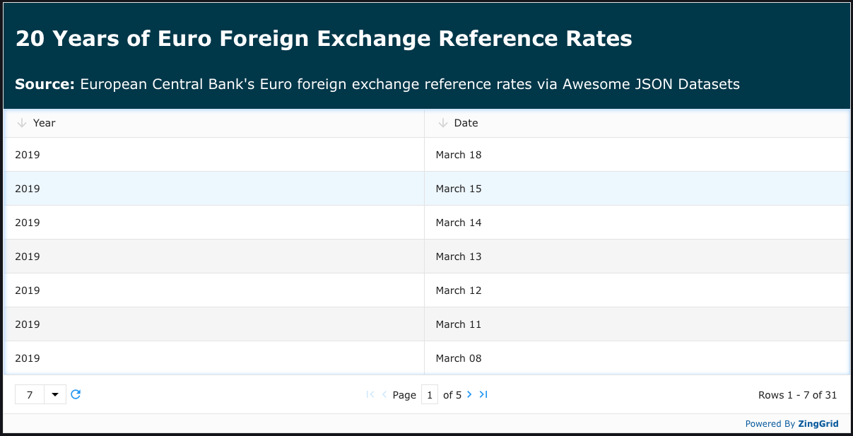
However there is one small issue as you can see above: If we specify any columns we must specify all of them. The columns that we specified look great (as shown below) but we should add back the rest.
Dynamically Add Columns With Astro
In the front matter of this component I create a map for each of the 3 letter currencies. In each mapping I have the currency symbol, the name of the country, and an icon filename (for flag icons I got from this GitHub repository).
const CURRENCY_MAP = {
  AUD: { sym: '$', country: 'Australia', icon: 'au.svg' },
  BGN: { sym: 'Лв', country: 'Bulgaria', icon: 'bg.svg' },
  BRL: { sym: 'R$', country: 'Brazil', icon: 'br.svg' },
  // truncated for brevity
};

const CURRENCIES = Object.keys(CURRENCY_MAP);
Using this map and Astro's Dynamic HTML we can loop over all of the currencies to dynamically generate our <zg-columns>. We'll use this currency value as the index for our columns since it matches up with the key value in our dataset.
<zg-colgroup>
  <!-- date columns truncated for brevity -->
  {
    CURRENCIES.map((currency) => {
      <zg-column
        index={currency}
        type="number"
        foot-cell="avg"
      ></zg-column>
    })
  }
</zg-colgroup>
While this is getting better, we can still improve the formatting a bit. It would be nice to have the currency symbols in the cells with the values.
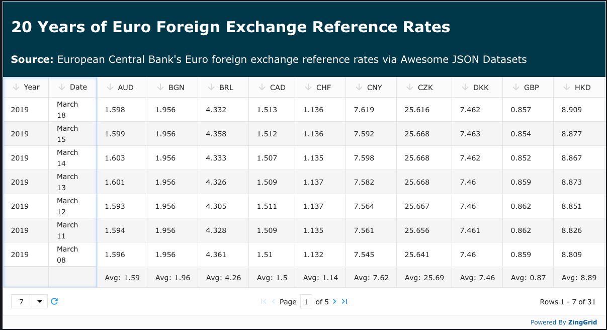
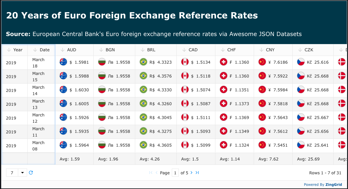
We can include a ZingGrid HTML template inside our <zg-column> for the cell to follow. This template has access to the values of each row using [[bracket]] syntax with the index variable. For example, since each row has an "AUS" key, [[index.AUS]] would grab the Australian currency value. In order to dynamically grab the correct currency value based on what currency we are currently looping over, we use `[[index.${currency}]` (note that ZingGrid's variables are swapped in on the front end while Astro's are used on the back end, which is why we have to output a string).
Then for the symbol, we use the CURRENCY_MAP we made earlier and grab the symbol out using CURRENCY_MAP[currency].sym
<zg-colgroup>
  <!-- date columns truncated for brevity -->
  {
    CURRENCIES.map((currency) => {
      <zg-column
        index={currency}
        type="number"
        foot-cell="avg"
      >
        <div class="cell-wrapper">
          <span class="currency-symbol">{CURRENCY_MAP[currency].sym}</span>
          <span class="currency-value">{`[[index.${currency}]]`}</span>
        </div>
      </zg-column>
    })
  }
</zg-colgroup>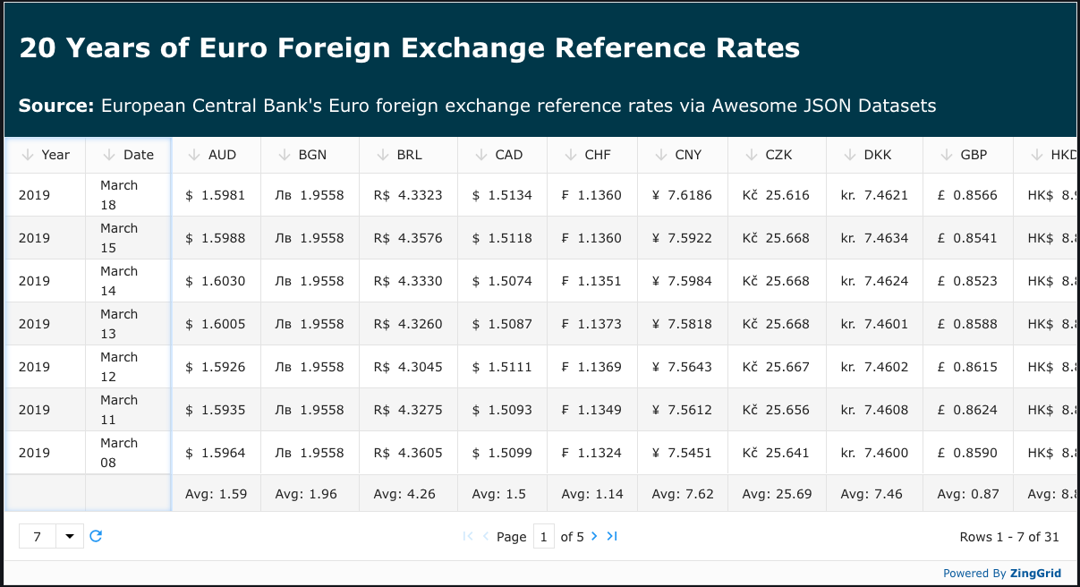
One final touch is to add flags inside each cell. Using the icons and country names from our previously made `CURRENCY_MAP` (along with a few CSS rules) we finally have our fully rendered chart!
<zg-colgroup>
  <!-- date columns truncated for brevity -->
  {
    CURRENCIES.map((currency) => {
      <zg-column
        index={currency}
        type="number"
        foot-cell="avg"
      >
        <img
          src={`/flags/${CURRENCY_MAP[currency].icon}`}
          alt={CURRENCY_MAP[currency].country}
          width='25'
          height='25'
        />
        <div class="cell-wrapper">
          <span class="currency-symbol">{CURRENCY_MAP[currency].sym}</span>
          <span class="currency-value">{`[[index.${currency}]]`}</span>
        </div>
      </zg-column>
    })
  }
</zg-colgroup>

<!-- ... -->

<style>
  .cell-wrapper {
    align-items: center;
    display: flex;
    gap: 1ch;
    width: 100%;
  }
  .cell-wrapper > img {
    filter: drop-shadow(0 0 1px rgba(0, 0, 0, 0.7));
    justify-self: flex-end;
  }
</style>
Final Thoughts
With Astro and ZingGrid creating a dynamic & user-friendly grid doesn’t have to be complicated! Astro’s Dynamic HTML capabilities make it easy to build grids that adapt to data on the fly, while ZingGrid’s extensive toolkit makes it easy to add interactivity with just a few tweaks. We have one more post in this series coming where we'll dive into creating a REST endpoint with Astro DB and hooking that up to our ZingGrid, so watch out for that here!