The philosophy of Astro is one of performance, flexibility, and customization. A web framework that prides itself on rendering as much as it can on the server first, allowing you to choose where your content lives, and giving you as many handles as possible to customize it how you like. The datagrid library you go with should be the same.
Initial Setup - Installing Astro
First things first, we have to setup a basic app—we'll do that by following the prompts in the following command
npm create astro@latestInitial Setup - Including ZingGrid Library
The library itself should be included as a script in the front end (preferably deferred using defer) for a few reasons:
- It needs to be included exactly once
- While the library itself is small for the sheer volume of features it packs (~259kb compressed), it is too big to be inlined in the HTML and maintain RAIL
- Quick side note: the
is:inlinedirective in Astro really means to opt the script out of any bundling and processing, not that the script will actually be fetched and swapped in place during the build process
- Quick side note: the
- A direct integration is not needed as ZingGrid was already built with a similar philosophy to Astro in mind.
src/layouts/Layout.astro
<!-- ... -->
<!DOCTYPE html>
<html lang="en">
  <head>
    <meta charset="UTF-8" />
    <meta name="description" content="Astro description" />
    <meta name="viewport" content="width=device-width" />
    <link rel="icon" type="image/svg+xml" href="/favicon.svg" />
    <meta name="generator" content={Astro.generator} />
    <title>{title}</title>
    <!-- ZingGrid Library -->
    <script is:inline defer src="/zinggrid.min.js"></script>
  </head>
  <body>
    <slot />
  </body>
</html>
<!-- ... -->
Creating the Activity Tracker Grid
We'll start with the simplest grid we can make and build up from there. First things first, we create a ActivityGrid.astro component in our src/components directory and add the following code.
We'll be passing our data to this component, so we create a prop for that, and we hand it to <zing-grid> using the data attribute.
src/components/ActivityGrid.astro
---
const { data } = Astro.props;
---

<zing-grid data={data}></zing-grid>
Over in our index.astro page in src/pages, we need to add our grid to the page. To do this we'll first need to import the component in our frontmatter (fenced off by ---), and we'll need to pull in our sample JSON as well. Now the only thing we have to be careful of is that we stringify the JSON as it will be passed into <zing-grid> as an attribute.
src/pages/index.astro
---
import Layout from '../layouts/Layout.astro';
import ActivityGrid from '../components/ActivityGrid.astro';

import activityData from '../data/activities.json';
const activityDataStr = JSON.stringify(currencyData);
---

<Layout title="ZingGrid + Astro">
  <header> <!-- ... --> </header>
  <main>
    <ActivityGrid data={activityDataStr} />
  </main>
</Layout>
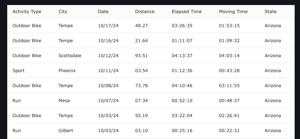
When we load up the page, we'll see a grid that looks like this. Nothing fancy yet, but surprisingly easy to get something going.
Adding User Controls and a Caption
To enhance our grid we'll start by configuring our <zing-grid> element. With 100+ attributes to choose from the <zing-grid> element has a ton of configuration available to it, but I'll pick out a few I think will be useful to us here:
layout: Determines whether or not the grid is shown in row or card modelayout-controls: Allow / prevent users from changing the layout modesort: Add controls to sort each columnpager: Paginates the grid instead of leaving it as one long listpage-sizer: The number of rows for each page
We'll also add a <zg-caption> inside of our <zing-grid> so we can give our grid a title
---
const { data } = Astro.props;
---

<zing-grid
  data={data}
  layout="row"
  layout-controls="disabled"
  sort
  pager
  page-size="6"
>
  <zg-caption>💃🏼 Activity Tracker</zg-caption>
</zing-grid>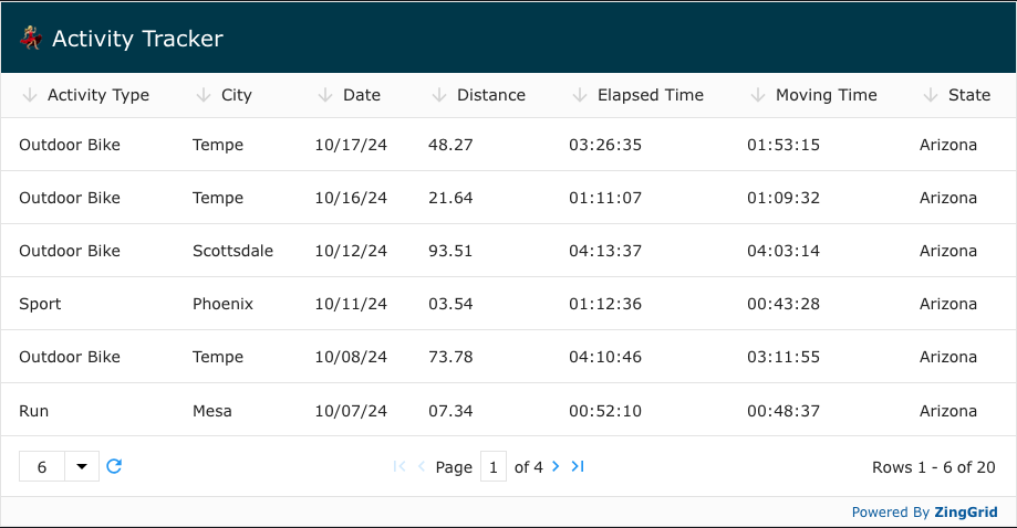
Formatting the Columns
Having a Distance column without any units makes it a bit hard to read. Luckily ZingGrid allows us to create templates for our columns. We can access the values from our row entry using the index object inside of [[double bracket]] notation. Below is a sample of what our data looks like for reference, the "distance" key is what we're pulling in when we write [[index.distance]] in the template.
src/data/activities.json
[
  {
    "activityType": "Outdoor Bike",
    "city": "Tempe",
    "date": "10/17/24",
    "distance": "48.27",
    "elapsedTime": "03:26:35",
    "movingTime": "01:53:15",
    "state": "Arizona"
  },
  /* ... */
]
src/components/ActivityGrid.astro
<zing-grid
  data={data}
  layout="row"
  layout-controls="disabled"
  sort
  pager
  page-size="6"
>
  <zg-caption>💃🏼 Activity Tracker</zg-caption>
  <zg-colgroup>
    <zg-column index='date'></zg-column>
    <zg-column index='activityType'></zg-column>
    <zg-column index='city'></zg-column>
    <zg-column index='state'></zg-column>
    <zg-column index='distance'>[[index.distance]] mi</zg-column>
    <zg-column index='elapsedTime'></zg-column>
    <zg-column index='movingTime'></zg-column>
  </zg-colgroup>
</zing-grid>
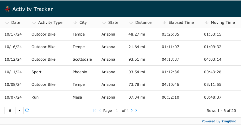
And the result is the mi unit being added to each Distance value just as in our template
Styling the Grid with CSS Vars and Open Props
ZingGrid is built with modern native web components for performance and resiliency, but as a side effect of that a lot of the components exist inside Shadow DOMs. Still wanting to allow users to style any part they desire, hundreds of CSS Variables were created to pierce these shadows. Below we show how they can be used in conjunction Open Props for added flexibility.
<style>
  zing-grid {
    --zg-body-color: var(--gray-8);
    --zg-caption-background: white;
    --zg-caption-border-bottom: 1px solid var(--gray-3);
    --zg-caption-color: var(--gray-8);
  }
</style>
Custom Cell Render Functions
To add some extra life to our grid it would be nice to be able to dynamically add an emoji in front of each activity. To do this, we'll create a function called activityRender on the window object (so it's accessible to ZingGrid) and add specify the function name the renderer attribute for the <zg-column> we want to apply it to. Inside this function we'll have the record text passed into us that we can then modify before it gets inserted into the cell.
<zing-grid>
<!-- ... -->
<zg-colgroup>
<!-- ... -->
<zg-column index='activityType' renderer='activityRender'></zg-column>
<!-- ... -->
</zing-grid>
<script>
window.activityRender = function (record) {
let sportEmoji = '';
if (record === 'Outdoor Bike') sportEmoji = '🚴♂️';
else if (record === 'Sport') sportEmoji = '⛳️';
else if (record === 'Run') sportEmoji = '🏃♂️';
return `${sportEmoji} <strong>${record}</strong>`;
};
</script>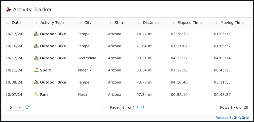
Dynamically Adding Classes to Rows
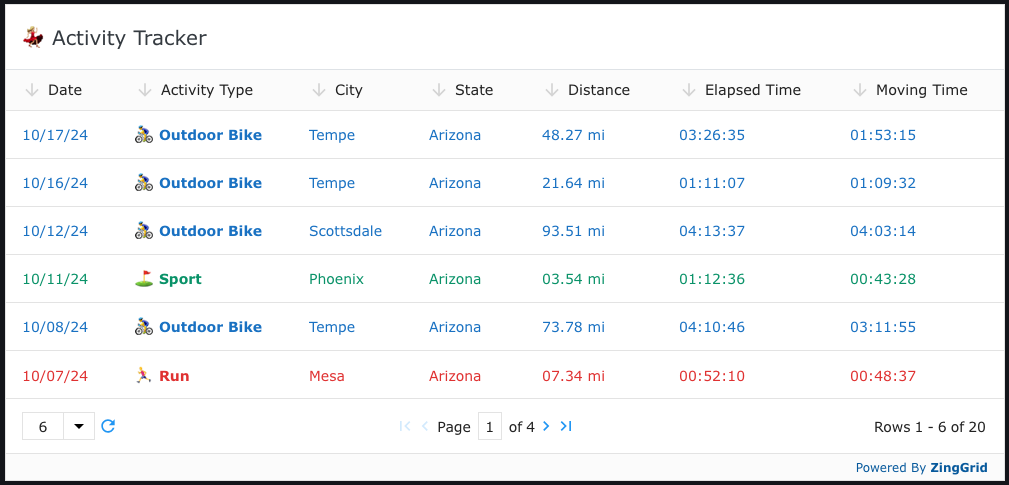
And then finally to color each row based on the activity type, we can use the row-class attribute to pass a function that will dynamically add a class to each row.
<zing-grid
  row-class="activityClassRender"
>
  <!-- ... -->
</zing-grid>

<script>
  // ...
  window.activityClassRender = function(record, rowIndex, rowDOMRef) {
    let rowCQlass = '';
    let activity = record.activityType;
    if (activity === 'Outdoor Bike') rowClass = 'outdoor-bike';
    else if (activity === 'Sport') rowClass = 'sport';
    else if (activity === 'Run') rowClass = 'run';
    return rowClass;
  }
</script>
We'll then need to create those classes in a global CSS style block as the <zg-row>s are created dynamically on the front-end and thus do not get tagged with the usual style scoping attributes that Astro adds at build time.
<style is:global>
  zing-grid zg-row.outdoor-bike {
    --zg-row-color: var(--blue-8);
  }

  zing-grid zg-row.sport {
    --zg-row-color: var(--teal-8);
  }

  zing-grid zg-row.run {
    --zg-row-color: var(--red-8);
  }
</style>
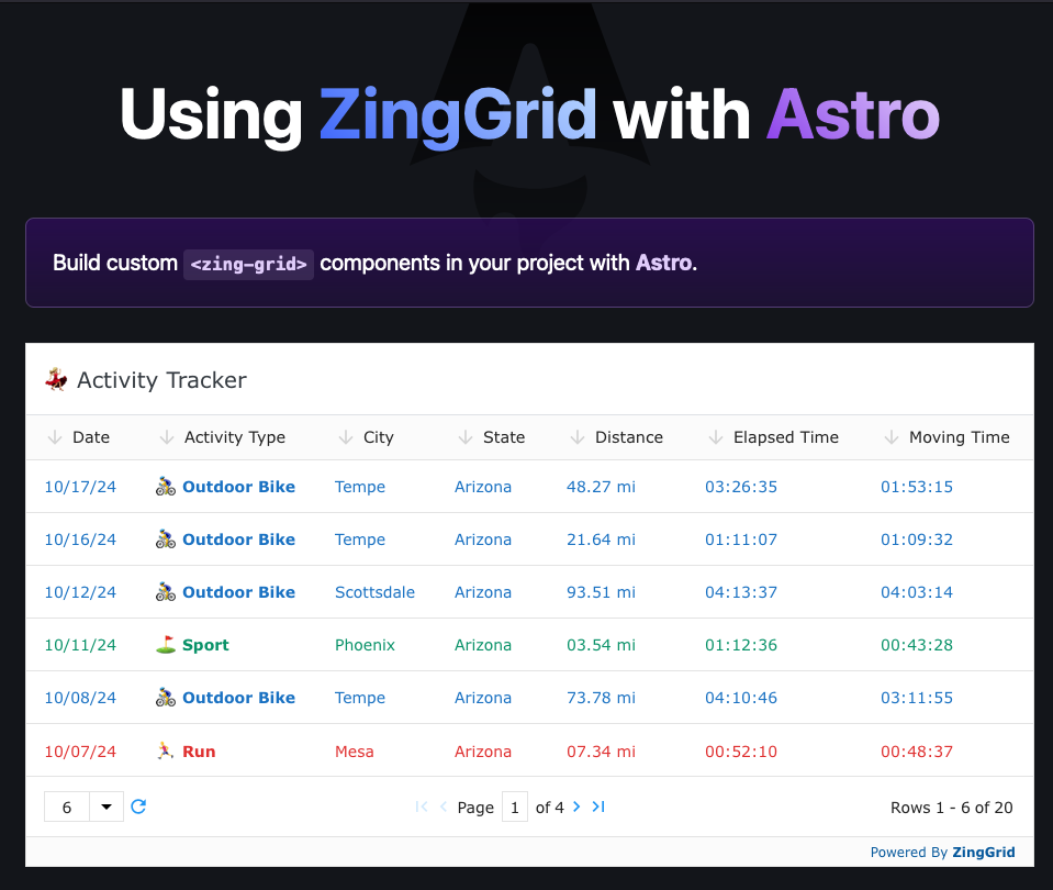
Et Voilà! 😄 We have a dynamically styled and formatted ZingGrid inside of Astro
Final Thoughts
With just a little configuration and very little code we were able to construct a robust and dynamic datagrid that fit with our Astro site. We've only scratched the surface of what ZingGrid can do in this article, so there will be a part 2 later on to show what the library can truly do, so watch out for that here if you're interested.