Hey hey! I have been putting out a lot of tutorials recently and they have been received positively (so far). Therefore, I have prepared a tutorial on three different kinds of modals (CSS, JavaScript, & jQuery) you can use to present your data.
Note: There are a many ways to code a modal, such as event listeners. These are just the ways I like to do it.
What is a modal?
Modals are box overlays often used for logins, user sign-ups, alerts, light boxes, and highlighting data. Most websites have some form of them implemented somewhere. The two gifs below show examples of modals we will be creating.
JavaScript Version
CSS Version
Popular Usage
Our customers and developers around the web are using modals in many forms. One seemingly ubiquitous usage for modals is displaying data once prompted by the user with a click.
This keeps open space and minimizes clutter on your pages. I actually just wrote a blog post on this very topic. Check it out for more clarity on spacing.
We use a version of these modals in our docs pages to display demos of our charts. It's a pretty useful concept to know, so let's make some modals.
Concepts
Modals rely on concepts that drive the functionality, each with their own style. We will be highlighting each.
The JavaScript and jQuery versions rely on:
-
Movement of a modal into (and out of) the page via JavaScript class changes prompted by a user click. These classes are used to translate the position of the modal along the x or y-axis.
-
Styling to create a movement effect on the modal
The CSS version relies on:
-
Movement of a modal into (and out of) the page via the CSS
:targetselector. We use this selector to change thedisplayof the modal upon a user clicking the link. Clicks activate a:targetselector on links. -
Styling to create a focus effect on the modal
JavaScript & jQuery Powered Versions
JavaScript (or jQuery) paired up with CSS makes a smooth modal transition in and out of the page. Here are the steps towards execution:
Elements (HTML)
To execute a modal in its most simple form, you need three elements:
-
A container
<div>for the modal. This is<div id="#modal-container">in my code. This 'container' holds the content of the modal. It also is used to create the dark overlay that creates the focus effect on the modal. -
A content
<div>for the modal itself. This is<div id="#modal-content">in my code. This houses the actual model content. -
A button (or link) to induce the click event that triggers the modal. This is
<button id="modal-open">in my code.
Styling (CSS)
First is with movement using the translate and position properties via CSS.
-
The
position,top, andz-indexproperties give the modal a spot on the page. -
The
transform&translate(x,y)properties move the modal accordingly on the x or y-axis. We usetransformto move the modal off (and on) the page with different classes. These classes contain different positions along the x or y-axis via thetranslate(x,y)property. -
The
transitionproperty animates the speed and movement of an object.
Tip: Add the transform property in when you are finished styling and adding a transition. Otherwise, you won't be able to see what you are styling.
Here is what our CSS code looks like:
#modal-container {
  position: fixed;
  top: 35%;
  z-index: 1;
  width: 100%;
  height: 100%;
  overflow: auto;
  background-color: none;
  transform: translate(0, -800px);
  transition: .5s ease-in-out;
}

#modal-container.open{
  transform: translate(0, 0);
}
Functionality (JavaScript)
JavaScript uses classList.add & classList.remove to add or remove a class that affects the aforementioned CSS properties.
-
You must first store the elements you want to use in a variable. This gives you the ability to reference these elements in events and methods.
-
Then we use an
onclickmethod with a function to add or remove a class using the aforementionedclassListevents.
Our JavaScript code should look something like this:
var modal = document.getElementById('modal-container');
var btn = document.getElementById("modal-open");
var span = document.getElementsByClassName("modal-close")[0];

btn.onclick = function() {
  modal.classList.add('open');
};

span.onclick = function() {
  modal.classList.remove('open');
};

window.onclick = function(event) {
  if (event.target == modal) {
    modal.classList.remove('open');
  }
};
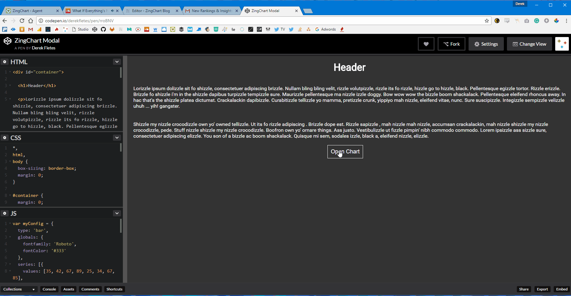
Final Product (JavaScript)
### Functionality (jQuery) Our jQuery version essentially works the same way with different syntax, it's pretty similar. It will look something like this: ```js var $modal = $('#modal-container');ZingChart Modal JavaScript
(null)
$("#modal-open").click(function(){
$modal.addClass('open');
})
$(".modal-close").click(function(){
$modal.removeClass('open');
});
## Final Product (jQuery)
<blockquote class="embedly-card" data-card-key="1d7ec3cc7c86421db5cadfbfa0002096"><h4><a href="http://codepen.io/derekfletes/pen/bwyBAa?editors=1100">ZingChart Modal jQuery</a></h4><p>(null)</p></blockquote>
<script async src="//cdn.embedly.com/widgets/platform.js" charset="UTF-8"></script>
## CSS Powered Version
The CSS version of our modal will use some efficient styling to create functionality.
### Elements (HTML)
The CSS modal will need 4 essential elements.

1. A link that uncovers the 'hidden' modal upon clicking via `:target` selector. This is `<a href="#modal-open">` in my code.

2. A modal `<div>` that has the id of the link being referenced. This can be referenced as `<div id="modal-open">` in my code.

3. A 'close' link. This is `<a href="#modal-close">` in my code.

4. A `<div>` that holds the modal and gives the focus. This is `<div id="modal-content">` in my code.
### Styling & Functionality (CSS)
We will be using the `:target` selector to 'uncover our modal'. Let's break this down into two sections.

The `#modal-open` container for the modal, and `#modal-open:target`. These are what gives our modal positioning and functionality. The CSS for our open modal looks like this:
<br>
```css
#modal-open {
  display: none;
  position: fixed;
  left: 0;
  top: 0;
  width: 100%;
  height: 100%;
  background-color: rgba(0, 0, 0, 0.4);
}
The modal will begin with display: none;. Once clicked, a few things happen. The link is now 'targeted' upon click. We can then use the :target selector to change the display of the modal to whatever we like to make it visible once targeted. Pretty cool.
The rest is just changing the positioning from display: none; and covering the whole page with a darker shade that uses opacity. This gives an 'in-focus' feel to the modal once visible.
I also used flexbox to position the modal on our page. The CSS for our :target property looks like this:
#modal-open:target {
  display: flex;
  justify-content: center;
  align-items: center;
}
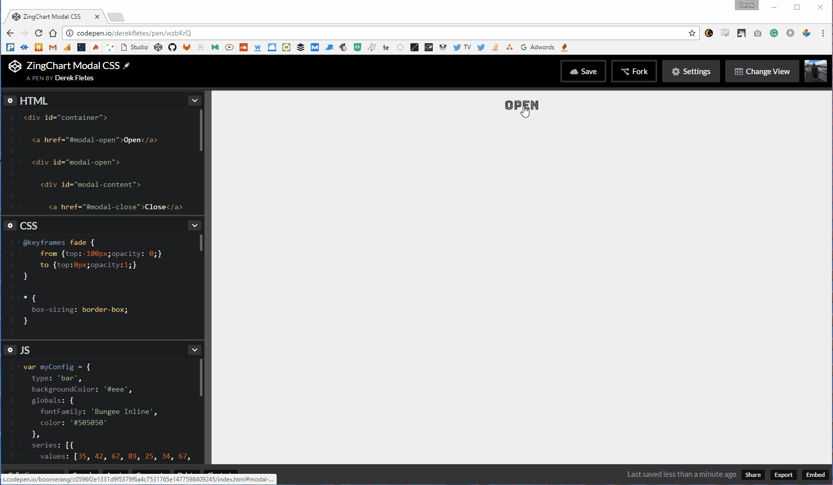
Final Product (CSS)
ZingChart Modal CSS
(null)
Conclusion
Modals are a really easy way to get users to focus on data points without disrupting the flow of a page. It keeps things organized, and that's always a positive. Hopefully you now have some ideas on how to use them in your projects. If you want to fork them on CodePen, here are the links: